The network for creativity
Join 1.25M professional creatives like you
Connect with clients, get discovered, and run your business 100% commission-free
Creatives on Contra have earned over $150M and we are just getting started
Back to feedPost

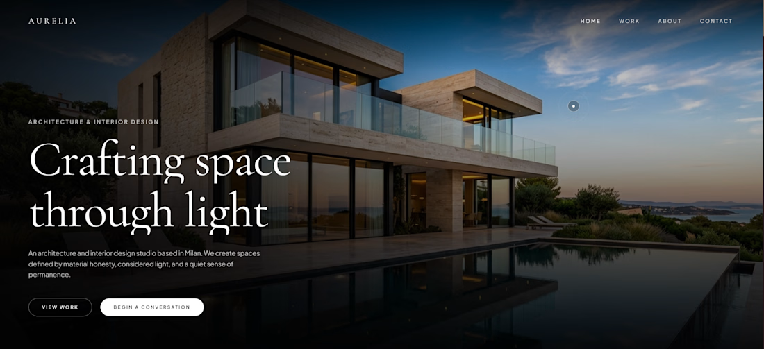
For an architecture studio, I didn't want the hero to feel like a typical “headline + image + button” layout.
The architecture itself should do most of the talking.
I built the hero around three things: a cinematic architectural image to establish emotion, oversized editorial typography to create hierarchy, and restrained CTAs that keep the focus on the work.
The goal was to make the first screen feel like an extension of the studio's design philosophy, quiet, intentional, and considered.
This is only the first section. More of Aurelia coming next.


The network for creativity
Join 1.25M professional creatives like you
Connect with clients, get discovered, and run your business 100% commission-free
Creatives on Contra have earned over $150M and we are just getting started





Related posts


Its feel like your archive is full of honey. wonderful

Bring back mascot logo's 🙌
Ram logo 'Stagepaid'.


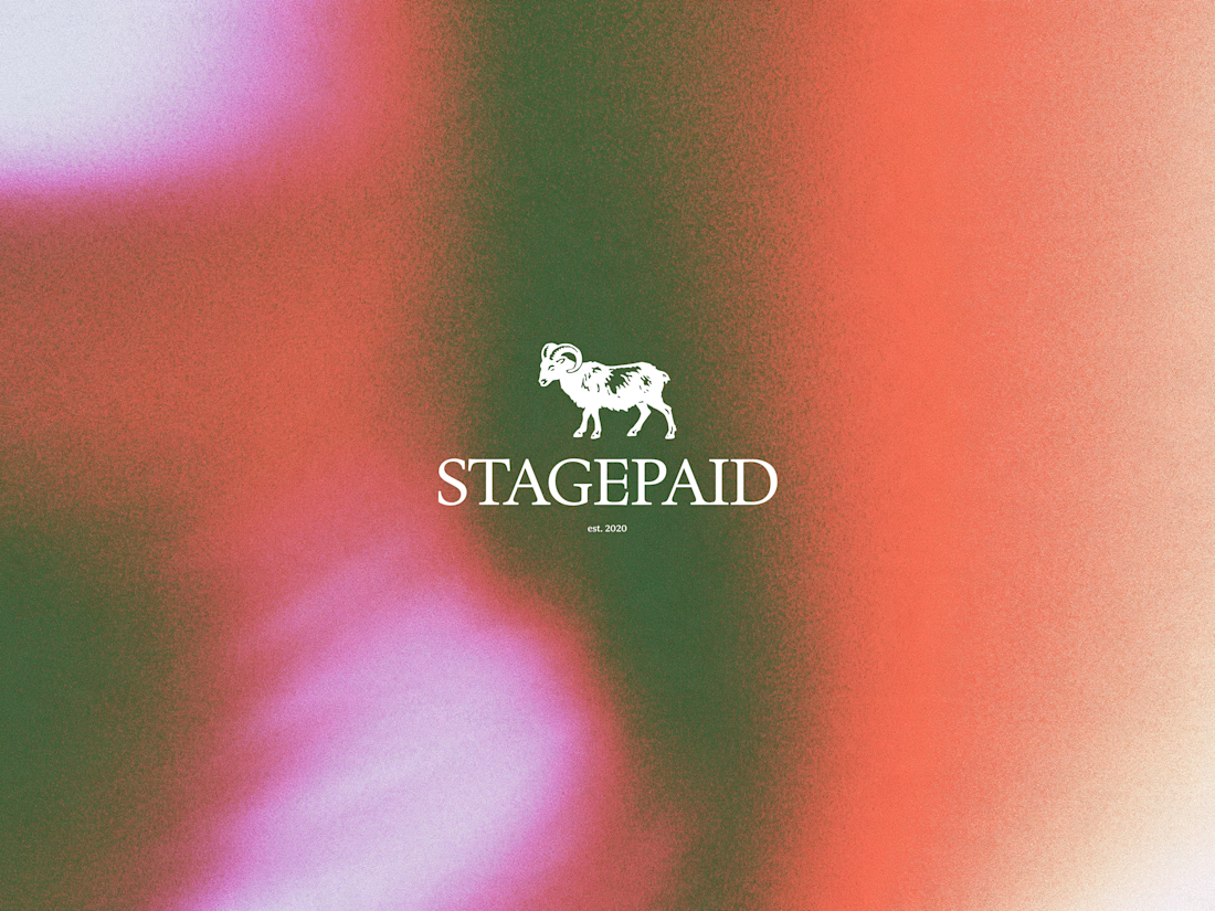


cool work! love mascot logos :D

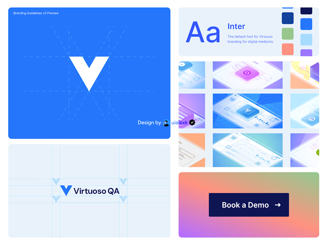
Branding v3 for Virtuoso
This design evolution, made an impact to the brand growth's by:
- Increasing website conversions
- Having consistent brand presence across digital mediums
- Increase brand awareness
See full case study here

One of the best designs I’ve seen today. Really solid work