The network for creativity
Join 1.25M professional creatives like you
Connect with clients, get discovered, and run your business 100% commission-free
Creatives on Contra have earned over $150M and we are just getting started
Back to feedPost


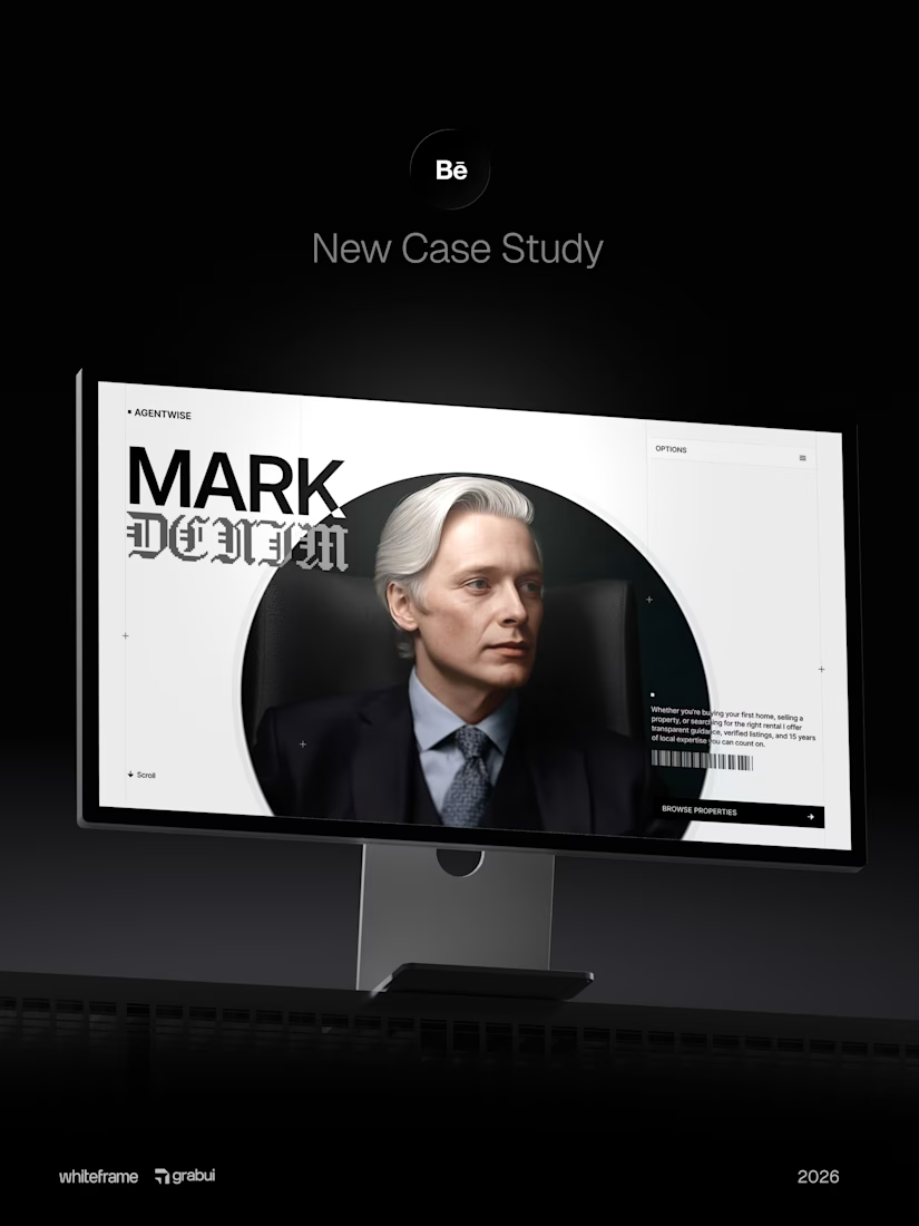

wow, what an execution

Real estate sites often bury the search, so I would be curious how you handled the listing filters in this case study. The layout reads clean in the Figma to Webflow flow.

Clean execution! Love the bold typography contrast with MARK / DENIM and the circular portrait treatment.
Real estate agent sites need trust + personality and you nailed both. That presentation mockup is fire too!
The network for creativity
Join 1.25M professional creatives like you
Connect with clients, get discovered, and run your business 100% commission-free
Creatives on Contra have earned over $150M and we are just getting started



Related posts

If your members pay premium. Your website should look like it.
Animation really changes the way you look at a website.
The premium is in the details. 🤌
Hero section with animation for a Tennis Sports Club Membership Platform.
Full landing page WIP; gonna share it very soon.


The animation adds a lot to the premium feel for a tennis club membership platform. Looking forward to seeing the full landing page.


A strong service business needs a website that builds trust in seconds.
Just wrapped up this Webflow project for Aquila Electrical, designed to make a wide range of electrical services feel simple to explore for homeowners, commercial clients, and industrial customers.
I focused on clear service pathways, strong project showcases, responsive layouts, trust signals, and a straightforward quote journey that helps visitors move from “I need an electrician” to taking action.
Curious to hear your thoughts, does the website feel clear and trustworthy enough for a service business like this?
#Webflow #WebDesign #UIDesign #UXDesign #WebDevelopment #ElectricianWebsite #LocalBusiness #ServiceBusiness #ResponsiveDesign #PortfolioProject #Contra
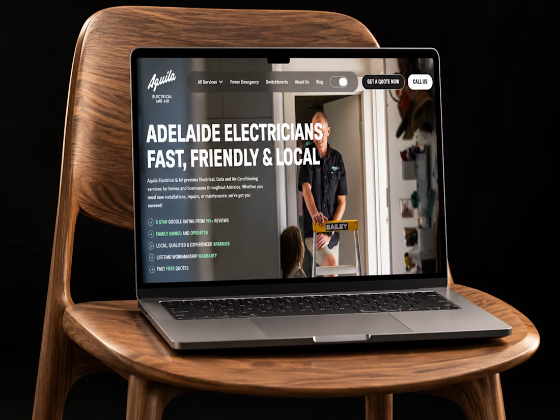

Simple, refined, and very well executed.