The network for creativity
Join 1.25M professional creatives like you
Connect with clients, get discovered, and run your business 100% commission-free
Creatives on Contra have earned over $150M and we are just getting started
Back to feedPost


The network for creativity
Join 1.25M professional creatives like you
Connect with clients, get discovered, and run your business 100% commission-free
Creatives on Contra have earned over $150M and we are just getting started





Related posts

Opening 15 seconds of an explainer we made for ORIKIN.
Type, motion, and a purple palette we built around their brand. The Spanish frame is in there on purpose, the product replies in whatever language the customer writes in.
Full piece and the story behind it coming soon. Ping me if you want it earlier😍

That purple palette is doing a lot of work in just 15 seconds. Was the Spanish frame something ORIKIN asked for, or did you pitch it as a way to show off the product feature visually?

Design Direction Poll!
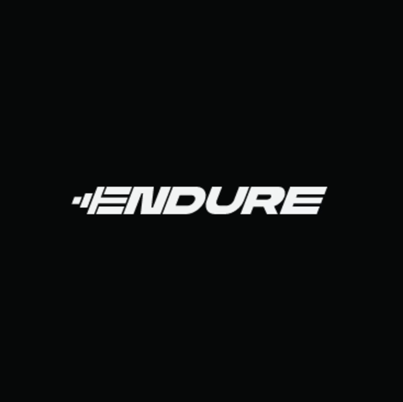
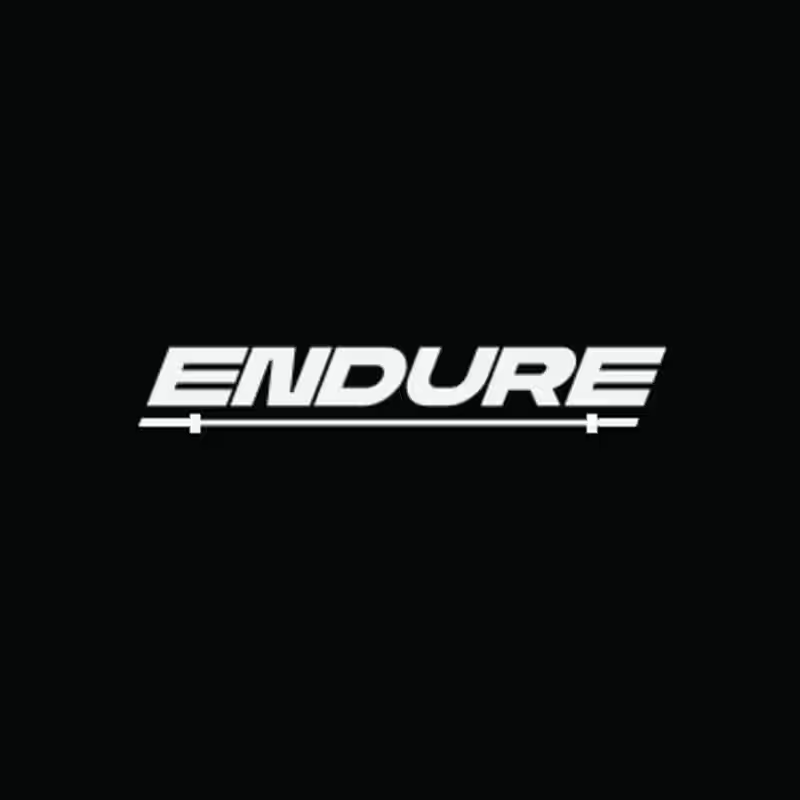
Two versions of the same Endure logo concept; same aggressive italic letterforms, same racing DNA. One detail changes the entire read.
Which version hits harder? 👇
14 voted
78%
4 voted
22%
18 votes
Closed


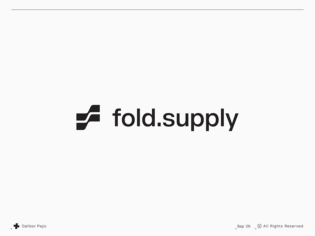

Took me a second to see the fold in the mark and now I can't unsee it, perfect for a dual-screen phone store. Was the slash always part of it or did it start as two plain stacked bars?