The network for creativity
Join 1.25M professional creatives like you
Connect with clients, get discovered, and run your business 100% commission-free
Creatives on Contra have earned over $150M and we are just getting started
Back to feedPost

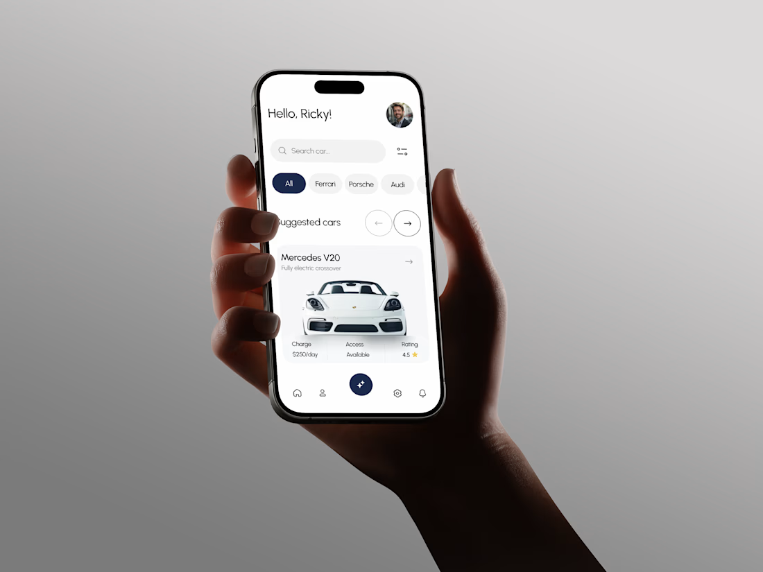
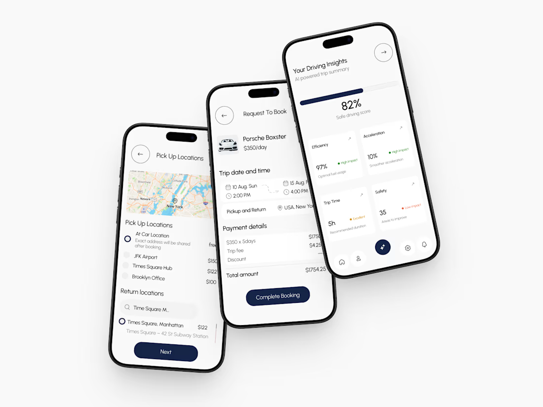
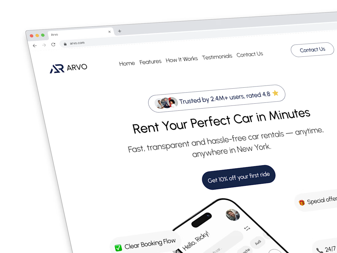
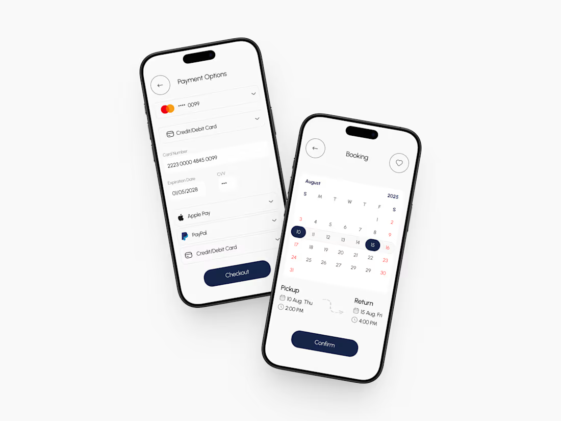
I feel happy, I working in design on Figma and develop in this week a funny website for kids.
Here's a glimpse of the design that's been developing. 😊

The network for creativity
Join 1.25M professional creatives like you
Connect with clients, get discovered, and run your business 100% commission-free
Creatives on Contra have earned over $150M and we are just getting started





Related posts



Professional work

My 3rd Framer template, SKI8, is live on @Framer
I kept landing on ski school websites with jaw-dropping mountains up top, then buried prices, tiny buttons, and no way to book.
Your site is your first lesson. If it feels clunky, people assume the instruction will be too.
So lead with one bold hero, show your courses clearly, and make booking a single tap.
That's exactly what SKI8 does: bold, snow-inspired, fully responsive, no code needed. Built for ski schools, clubs, camps, and instructors.
Grab it free on Framer 👇


Congrats buddy

AI Sales Agent SaaS Landing Page
A modern AI Sales Agent & Sales Intelligence SaaS website designed for startups and growing businesses looking to automate sales workflows, streamline lead management, and boost revenue through intelligent automation and real-time insights. The design combines a premium SaaS aesthetic with a conversion-focused user experience, featuring clear product messaging, interactive sections, and a scalable interface built to support modern sales teams.

Amazing design