The network for creativity
Join 1.25M professional creatives like you
Connect with clients, get discovered, and run your business 100% commission-free
Creatives on Contra have earned over $150M and we are just getting started
Back to feedPost


AI builds a landing page in 10 minutes now. Nobody's stuck on that part anymore
They're stuck on the first line. What you do and who it's for
Most AI startup sites I open still can't say it

Stuck on the first line is such a sharp way to put it. Most AI startup sites hide behind vague nouns. Writing the line first and the landing page second would fix half of them.
The network for creativity
Join 1.25M professional creatives like you
Connect with clients, get discovered, and run your business 100% commission-free
Creatives on Contra have earned over $150M and we are just getting started











Related posts


Amazing work

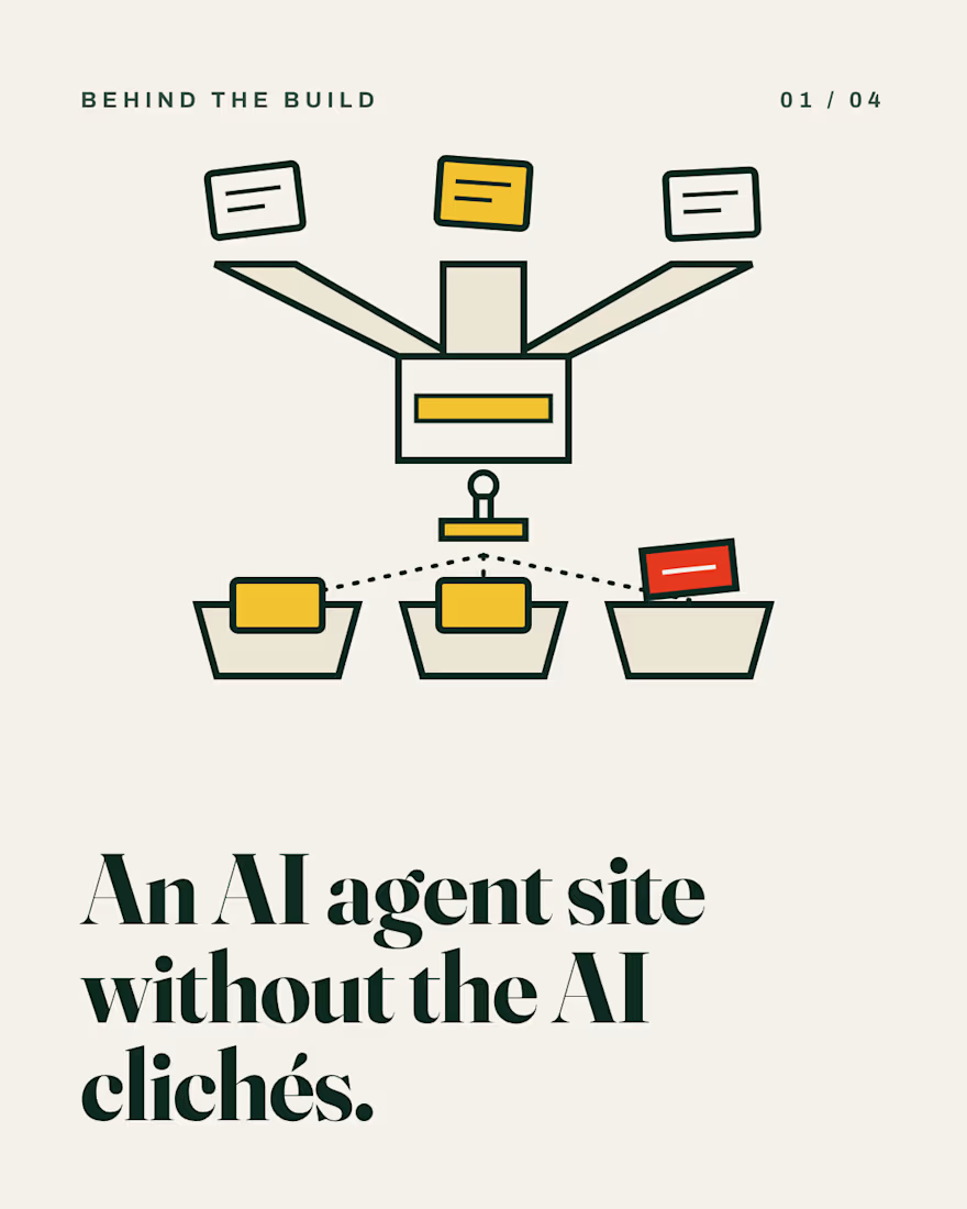
Most AI agent sites look the same: glowing brains, purple gradients, a chat box.
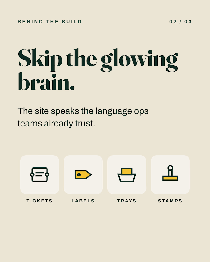
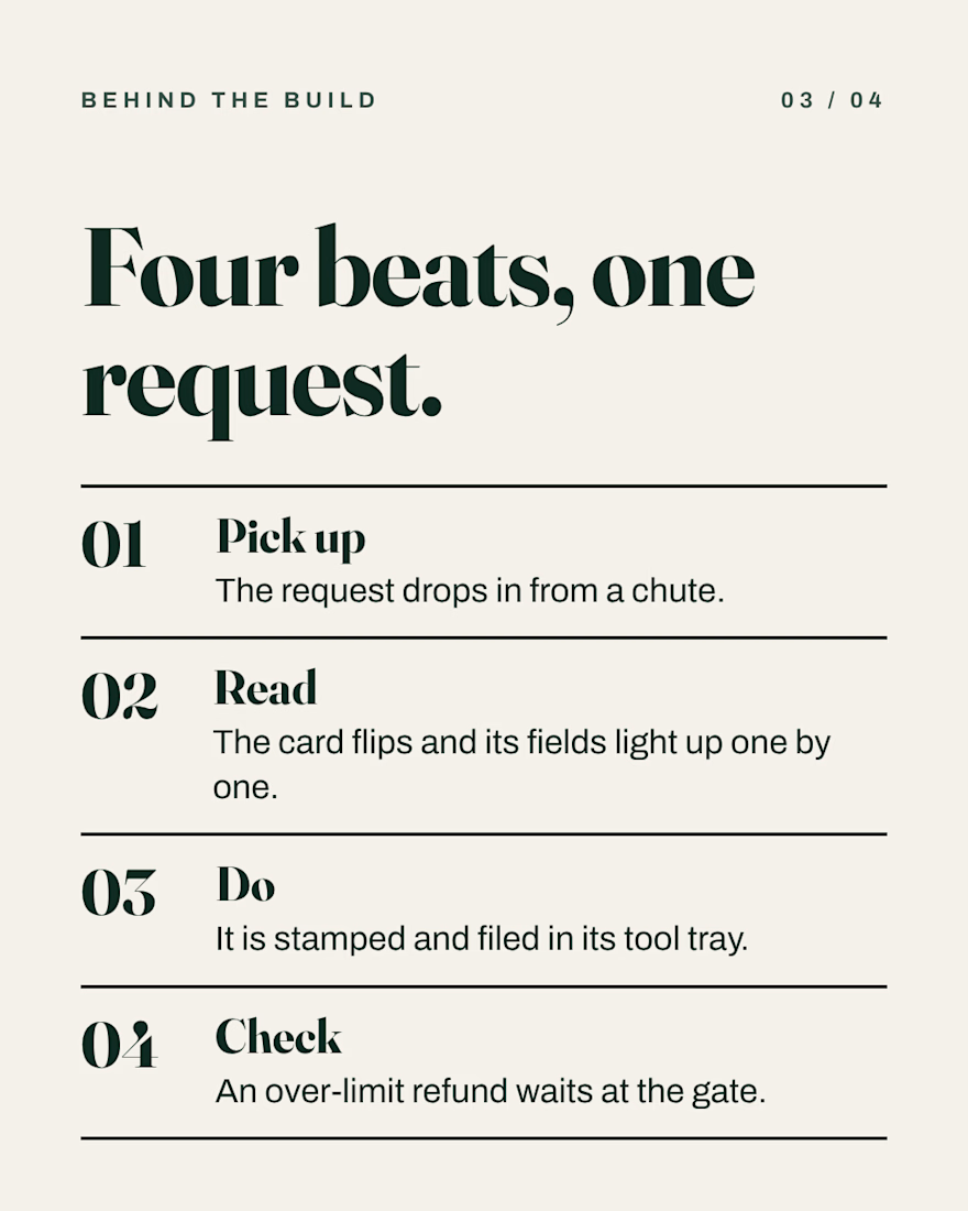
For Dockett, a fictional startup whose AI agents handle refunds, plan changes and missing invoices, I used tickets, labels, trays and stamps instead, and built the site around a toy-like 3D sorting machine.
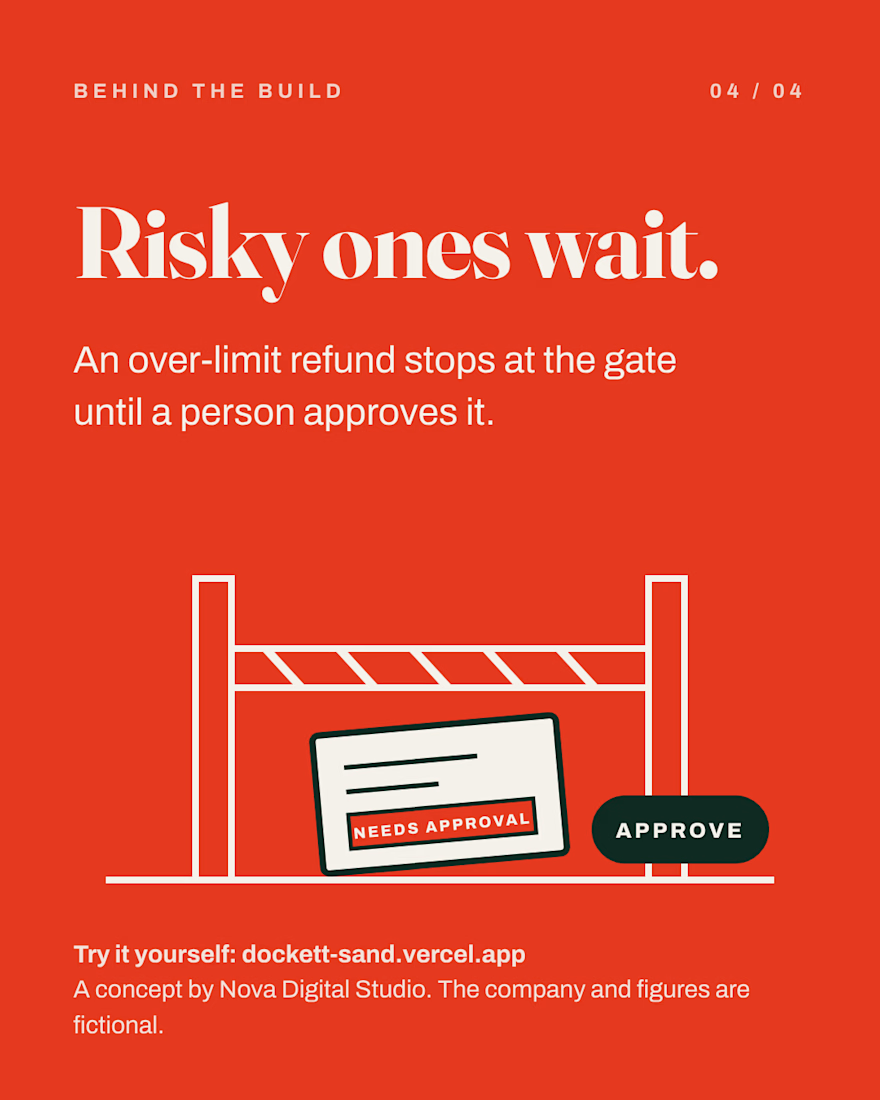
Risky requests stop at an approval gate until a person says yes.
Concept by Nova Digital Studio. React, Three.js, GSAP.



Tickets and stamps instead of purple gradients is a refreshing take for an AI site.

Most AI startup pages say "AI-powered" and show a gradient. Buyers scroll past, because nothing on the page proves the product does anything.
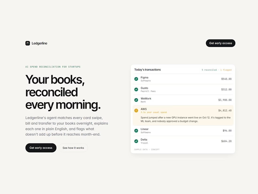
So for Ledgerline, a concept AI agent that reconciles a startup's spend every night, I built a launch page where the product works on the page itself.
• The hero is a live ledger. Transactions reconcile one by one, and one AWS charge turns amber and explains in plain English why it was flagged.
• Colour means something. Green is reconciled, and amber is reserved for problems. Visitors learn that in the hero and see it in every section after.
• "Ask Ledgerline" types a question, streams an answer, then shows the exact transactions behind it. They add up to the number in the answer, because AI people can check is AI people trust.
• The sections follow a founder's questions in order: what is it, why now, how it works, is it safe, what it costs.
Built in Framer with three custom React components that the team can edit from the properties panel without touching code.
Ledgerline is a concept and all the numbers are sample data. The craft is real.
Launching an AI or fintech product and your page still describes it instead of showing it? That's what my Startup Landing Page service fixes: designed and built in two weeks, in Framer or Next.js.
Or send me your current URL and I'll reply with the three changes I'd make first.

The colour system is the detail that sells this. Green means reconciled, amber means problems, and the hero teaches it so every later section clicks instantly. Showing the transactions behind the ask feature is exactly how you make AI feel trustworthy. Did you design the sample...