The network for creativity
Join 1.25M professional creatives like you
Connect with clients, get discovered, and run your business 100% commission-free
Creatives on Contra have earned over $150M and we are just getting started
Back to feedPost

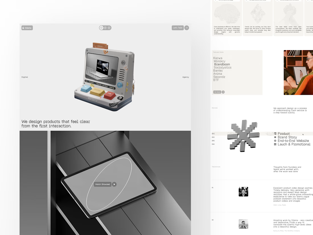
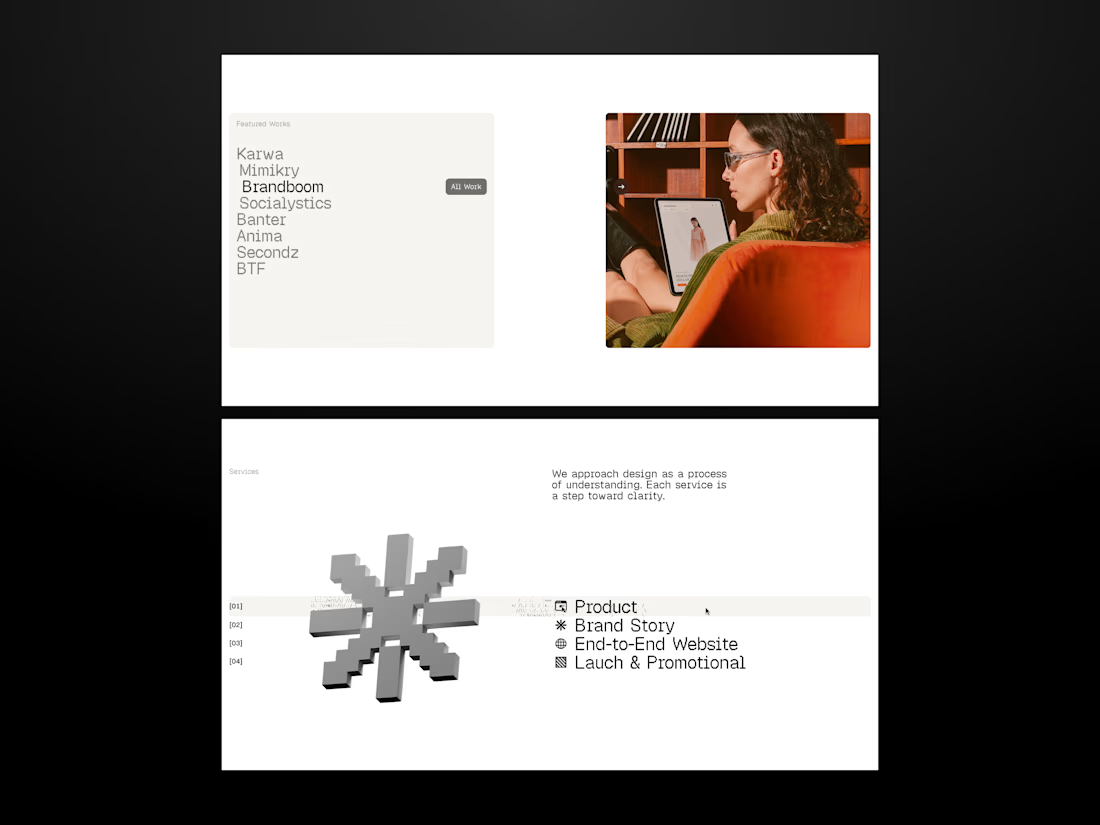
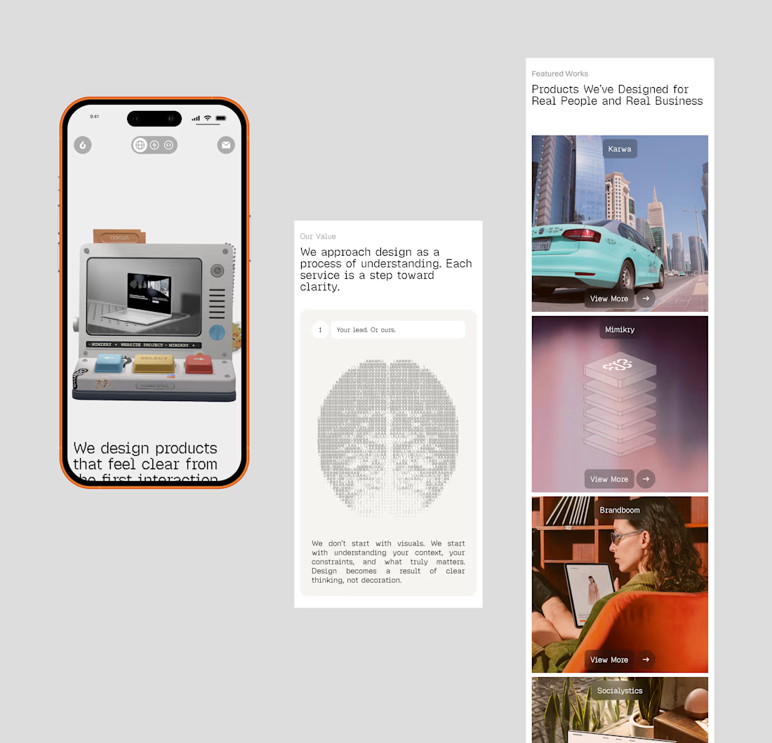
We’ve got a new website!
After 5+ years shaping digital products, we’ve brought our work and approach into one place—from product design and brand storytelling to end-to-end websites and launch creatives. The site tells that story through a retro-inspired experience.
The network for creativity
Join 1.25M professional creatives like you
Connect with clients, get discovered, and run your business 100% commission-free
Creatives on Contra have earned over $150M and we are just getting started



Related posts

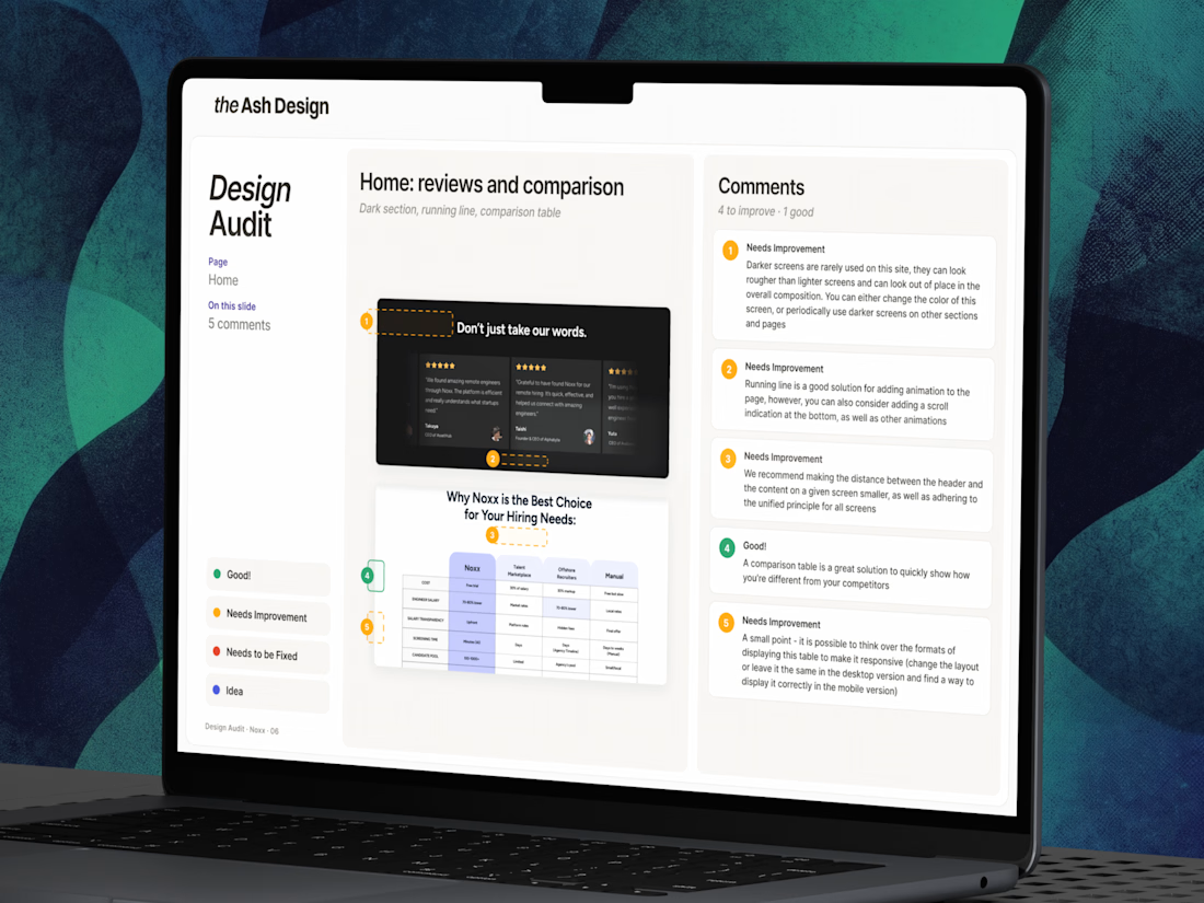
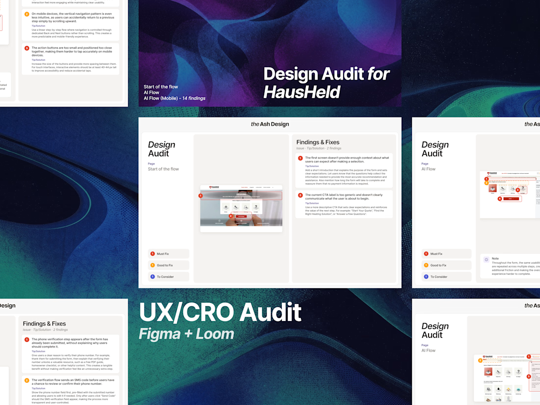
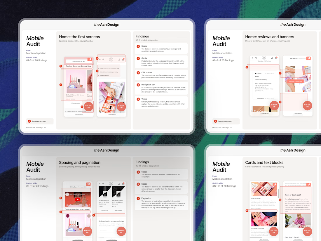
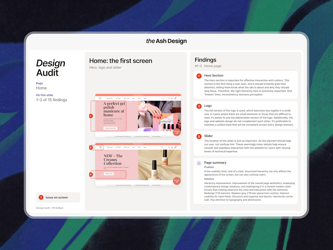
Not every redesign needs to start with a redesign.
Quite often, clients come to me with an existing product, MVP, or website and pretty much the same concern:
“We know something isn’t working, but we’re not exactly sure what”
And in cases like this, I almost always suggest starting with an audit.
It doesn’t have to be a huge 30-page document. It really depends on what the product needs. Sometimes it’s a full product or website audit. Sometimes it’s a quick landing page review, a deep dive into a specific flow, or simply looking at where users are dropping off and why.
What I like about starting with an audit is that it quickly turns “we need to improve something” into a clear list of actual problems, hypotheses, and next steps.
From there, everything gets easier. We know what’s actually worth changing, what the scope looks like, and what should come first. And if there’s a lot to improve, we can prioritize it and break the work into manageable iterations.
It also means much less back and forth once we get into design, because we’re not trying to figure out the core problems along the way.
So if you already have a working product or website but aren’t quite sure where to start improving it, you might not need a redesign just yet.
You might need a good audit first.
And if you need a fresh pair of eyes on your product, website, or a specific flow - feel free to DM me!


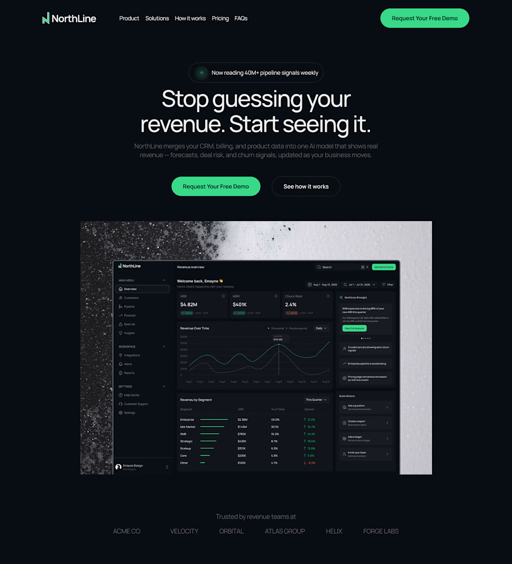
Designed a hero section for NorthLine, an AI revenue intelligence platform 🚀
The challenge: make a complex, data-heavy product understandable in seconds.
What I did:
• One clear promise in the headline: “Stop guessing your revenue. Start seeing it.”
• Put the real dashboard front and center, so visitors see the product, not just read about it
• Dark UI with a vibrant green accent to signal trust and precision
• One focused CTA to drive demo requests
#WebDesign #SaaSDesign #LandingPageDesign #UIUX #Figma #WebDesigner #Contra



Nice direction for a data-heavy product.

Work @ Bitwala as UX and Product Engineer
Check it out
That was fun!
Three months of building, backed by a solid round of user research – and the results paid off.
What we tested:
✅ Onboarding: Was it quick and frictionless? Did users grasp the key details without cognitive overload?
✅ Home & Dashboard: Where do they click first? How long do they pause before acting? How quickly do they find what they need, and what do they prioritize?
✅ Errors: Are the messages clear and well-timed, or contradictory? Do users hit dead ends with no clue what went wrong?
There is a ton of actionable insight in watching real users navigate your product – helping them achieve their goals smoothly is what ultimately drives revenue.


Love seeing the onboarding backed by research.


