The network for creativity
Join 1.25M professional creatives like you
Connect with clients, get discovered, and run your business 100% commission-free
Creatives on Contra have earned over $150M and we are just getting started
Back to feedPost

Work @ Bitwala as UX and Product Engineer
Check it out
That was fun!
Three months of building, backed by a solid round of user research – and the results paid off.
What we tested:
✅ Onboarding: Was it quick and frictionless? Did users grasp the key details without cognitive overload?
✅ Home & Dashboard: Where do they click first? How long do they pause before acting? How quickly do they find what they need, and what do they prioritize?
✅ Errors: Are the messages clear and well-timed, or contradictory? Do users hit dead ends with no clue what went wrong?
There is a ton of actionable insight in watching real users navigate your product – helping them achieve their goals smoothly is what ultimately drives revenue.


Research-driven onboarding uplift is impressive work.
The network for creativity
Join 1.25M professional creatives like you
Connect with clients, get discovered, and run your business 100% commission-free
Creatives on Contra have earned over $150M and we are just getting started





Related posts

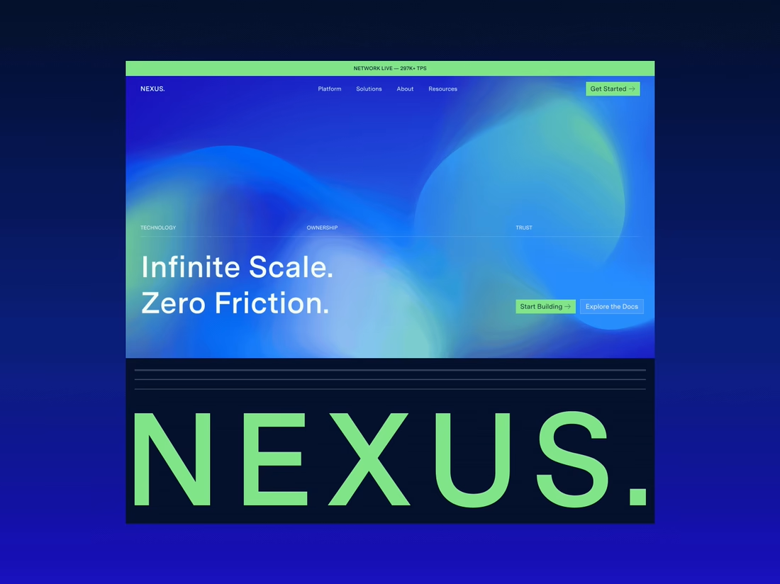
Happy to finally share the full NEXUS project 🙌
A few days ago I posted a small motion teaser. Now the whole thing is live on my profile: 12 pages designed in Figma, a design system, and a homepage I built in HTML, CSS and JS with every interaction working.


12 pages in Figma plus a design system, then hand coding the homepage with every interaction working is a great way to show the concept holds up, Sofiia. Nice to see the teaser turn into the full project.


We *assembled* a brand identity for Project Assembly ;)


So cool!