The network for creativity
Join 1.25M professional creatives like you
Connect with clients, get discovered, and run your business 100% commission-free
Creatives on Contra have earned over $150M and we are just getting started
Back to feedPost

Good products can still have confusing interfaces.
Sometimes the issue isn't the functionality.
It's the way everything is presented.
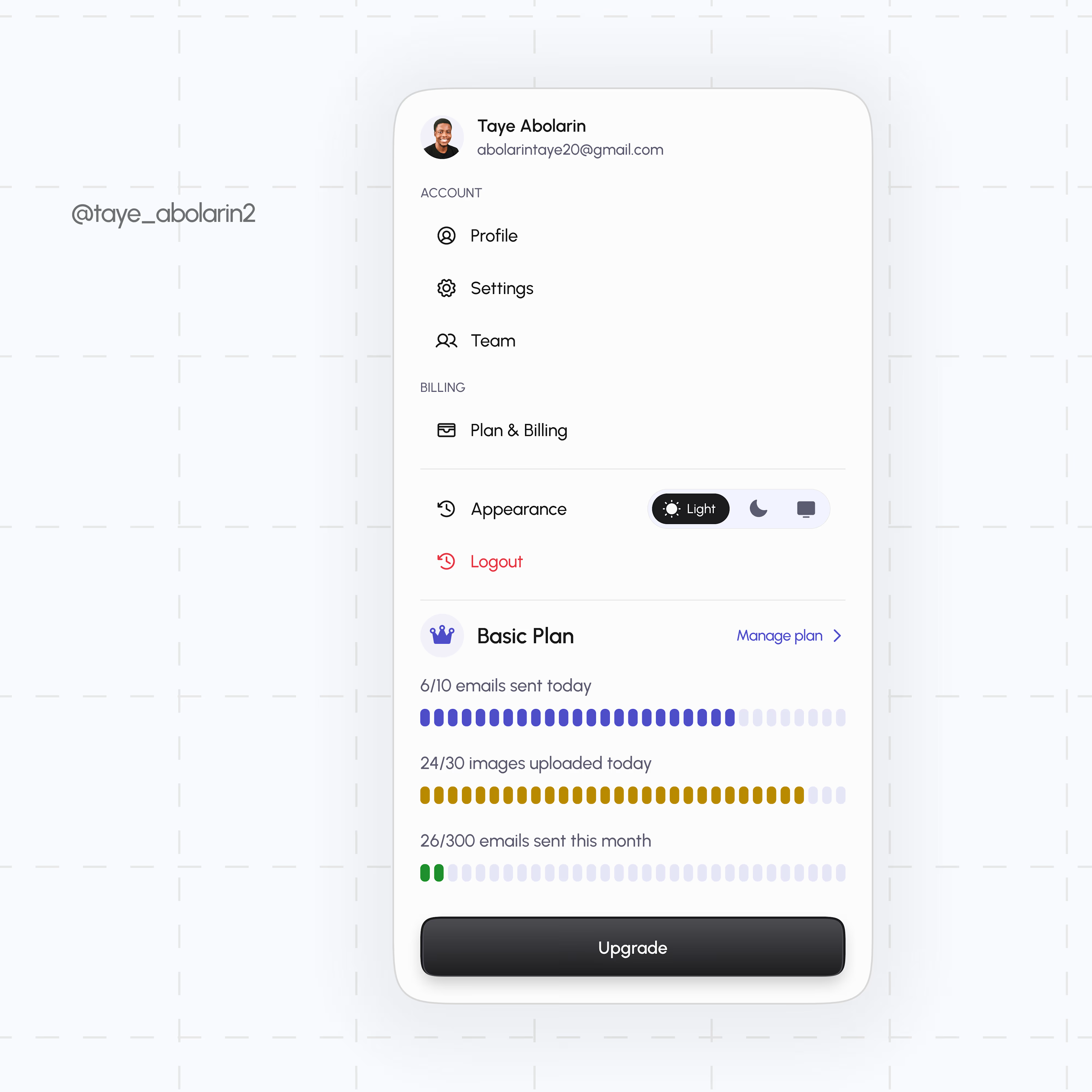
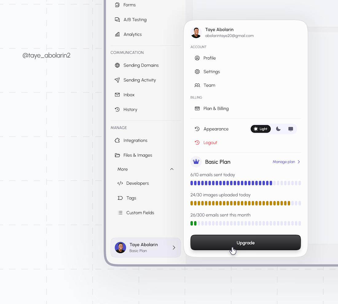
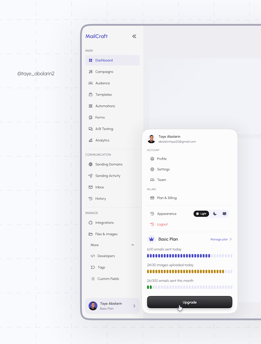
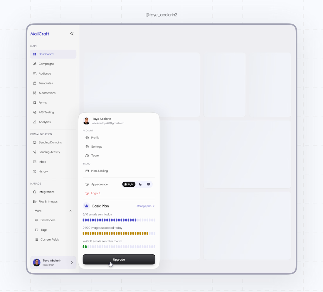
That's what I explored with this MailCraft dashboard concept, taking a crowded account menu and restructuring it around how users actually think:
Account → Billing → Preferences → Plan
Small decisions like this can make a product feel significantly easier to navigate.
This is the kind of work I enjoy: taking existing products, finding the friction and turning it into a cleaner experience.
If you're building a SaaS, web app, dashboard or digital product and need a Product Designer to help with the UX/UI, I'd love to work with you.
Have a product that needs a design eye? Let's talk.

The network for creativity
Join 1.25M professional creatives like you
Connect with clients, get discovered, and run your business 100% commission-free
Creatives on Contra have earned over $150M and we are just getting started
Trending
retrofuturism
Share your favorite designs from the past exploring the distant future. Or your own take on the aesthetic 🚀
halftone
Dots. Texture. Grain. Let's see your designs using the halftone technique.

Midjourney
Creatives are showing off what they're making with Midjourney.
colorgrade
Video editors sound off: How do you enhance the mood of your video in color grading?


Related posts

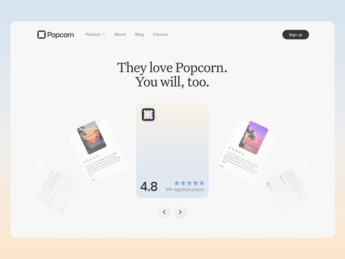
An exploration for the review section of Popcorn. Didn't make it live but i really liked it!


Yoo seems goood

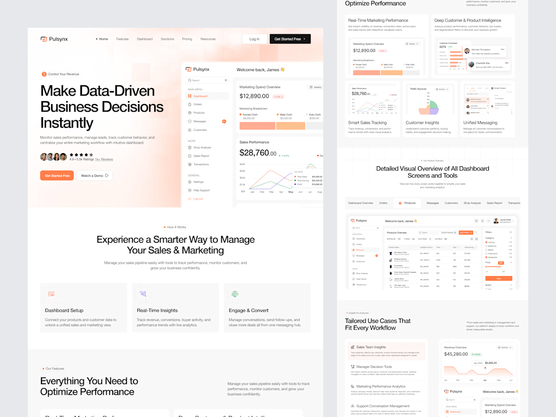
Designed a modern Sales & Marketing Analytics SaaS Landing Page for Pulsynx.
Clean and data-focused UI with powerful dashboard previews, real-time performance tracking, customer insights, and tools to make smarter business decisions.



Well done, looks clean!

The hero is the site's handshake, so it had to carry the whole idea in a few seconds.
Rather than a static image with a headline over it, the hero responds to cursor and scroll input with subtle parallax and depth. The freight reads as something in motion rather than a photograph of something that moved. Restraint mattered here: enough life to signal that this site behaves differently, not so much that it turns into a demo reel and gets in the way of the message.


The hero is the sites handshake—love that framing. Did you keep the full interactive 3D globe for mobile screens too or fall back to a lighter 2D version to save on performance?