
Taye Abolarin
Speedy UX/UI Design with Strategic Thinking 🚀
Ready for work
Taye is ready for their next project!
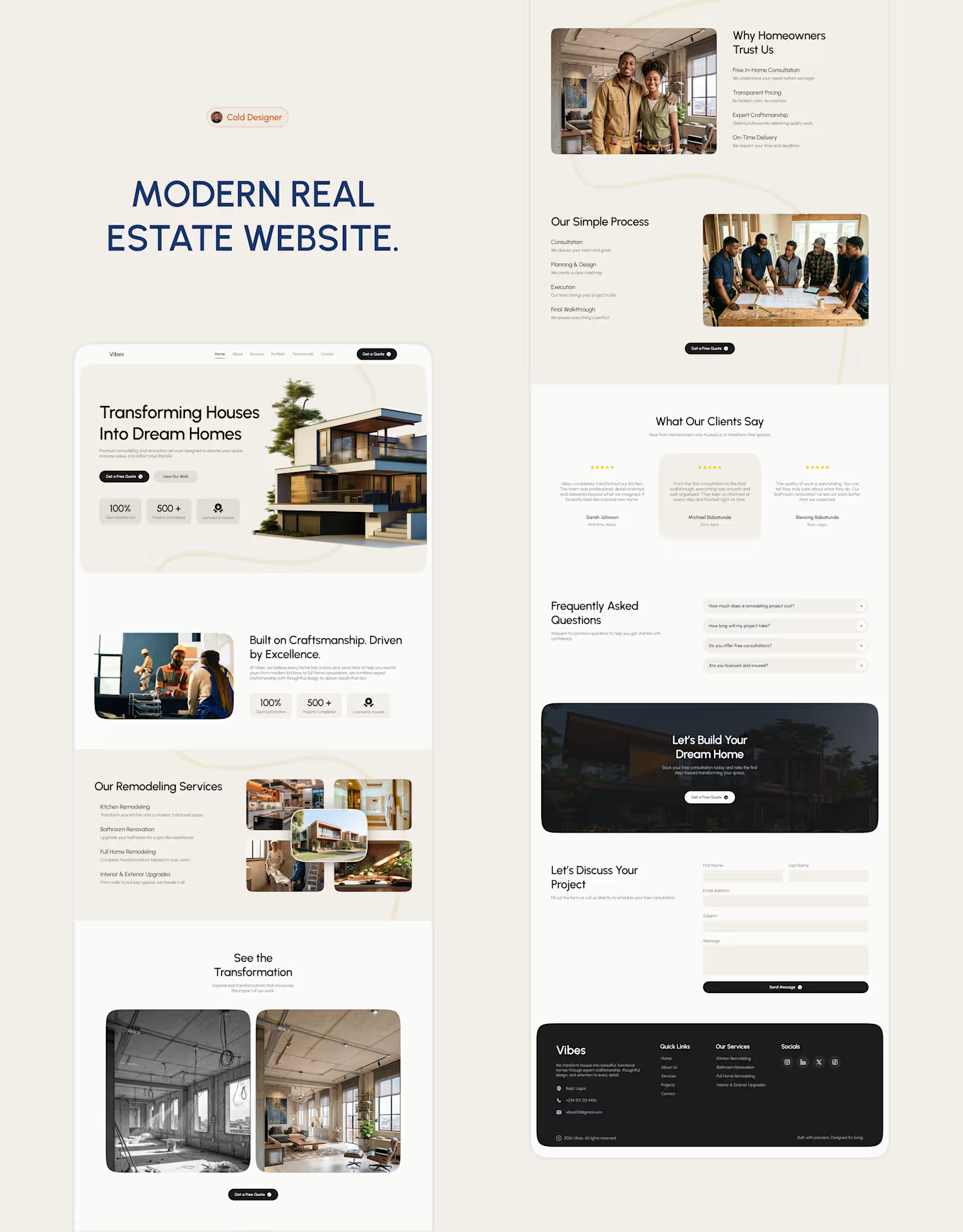
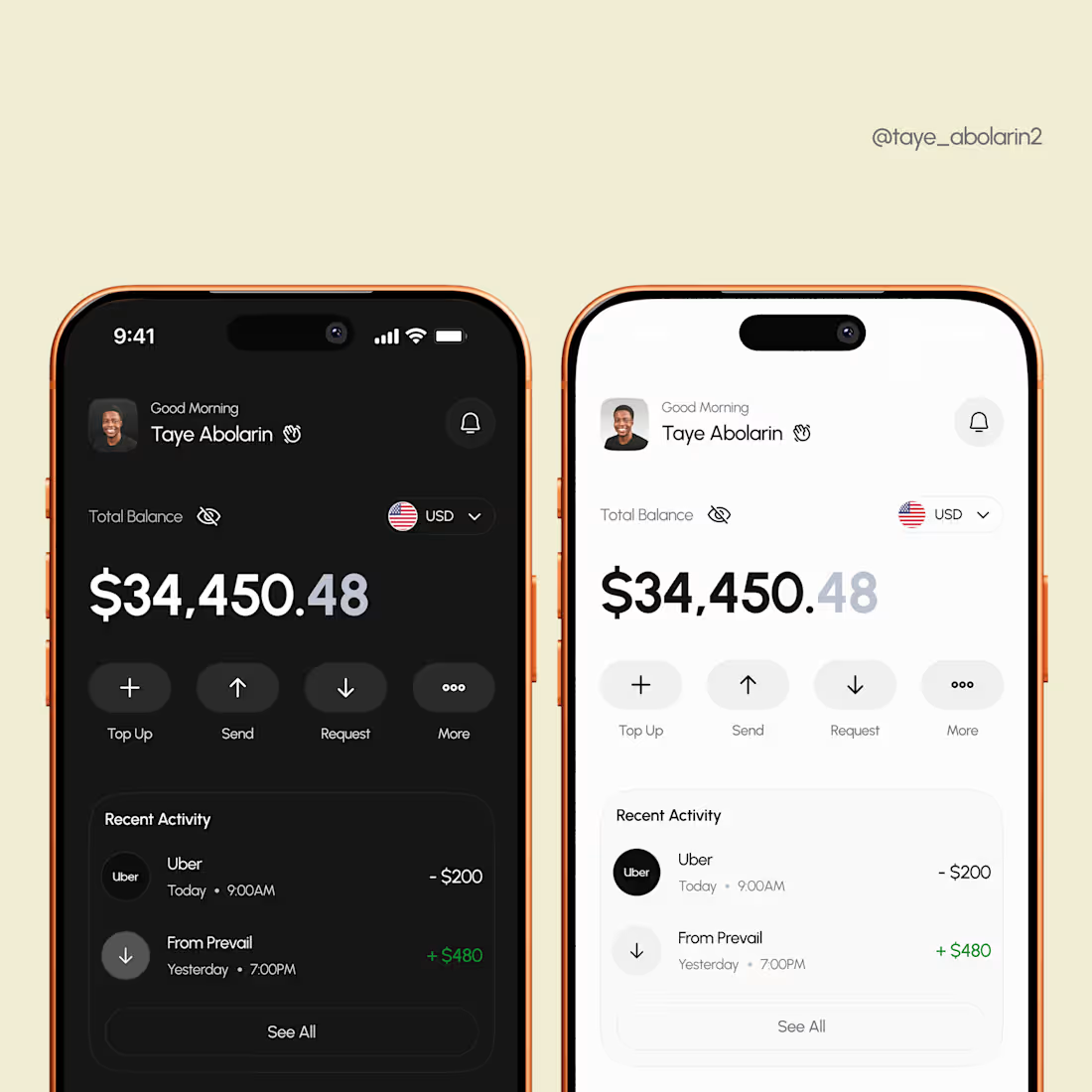
Has minimalism gone too far or are we finally designing with intention?
Over the past year, I've noticed more fintech products moving away from colorful interfaces toward restrained, monochrome design systems.
I don't think it's because color is disappearing, I think it's because we're relying less on decoration and more on typography, spacing, hierarchy, and thoughtful use of color.
In this concept, I challenged myself to use black, white, and a single accent color only where it adds meaning, not decoration.
Curious where you stand: Are monochrome interfaces the future of fintech, or do they risk becoming too sterile?
Happy New Month! 🚀🫴😌
#ProductDesign (https://www.linkedin.com/search/results/all/?keywords=%23productdesign&origin=HASH_TAG_FROM_FEED) #UIUX (https://www.linkedin.com/search/results/all/?keywords=%23uiux&origin=HASH_TAG_FROM_FEED) #Fintech (https://www.linkedin.com/search/results/all/?keywords=%23fintech&origin=HASH_TAG_FROM_FEED) #DesignSystems (https://www.linkedin.com/search/results/all/?keywords=%23designsystems&origin=HASH_TAG_FROM_FEED) #Figma (https://www.linkedin.com/search/results/all/?keywords=%23figma&origin=HASH_TAG_FROM_FEED) #MobileDesign (https://www.linkedin.com/search/results/all/?keywords=%23mobiledesign&origin=HASH_TAG_FROM_FEED)
1
6
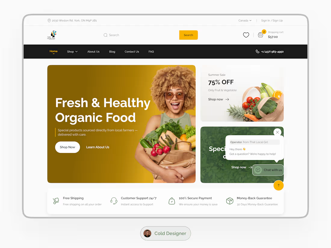
Organic Food E‑Commerce Website UI Design
I designed the UI for a US‑based organic food e‑commerce brand, creating a shopping experience that feels fresh, clean, and trustworthy.
The interface uses a warm, earthy palette (olive green, soft gold, and white) to reflect the brand’s natural identity. The layout follows a product‑first approach, placing produce and featured items at the center while guiding users through products, reviews, and helpful content.
Each breakpoint was designed intentionally instead of simply scaling the desktop layout.
Breakpoints designed:
• Desktop (1440px)
• Tablet (744px)
• Mobile (393px)
This ensured the grid, spacing, and hierarchy work well on every device.
Live site: https://thatlocalgirl.com/
(https://thatlocalgirl.com/)Portfolio: colddesigner.lovable.app (http://colddesigner.lovable.app)
2
3
65
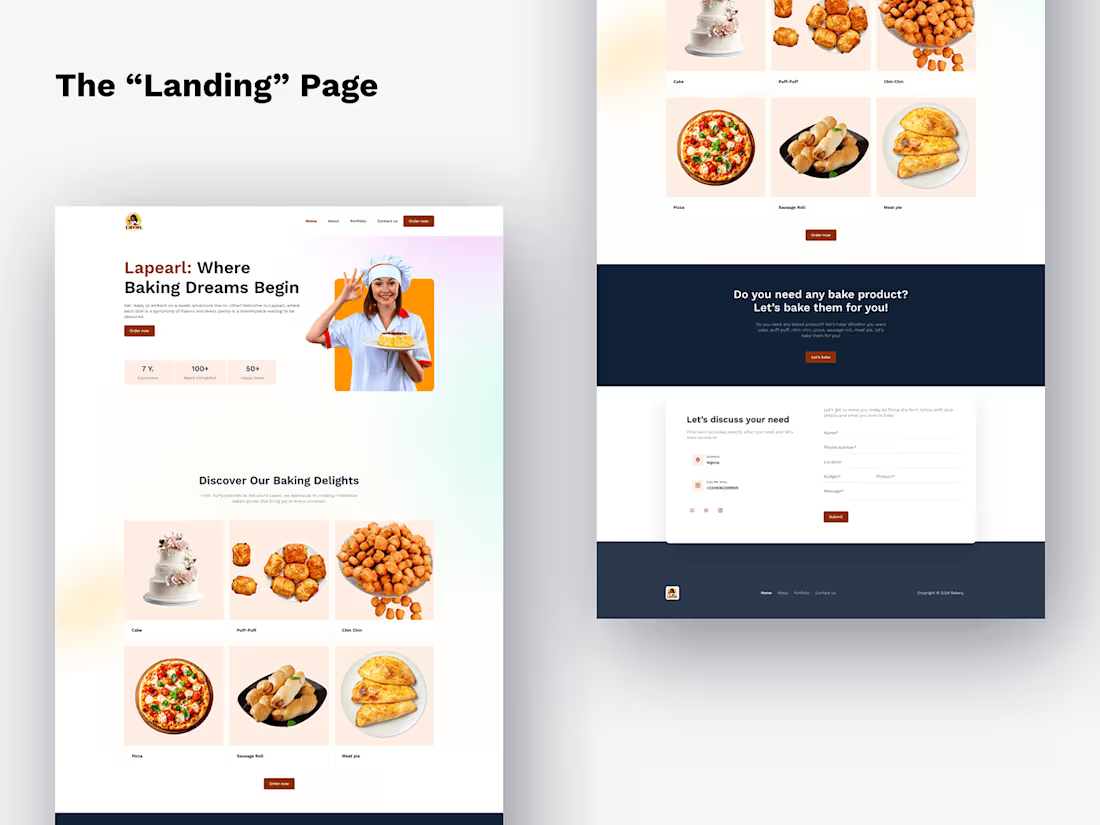
"Lapearl" - A Baking Website :: Behance
1
2
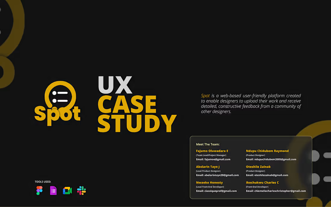
Spot: Redefining Creative Feedback – A Case Study :: Behance
1
3
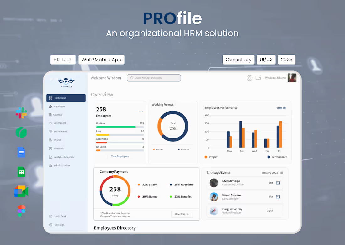
PROfile - An Organizational HRM Solution
1
3
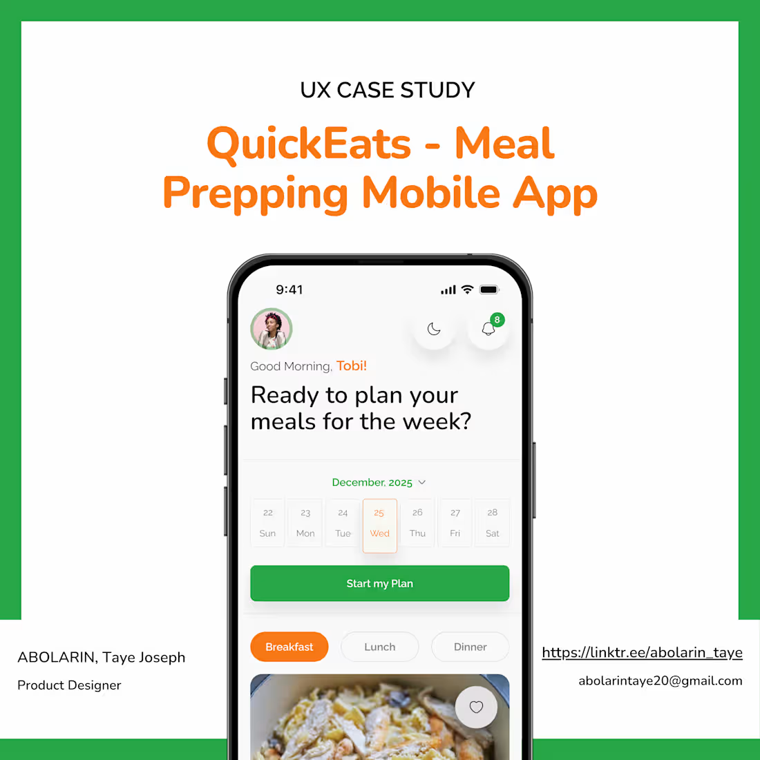
Meal Prepping Mobile App - A Case Study
1
5
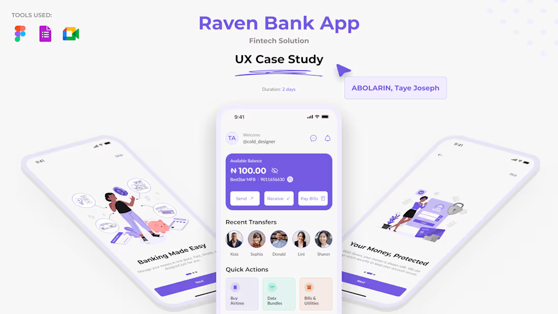
Raven’s Personal Banking App - A Case Study
1
1
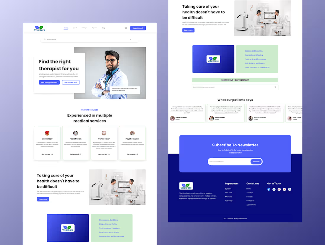
Healthcare Landing Page
1
4