The network for creativity
Join 1.25M professional creatives like you
Connect with clients, get discovered, and run your business 100% commission-free
Creatives on Contra have earned over $150M and we are just getting started
Back to feedPost

Excited to share that I’ve taken the next step in my design journey! 🎉
I am thrilled to announce that I have joined Game Chief as a UI/UX Design Intern!
Huge thanks to the team for this incredible opportunity. I can't wait to dive into crafting immersive experiences, leveling up my design skills, and collaborating with talented creators in the gaming industry. Let's build something amazing! 🚀
#UIUX #UXDesign #GameChief #DesignInternship #CareerMilestone #UIUXDesign
GameChief
The network for creativity
Join 1.25M professional creatives like you
Connect with clients, get discovered, and run your business 100% commission-free
Creatives on Contra have earned over $150M and we are just getting started

Challenges
View all


Related posts


A look at my design work for Tithe, an app built around being more deliberate with your attention.
That idea carries into the design too. Soft blue and warm neutrals give the screens a quiet feel, while direct copy makes the next step clear.
There’s a lot happening across the product, from choosing what deserves your focus to earning your way back into blocked apps. The challenge is making each of those moments feel simple – @BrightStudios®


Amazing work Daniel🙌


Do you ever try breaking the site you're interacting with?
I'm always thinking "what will people try to do" and then coming up with a solution for it. If I saw a card like this I'd try to pick it up. Then once I discovered it was draggable, I'd try seeing what happens if I throw it outside the browser.
What do you think?


Hot design


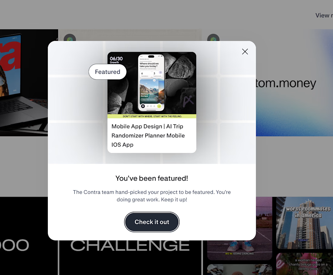
🚀 FEATURED AGAIN.
THE INTERESTING PART IS WHAT HAPPENED BEFORE THE UI.
Traveling Up was the first mobile concept I created purely for myself in almost three years.
No client brief.
No existing product.
No predefined feature list.Just one observation from a short trip:
🌍 Most travel products start by asking where you want to go.
I wanted to start one step earlier.
How do you want to feel?
That single shift changed the whole product logic.
✨ Destination search became mood led discovery.
⏳ Time became part of the recommendation.
🎲 Uncertainty became part of the experience instead of something the product had to remove.
That became Traveling Up.
And now Contra has hand picked the project for Featured and placed it in the AI Projects section on the homepage.
The most interesting part for me is not the feature itself.
It is how often the strongest product directions begin before the interface.
In the framing.
In the question.
In understanding what the user is actually trying to experience.
That is the kind of work we keep pushing at Asol Design.
Not just better screens. Better product decisions before the screens exist.
If you are building a mobile product and want more than polished UI, if you want stronger product thinking, sharper UX direction and a visual system built around a clear idea, let’s talk.
#MobileAppDesign #ProductDesign #UXDesign #UIDesign #MobileUX #TravelApp #TravelAppDesign #iOSDesign #ProductStrategy #GrowthDesign #AppDesign #UXUI #DesignAgency #DigitalProductDesign #AsolDesign #Contra #StartupDesign #ProductThinking #MobileProduct #CreativeDirection


Keeping uncertainty in the product instead of designing it out is the risky half of that shift. Curious what the screen shows when the mood input is thin.