The network for creativity
Join 1.25M professional creatives like you
Connect with clients, get discovered, and run your business 100% commission-free
Creatives on Contra have earned over $150M and we are just getting started


The network for creativity
Join 1.25M professional creatives like you
Connect with clients, get discovered, and run your business 100% commission-free
Creatives on Contra have earned over $150M and we are just getting started
Challenges
View all


Related posts

slightly exhausting personality trait: I need every new project to be the best thing I've ever designed.
14 years of doing this and somehow the obsession is only getting worse.
constantly learning, getting better, changing my mind, finding new things I want to try.
god I love design.

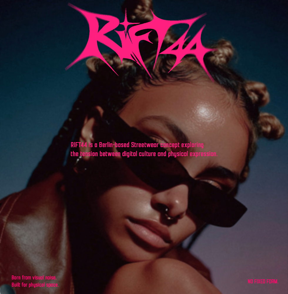
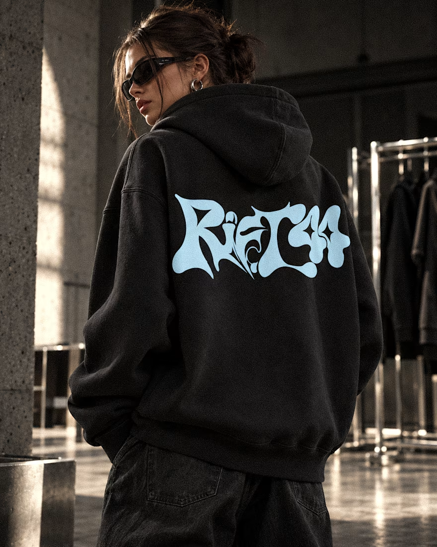
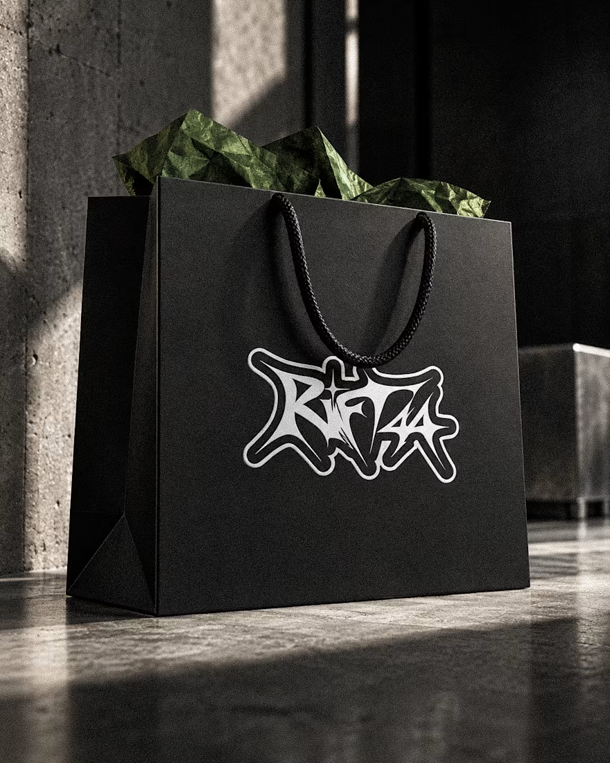
RIFT44 — Streetwear Visual Identity
A self-initiated identity exploring custom lettering, underground fashion culture and bold physical applications.
Visual Identity · Art Direction · Campaign Design



Beautifully done! 🌟🌟

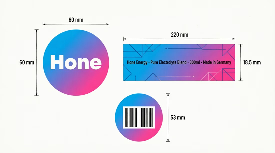
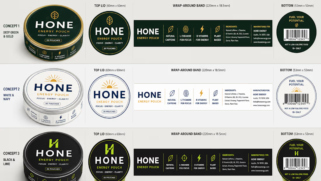
Returning to foundational assets is always a valuable exercise in brand scalability. Currently, I am preparing and structuring the master delivery files for a new sub-brand—built upon a visual identity system I originally designed a couple of years ago. Designing adaptable brand frameworks from day one is what allows a business to expand seamlessly over time while maintaining complete visual coherence. Looking forward to sharing the final execution soon.