The network for creativity
Join 1.25M professional creatives like you
Connect with clients, get discovered, and run your business 100% commission-free
Creatives on Contra have earned over $150M and we are just getting started
Back to feedPost

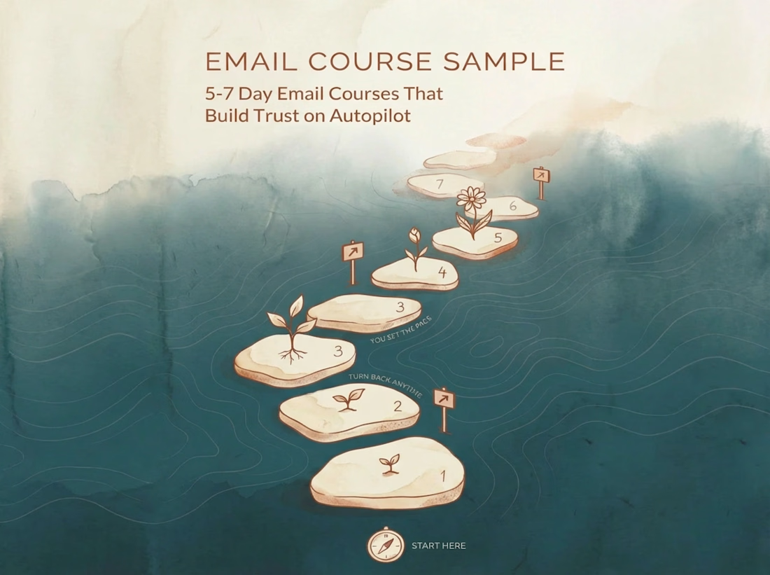
96% of mental health app users abandon within 15 days. What if your onboarding could change that?
This sample shows a 5-day automated email course designed to build trust before conversion—trauma-informed lessons, clinical accuracy without jargon, and engagement mechanisms that keep users opening.
What's inside:
◘ Progressive learning architecture
◘ Plain-language research translation
◘ Completion-driven design
→ View full email course sample


#mentalhealth #mentalhealthapp #DMH #behavioralhealthtech #blendedcare #digitalhealth
The network for creativity
Join 1.25M professional creatives like you
Connect with clients, get discovered, and run your business 100% commission-free
Creatives on Contra have earned over $150M and we are just getting started





Related posts

This year, I worked on a mental health app where I explored using water to represent brainwaves and quality sleep.
I think it communicates the idea much better than the typical green energy orb. 🌊
What do you think?
27 voted
43%
36 voted
57%
63 votes
Closed

Love the energy orb. which one is your pick here?

Our latest case study is live! 🌿
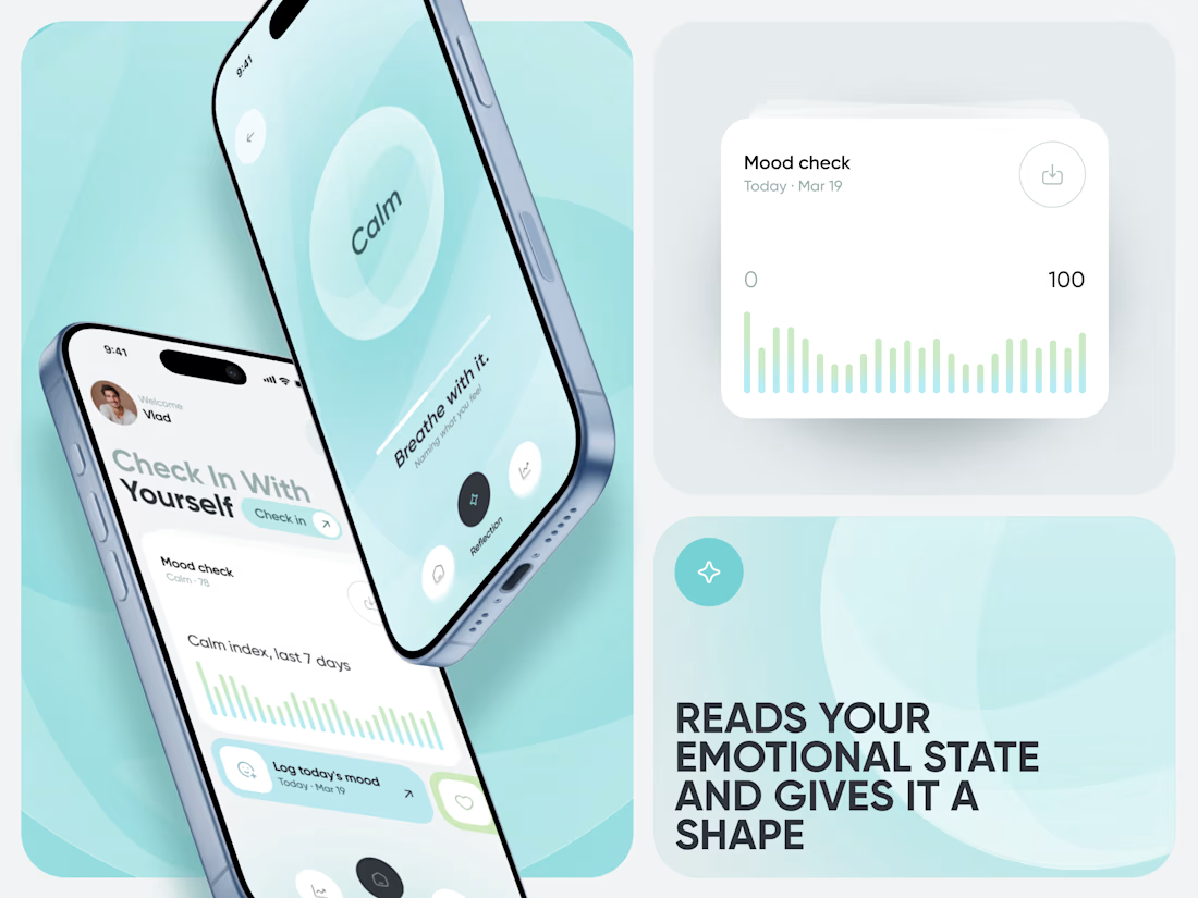
Meet Calm, an AI-powered wellness app designed to make mood tracking, emotional insights, and healthier daily habits feel simple and approachable.


That's great case study that's really a great job 🎉🎉🔥🔥

Indie Lee — Welcome Email Strategy & Redesign
Overview
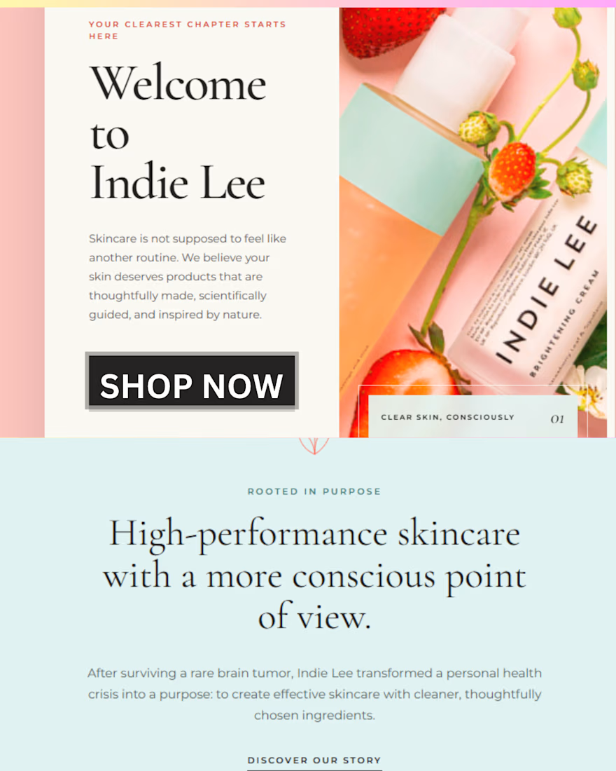
A speculative email strategy and redesign project for Indie Lee, created to practice customer research, email strategy, copywriting, and email design for a beauty/skincare brand.
The Challenge
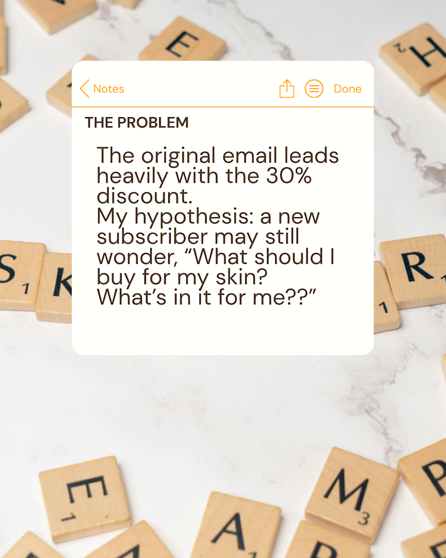
The original welcome email strongly emphasized the first-order discount and encouraged subscribers to shop.
I identified a potential customer barrier:
“What should I buy, and how do I know what's right for my skin?”
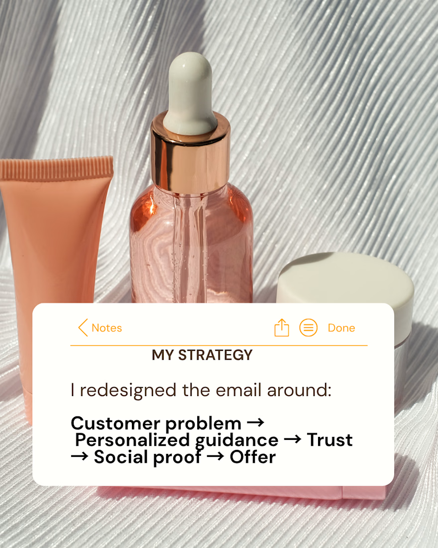
My Strategy
I redesigned the email around a more customer-focused journey:
Customer problem → Personalized guidance → Trust → Social proof → Offer
What I Changed
Added messaging around product-selection uncertainty.
Introduced personalized skincare consultation as a solution.
Strengthened the customer-focused messaging.
Added founder storytelling to build trust.
Added social proof around customer desires such as hydration and glow.
Kept the 30% first-order offer as a conversion incentive.
Reorganized the email to create a clearer path toward purchase.
Speculative concept created for portfolio purposes. Not affiliated with Indie Lee.


Starting from the new subscriber's question is a smart way to frame the welcome email.