The network for creativity
Join 1.25M professional creatives like you
Connect with clients, get discovered, and run your business 100% commission-free
Creatives on Contra have earned over $150M and we are just getting started
Back to feedPost


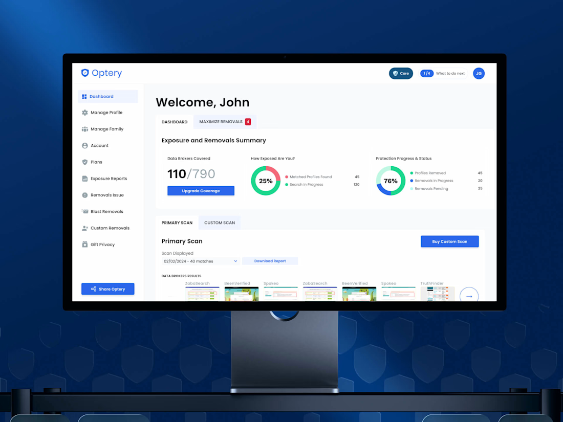
Nobody churns because a dashboard is ugly, they churn because they can't tell whether anything is happening.
Optery was quietly pulling users' data off hundreds of broker sites and almost none of that work was visible to the person paying for it, so the biggest win in this redesign wasn't a new screen; it was making invisible work visible. Free-to-paid hit 30%
Check it out


Great design!
thank you, George! glad it landed

The free-to-paid lift came from surfacing work that was already happening, not adding a feature - the redesign's real job was making an invisible process legible enough to justify the upgrade.
exactly that. the work was already happening, people just could not see it. once the process was visible the upgrade made sense on its own

The strongest part is tying the Framer experience to the workflow behind it—it makes the template feel purpose-built rather than decorative. That inquiry flow sounds like a great fit for the event-planning context.
appreciate it, Rohan! the workflow behind the screens is usually where the real work sits

Making the invisible work visible is such a sharp way to frame it, that 30% lift proves people will pay once they can actually see the value happening in the background. How did you decide which data points were worth surfacing without overwhelming someone who just wants reassurance?
thanks Maty! we kept only what answers one question: is my data coming off. removals done, what is still in progress, and when the next scan runs. the rest moved one level deeper so the main view stays calm

Great insight invisible work is a trust problem, not a UI one. 30% conversion says you nailed the fix.
The network for creativity
Join 1.25M professional creatives like you
Connect with clients, get discovered, and run your business 100% commission-free
Creatives on Contra have earned over $150M and we are just getting started






Related posts


A calm, editorial landing page for an architecture studio, built around daylight and materials. We'd love to hear your thoughts! 🏛️


The warm timber slats against the pale page feel calm. Did you build the motion in Jitter?


One of our favorite & most challenging parts of product video is figuring out how much someone actually needs to see to understand the product
That’s where motion and pacing do a lot of the work: guiding your attention and giving each step enough room to make sense.
Here’s our latest video for evolv, made by the VAAS team.

The glow on the Vee button draws the eye before the UI even appears. Nice pacing for a 1 minute product video.


