The network for creativity
Join 1.25M professional creatives like you
Connect with clients, get discovered, and run your business 100% commission-free
Creatives on Contra have earned over $150M and we are just getting started
Back to feedPost

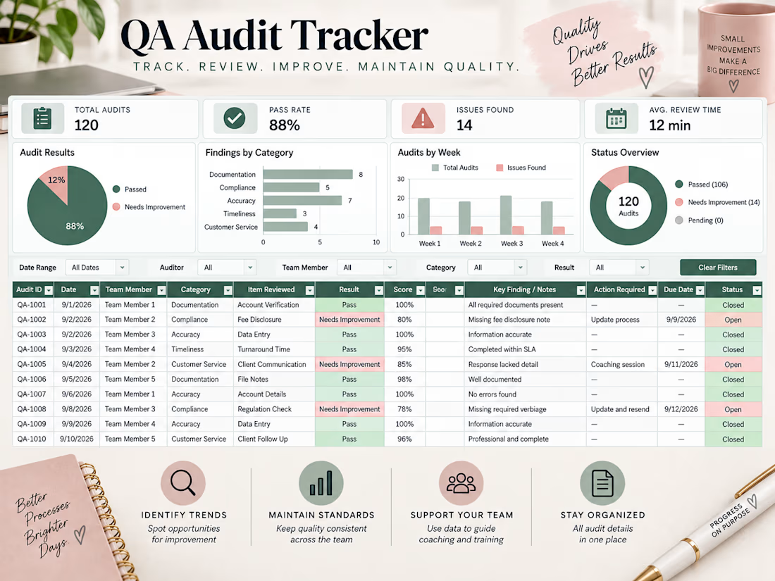
I created a QA audit tracker designed to organize quality reviews and make results easier to monitor. The tracker brings audit results, scores, findings, follow-up actions, due dates, and status information into one organized view.
Visual summaries make it easier to identify recurring issues, monitor quality trends, and see where additional follow-up or process improvements may be needed.
This sample project demonstrates my ability to organize quality and audit data into a practical tracking system that supports consistent processes and clearer reporting.

The network for creativity
Join 1.25M professional creatives like you
Connect with clients, get discovered, and run your business 100% commission-free
Creatives on Contra have earned over $150M and we are just getting started
Related posts


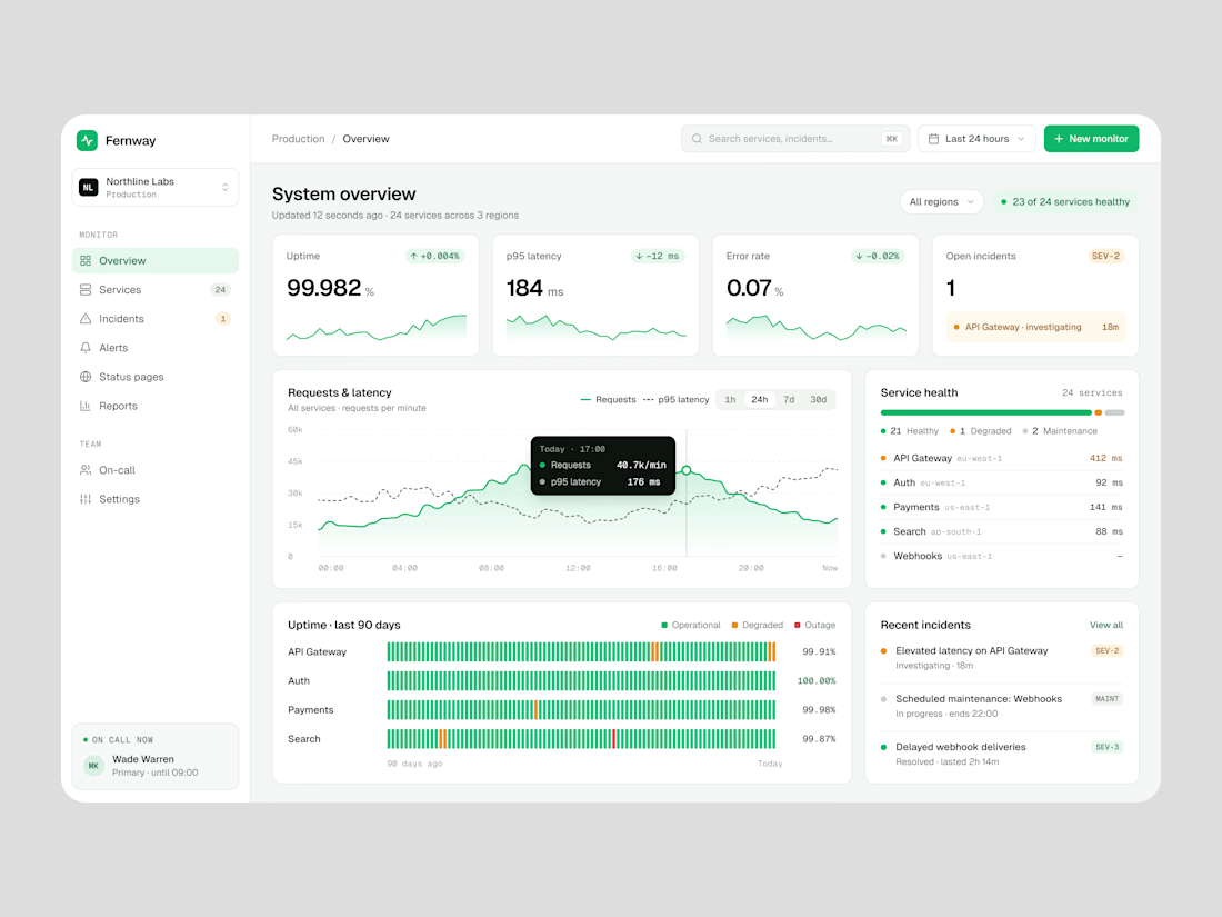
Reviewing your audit log workflow for a legal tech platform



Sasflo — Project Management Dashboard UI Design 📊
A dashboard should do more than display data. It should help users understand their progress, track projects, and make better decisions with less effort.
For this concept, I explored a clean project management dashboard with:
📈 Revenue and project performance metrics
🎯 Overall project progress visualization
📋 Project summaries with status and progress indicators
🗂️ Task management and resource tracking
🎨 A clean layout with a warm yellow and neutral color paletteMy goal was to make complex project information easier to scan while keeping the interface professional and visually balanced.
Need a dashboard or web app that looks great and works for your users? Let's connect!
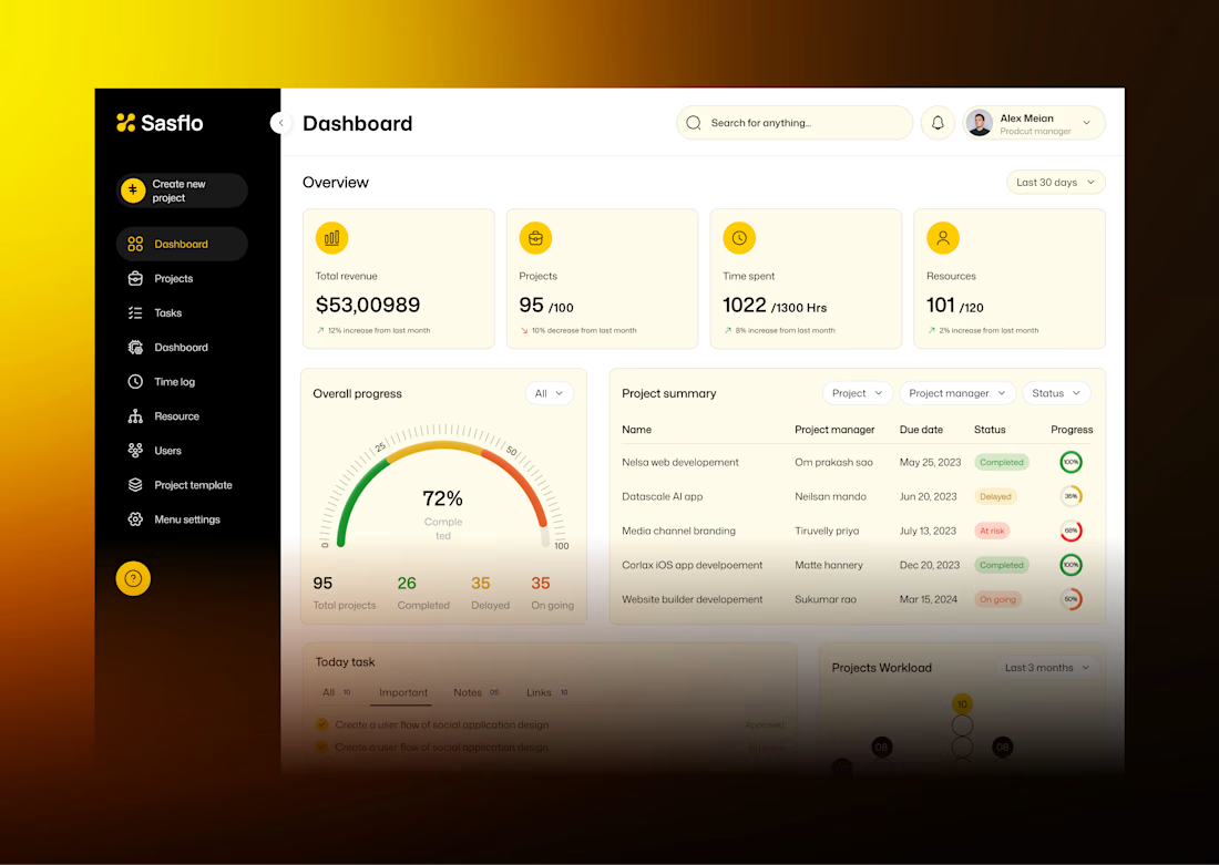

The four stat cards on warm yellow, the 72% gauge and the project summary table with coloured status pills are easy to scan, which was your goal. My challenge on your own line about better decisions with less effort: this dashboard shows how things stand but doesn't say what to...