The network for creativity
Join 1.25M professional creatives like you
Connect with clients, get discovered, and run your business 100% commission-free
Creatives on Contra have earned over $150M and we are just getting started
Back to feedPost
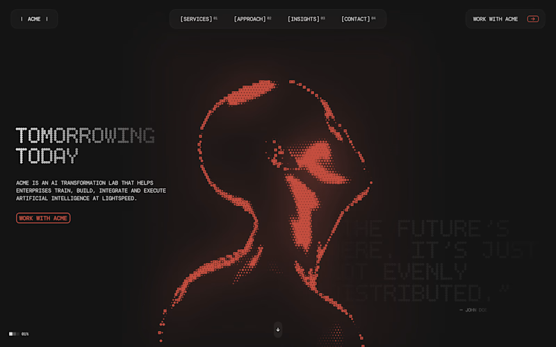
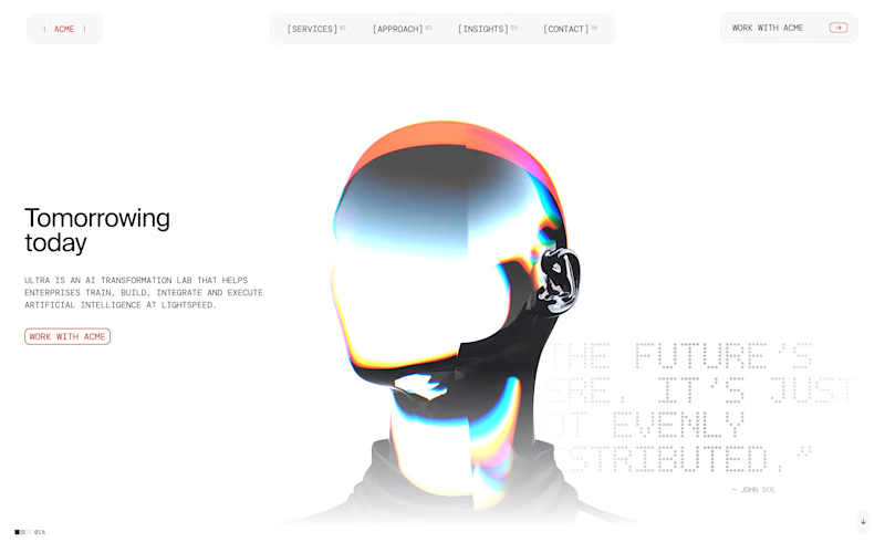
Taste Test
Which hero section would you pick?
134 voted
51%
130 voted
49%
264 votes
Closed
Wanted to pick both 🙌
Looks good
Stunning visuals and typography! Thought that was the new Geist font for a sec
Dark hero section seems to have so much more depth.
Light 🔥
Second option stands out more
I’d go with the dark hero. Feels way more immersive and “AI / future-tech” aligned. The glow + particle treatment adds depth and makes the headline feel more premium
They both look awesome and AI crowd definitely likes dark themes. At the same time, the dark one has a subtle feeling of danger and anxiousness. I think that can influence conversions negatively.
The color combination is very high-quality
Light hero is a scroll stopper🪄
Dark Hero! That red glow and pixelated texture give it such a futuristic, underground tech feel. It really commands attention immediately.
Light hero absolutely wins here
Huge inspo as always!
Something about dark mode makes everything look better
*why not both meme*
dark one looks sickkk
I like that dark hero better
The dark hero. It feels more visually appealing and looks better
the dark hero hits different honestly. that glow effect with the red tones is giving premium vibes. clean work Mason!
Although both look great, the dark hero is more balanced and better suits the aesthetic. Great work @Mason Price!
dark hero section looks good
both are 🔥
I'd go with the dark hero, the typography and imagery feel more relevant to the industry.
Dark hero seems more polished!
Both are strong 🔥
On the dark version the headline feels stronger, but the red illustration and buttons blend a bit and lose some contrast, even though it still looks cohesive and cool 🙌
Dark Theme hero seems absolutely stunning
I trust dark hero more.
I will send light hero to the competitor.
The network for creativity
Join 1.25M professional creatives like you
Connect with clients, get discovered, and run your business 100% commission-free
Creatives on Contra have earned over $150M and we are just getting started
Related posts
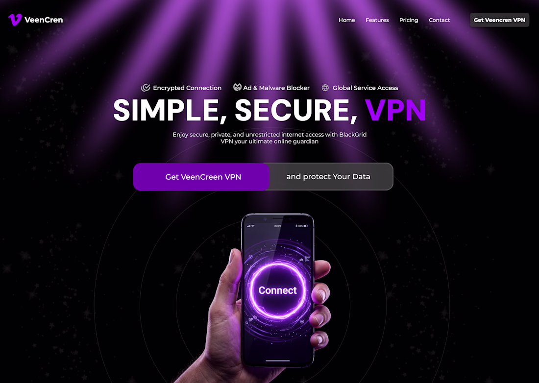
Did a VPN hero section design
Love this!
That's awesome!
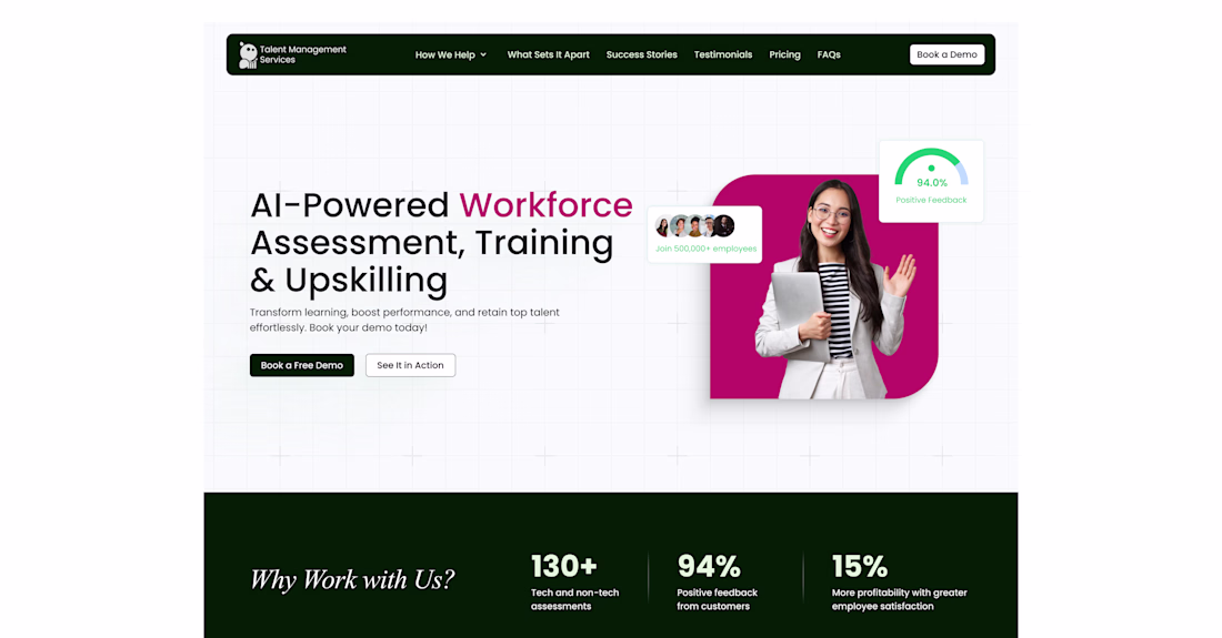
Hero section design for a talent management platform. Designed in @Figma ✨
I'll share the live build soon. Stay tuned 🙌
Nice!
Trending
Claude
Claude has entered the design space. How are you using Claude Design?
Contra University
Learn from expert creatives how to earn more using next-gen AI tools.
creativeaiflow
Creative AI workflows are evolving. What tools do you use, and what are their strengths and weaknesses?
portfolioreview
The best portfolios tell a story, not just show a grid. Share yours for feedback.
freelancerlife
Freelancer life is wins, pivots, and everything in between. What’s yours right now?