The network for creativity
Join 1.25M professional creatives like you
Connect with clients, get discovered, and run your business 100% commission-free
Creatives on Contra have earned over $150M and we are just getting started
Back to feedPost
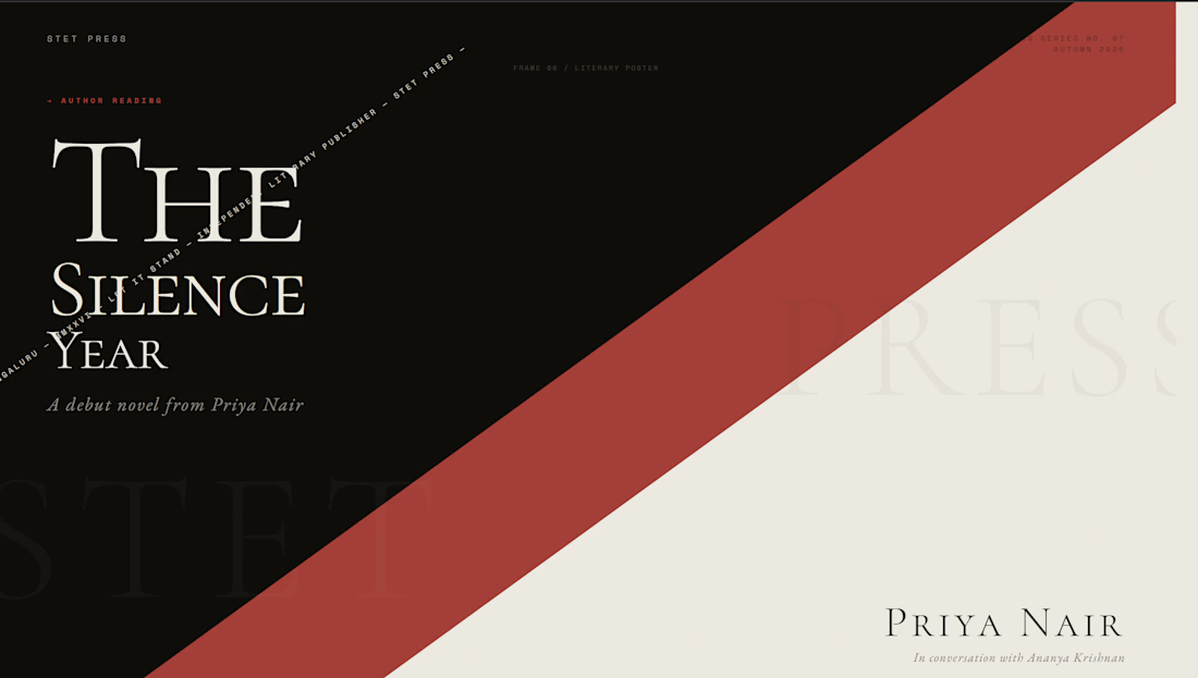
STET — Independent Literary Publishing Typography Direction
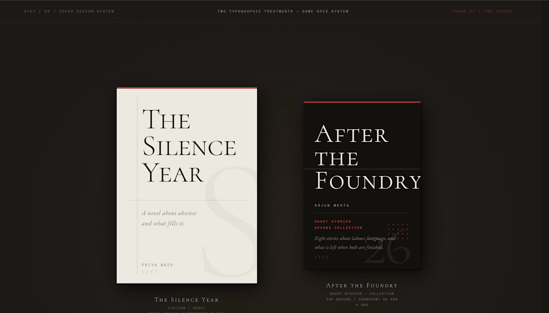
STET is a typography direction for an independent literary press whose name is its entire editorial philosophy: the proofreader's mark that means let it stand. Ignore the correction. Restore the original. The brand asks: what if a publishing house had no visual identity except its type?
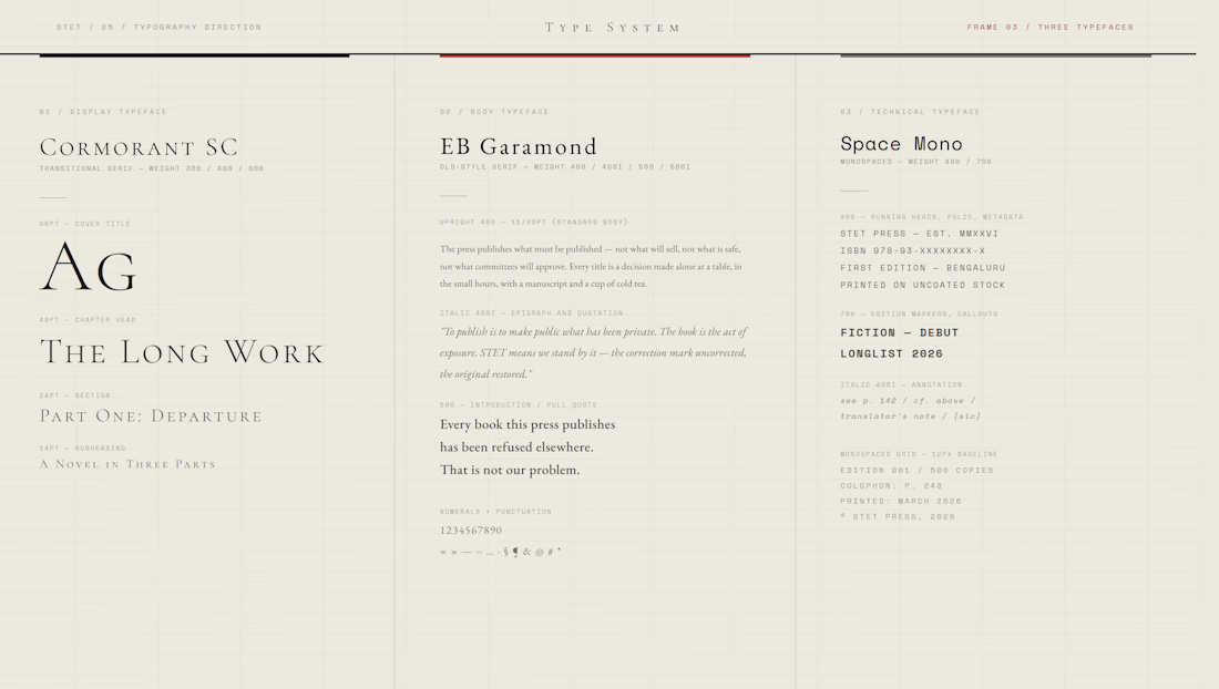
The answer required three typefaces chosen with the precision of a compositor selecting from a case: Cormorant SC 300 for display — extreme contrast, editorial authority, the architecture of a book cover before illustration existed. EB Garamond for the body — old-style warmth, the type that disappears into text and lets the words do the work. Space Mono for all metadata — the monospaced grid of the compositor's table, objective and precise.
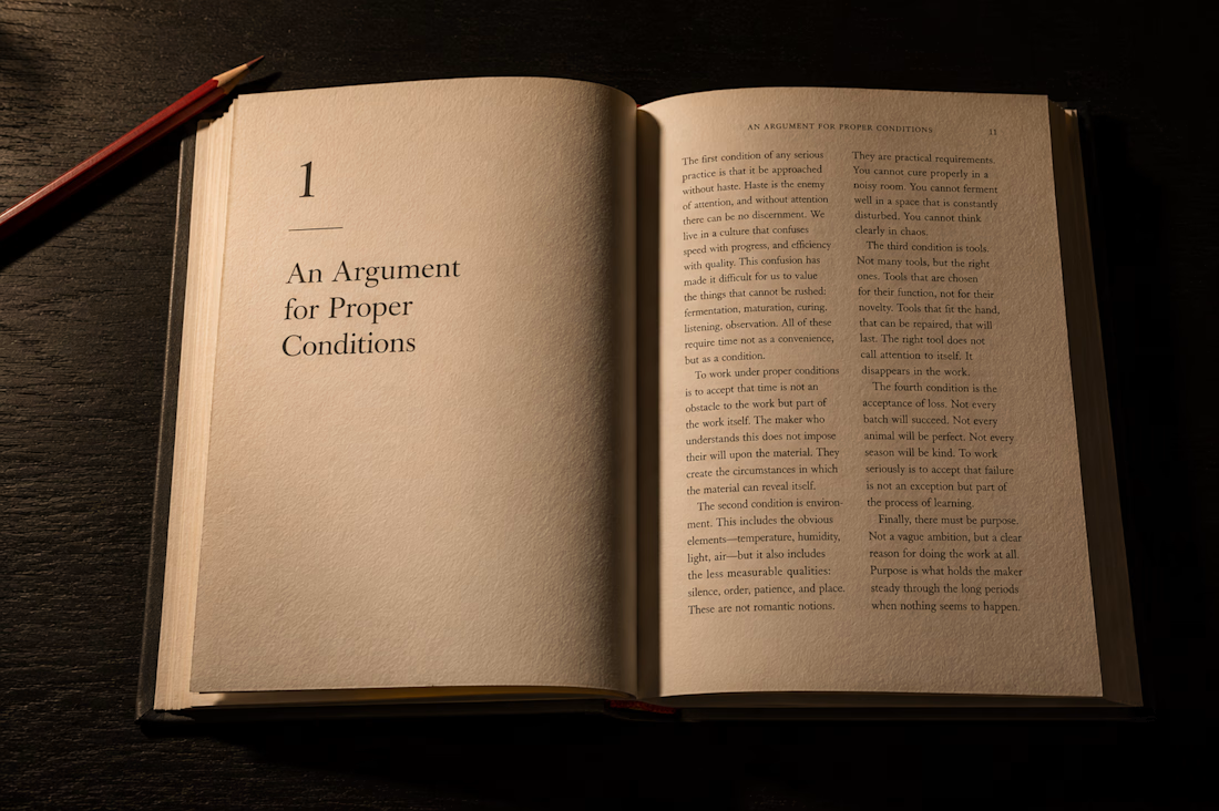
The Atmosphere Lock across the AI frame: Ilford HP5+ large format, Irving Penn's formal precision with printed matter, Rinko Kawauchi's intimacy with the page. A single raking lamp at 40° from the upper left — the only light that reveals letterpress impression in paper, making the type physically present rather than merely visible.
Typography is the press's only visual argument. It is enough.
M N LOKESHWAR REDDY, Creative Director.


Link to the full project:
https://www.behance.net/gallery/249985293/STET-Literary-Publishing-Typography-Direction
The network for creativity
Join 1.25M professional creatives like you
Connect with clients, get discovered, and run your business 100% commission-free
Creatives on Contra have earned over $150M and we are just getting started
Related posts

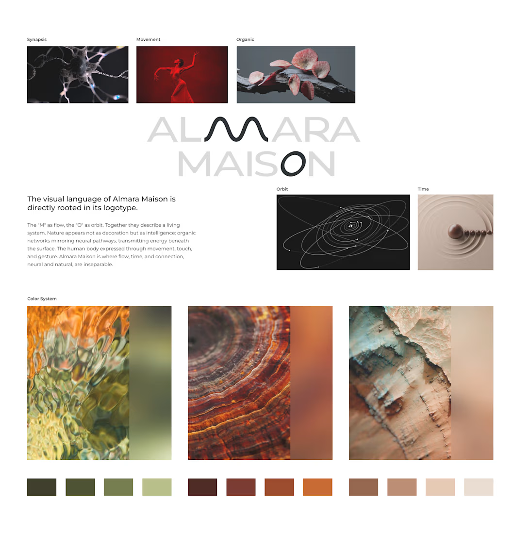
Almara Maison arrived with a name and a feeling: organic and futuristic, body and technology, ancient and now. Most wellness brands resolve that tension by choosing a side. We didn't.
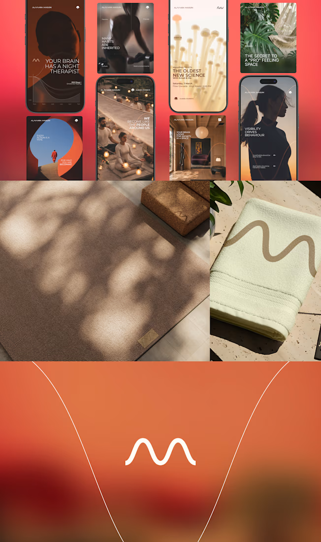
The identity is built on the intelligence of living systems: fungal networks, synaptic connections, invisible structures that mirror human awareness. The wave-shaped "M" carries movement and rhythm. The "O" is time understood as cycles. Nothing decorative. Every form is a decision.
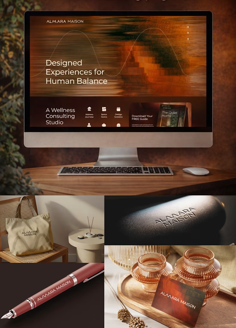
From there: full website in Antigravity with custom cursor and motion, AI-powered automations for content and communication, internal systems that let the studio scale without adding headcount.
Brand identity to live website. Two weeks.



Nice:)

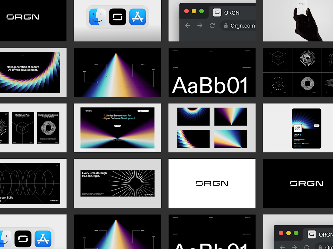
SORIN™ launched with a branding system designed to define a category, not to follow it. The visual identity we created from scratch gives the product the credibility its formulation deserves, building trust with an informed consumer who makes purchasing decisions based on what the brand communicates, not just what it claims.
Precision on the outside; precision on the inside. In a market saturated with brands trying to appear scientific, our mission is to represent the brand's authenticity.

Awesome!



Creative and inspiring!







Trending

Claude
Claude has entered the design space. How are you using Claude Design?

Contra University
Learn from expert creatives how to earn more using next-gen AI tools.
creativeaiflow
Creative AI workflows are evolving. What tools do you use, and what are their strengths and weaknesses?
portfolioreview
The best portfolios tell a story, not just show a grid. Share yours for feedback.
freelancerlife
Freelancer life is wins, pivots, and everything in between. What’s yours right now?