The network for creativity
Join 1.25M professional creatives like you
Connect with clients, get discovered, and run your business 100% commission-free
Creatives on Contra have earned over $150M and we are just getting started
Back to feedPost

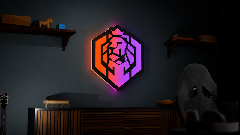
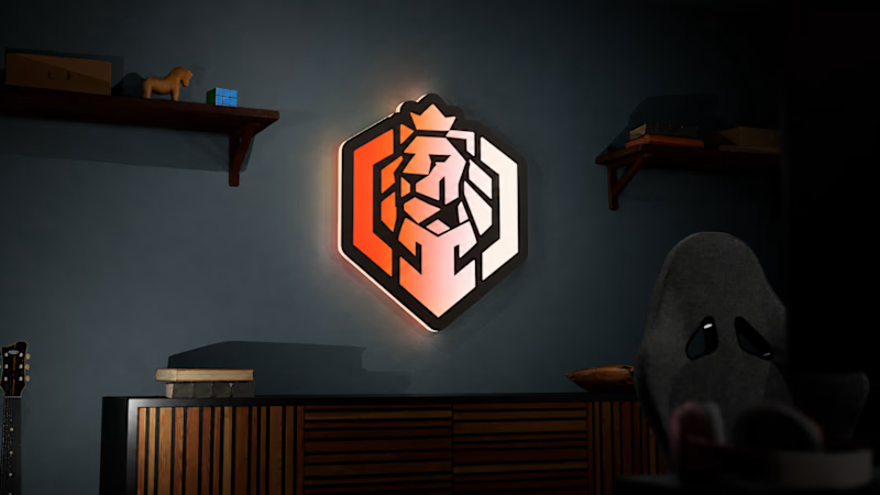
I’m leaning toward Option 1 for that extra impact.
Which version would you put in your setup? 👇

🦁Two LED sign mockups for a geometric lion shield logo, same dark gaming room, same backlit wall mount, same angular lion mark. Two different color treatments that completely change the energy.
Which one's going behind your chair? 👇
19 voted
42%
26 voted
58%
45 votes
Closed
The network for creativity
Join 1.25M professional creatives like you
Connect with clients, get discovered, and run your business 100% commission-free
Creatives on Contra have earned over $150M and we are just getting started











Related posts

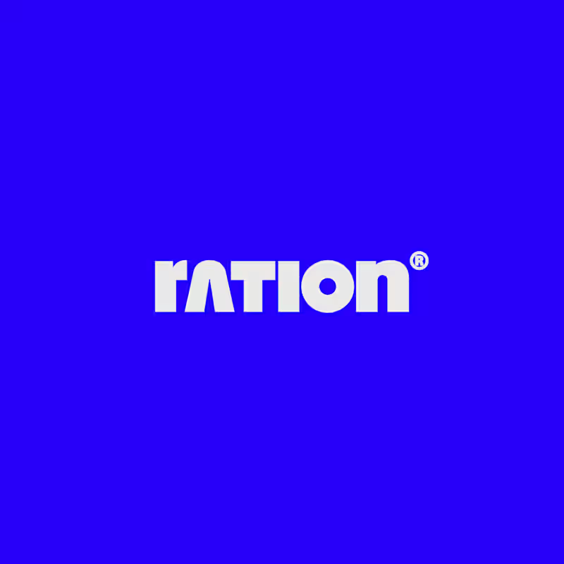
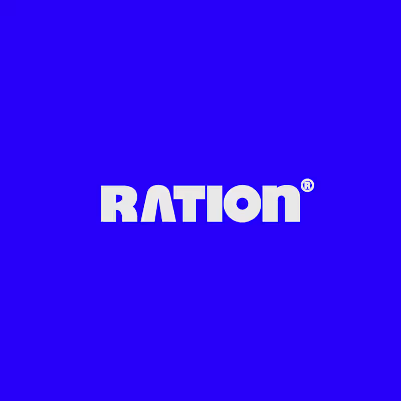
I’ve been working on a bold, modern-retro logotype and can’t decide between these two options.
🆘 Which one feels more aesthetically pleasing to you?

11 voted
26%
31 voted
74%
42 votes
Closed

CAPITAL is great but SMALL is unique great job Nawras 🔥🔥


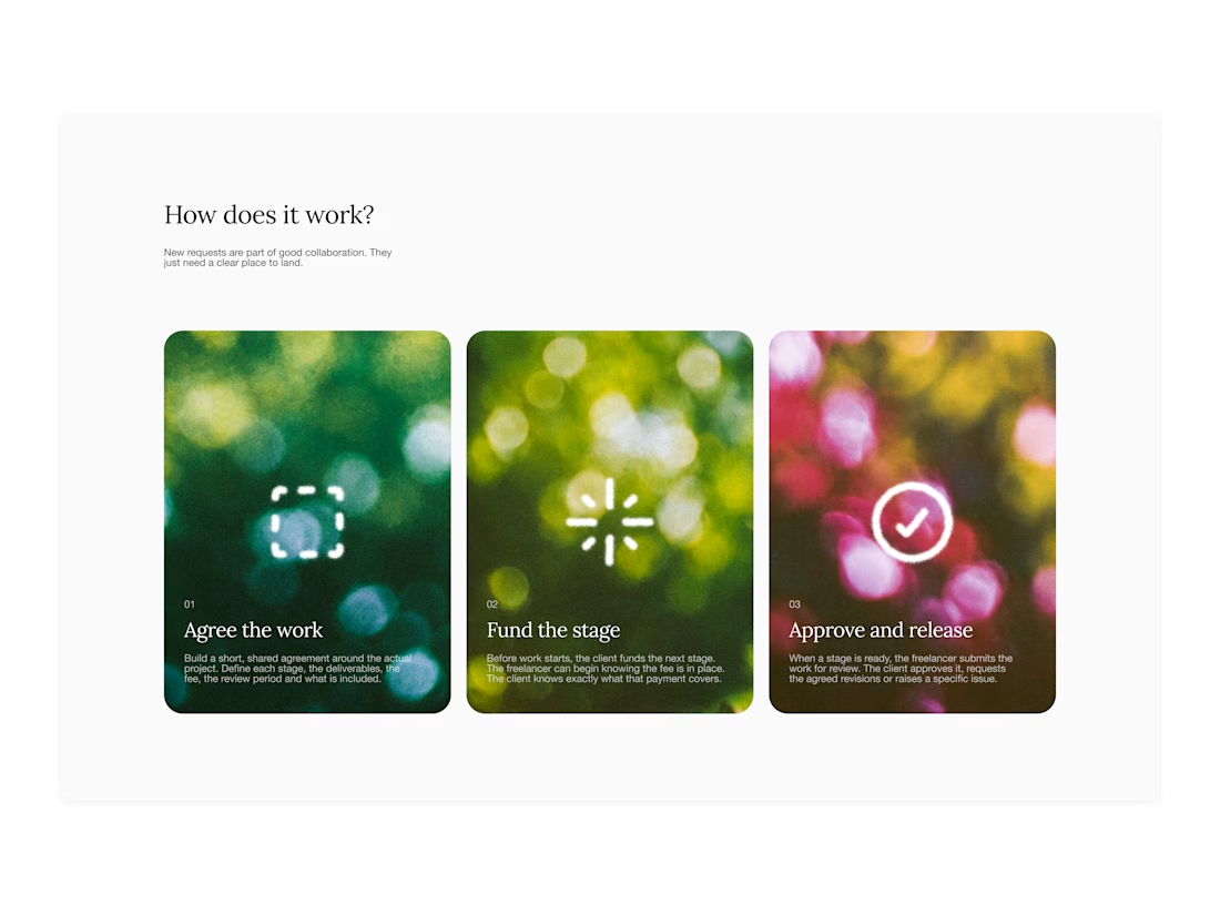

Your web sections always have such strong art direction. Great to see the brand carried right into the layout.


A little excerpt from the brand guidelines for a recent project


The APS mark built from the four small symbols reads like a map legend, which suits a psychology service. Nice that the guidelines page shows it on the dark teal, most would have played it safe on white.