The network for creativity
Join 1.25M professional creatives like you
Connect with clients, get discovered, and run your business 100% commission-free
Creatives on Contra have earned over $150M and we are just getting started
Back to feedPost

A client rejected 3 of my poster concepts.
Same layout. Same photo. Same colors.
I couldn't figure out what was wrong.
Until I changed one thing.
The font.
Nothing else. Just the font.
Suddenly the exact same design looked "expensive" to him.
That's when it hit me —
Nobody ever says "I love your typography."
But everyone feels it the second it's wrong.
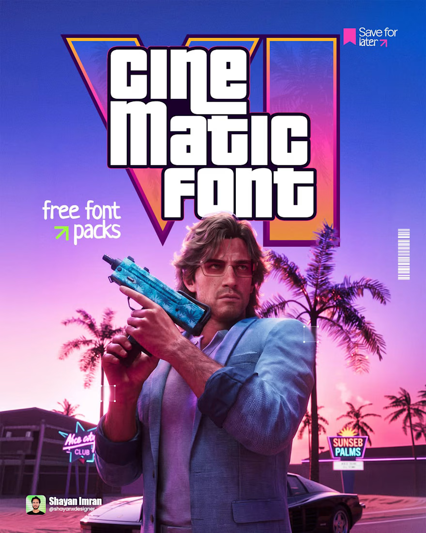
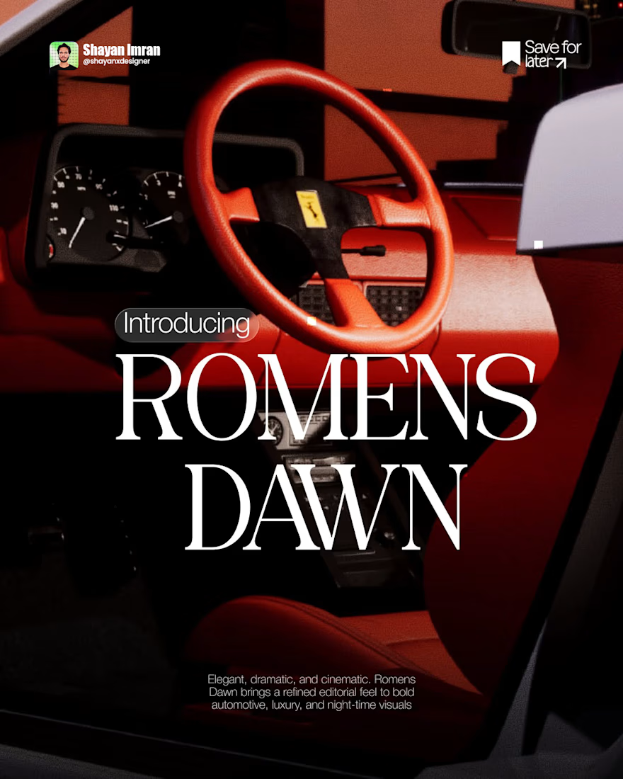
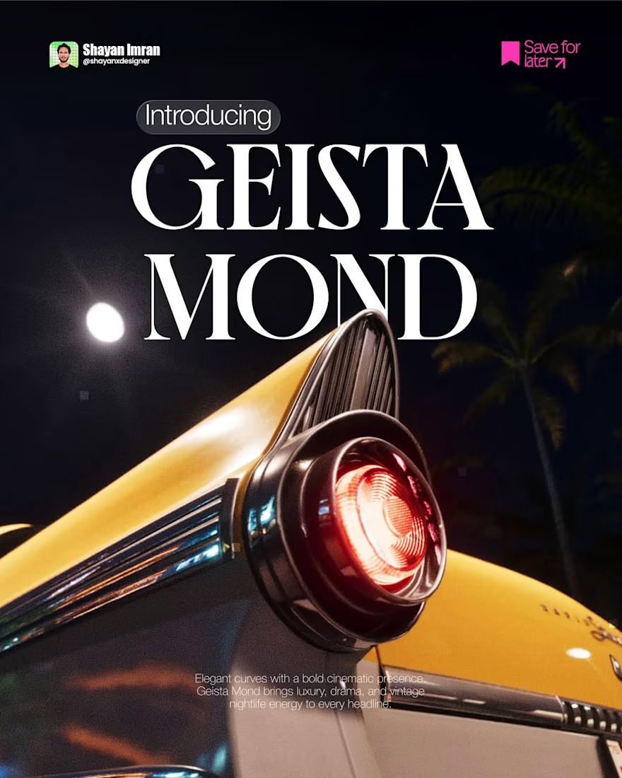
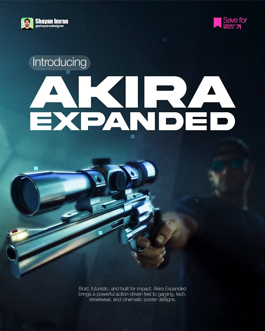
So I started collecting fonts that actually carry weight. The kind that look cinematic before anyone even reads the words.
5 of them. Free. Sitting in my personal library right now.
Save this post.
Next time a client says "something feels off" and can't tell you why — check the font before anything else.
— Shayan Imran

The network for creativity
Join 1.25M professional creatives like you
Connect with clients, get discovered, and run your business 100% commission-free
Creatives on Contra have earned over $150M and we are just getting started





Related posts

Very well looking composition, good sinergy

Safe or bold, which one actually makes you stop scrolling? 🤔
Sans: the serif, tight tracking, one accent color playbook every skincare brand is running right now.
Bold: the same idea, redesigned with attitude. 💅
25 voted
32%
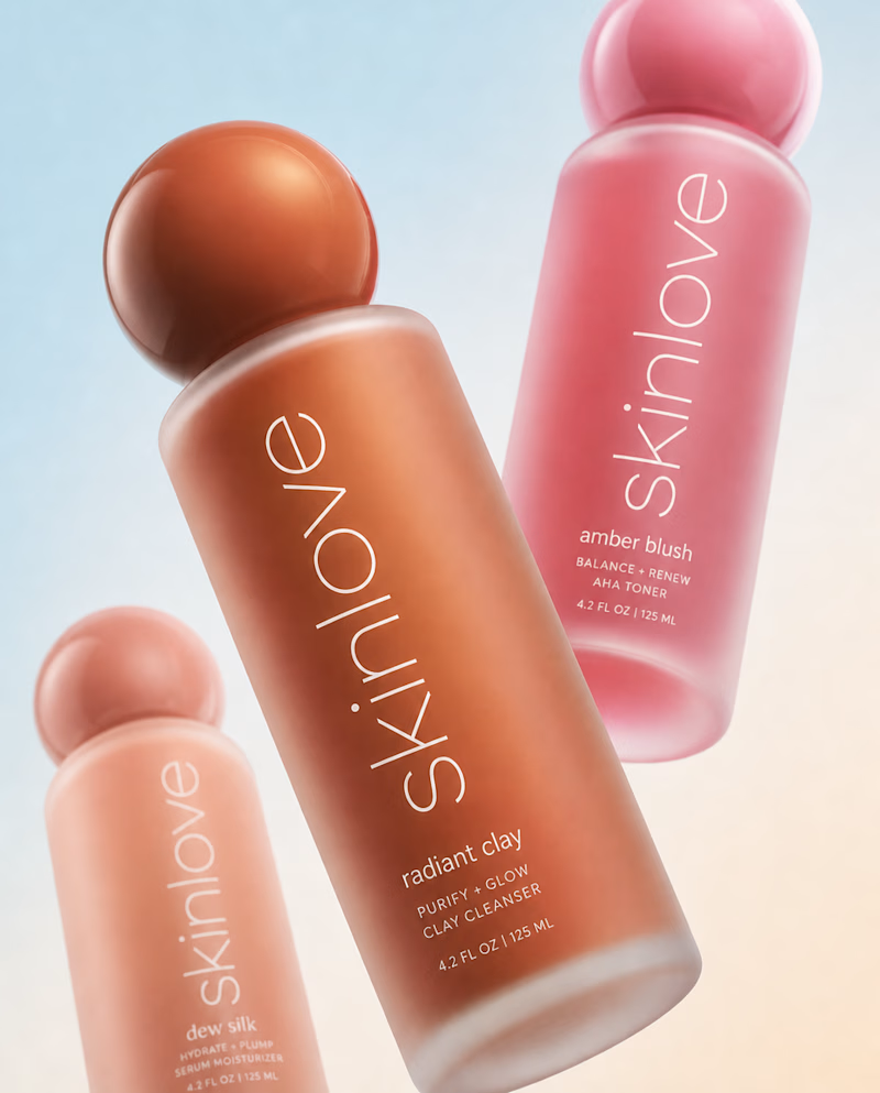
53 voted
68%
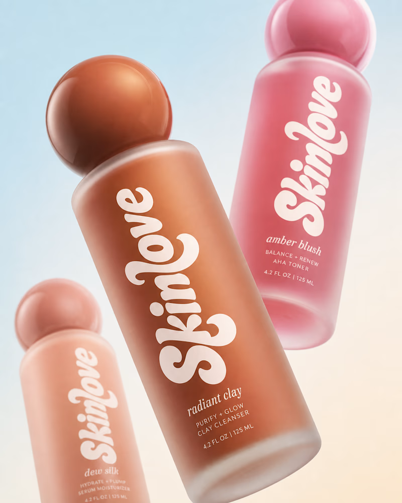
78 votes
Closed

Peace Begins at Home — Editorial Handbook Design


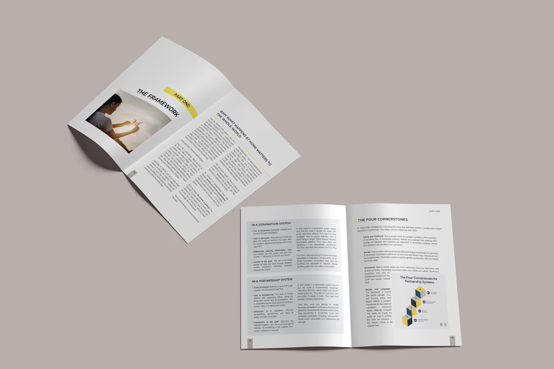
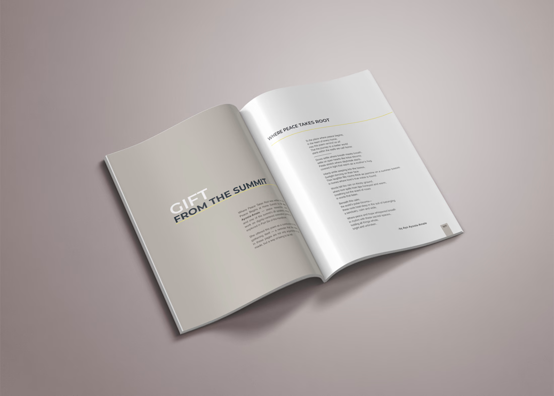
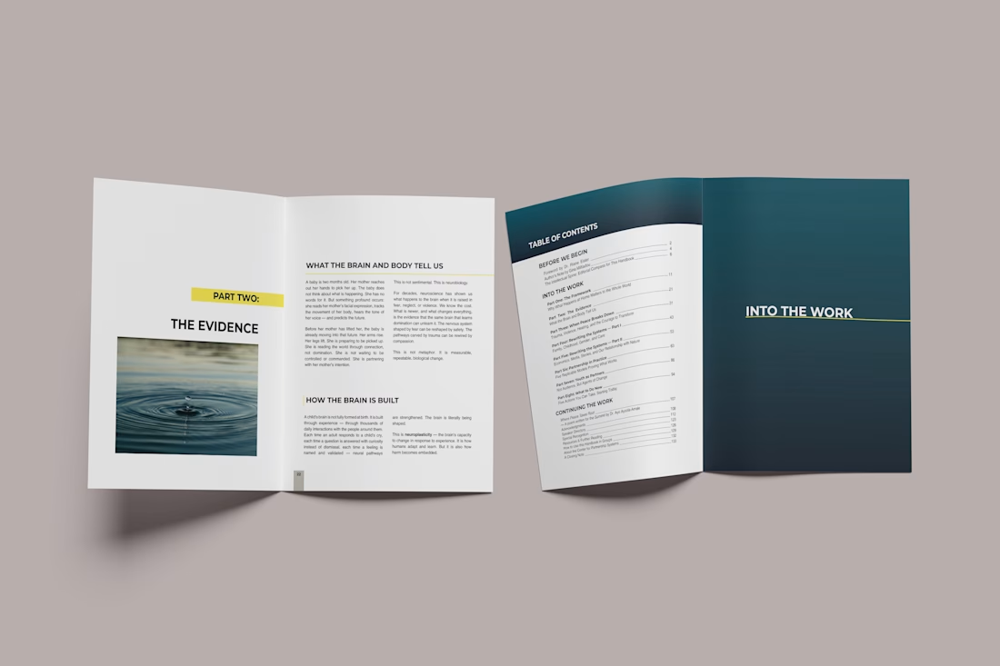
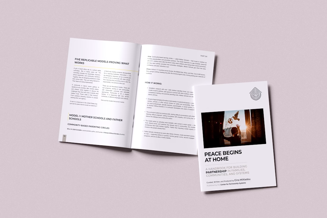

This is so visually satisfying! Great job.

Saas Management Landing Page Design

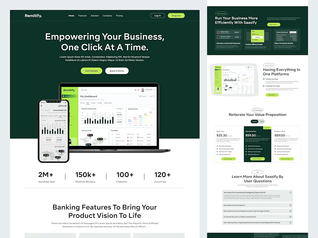
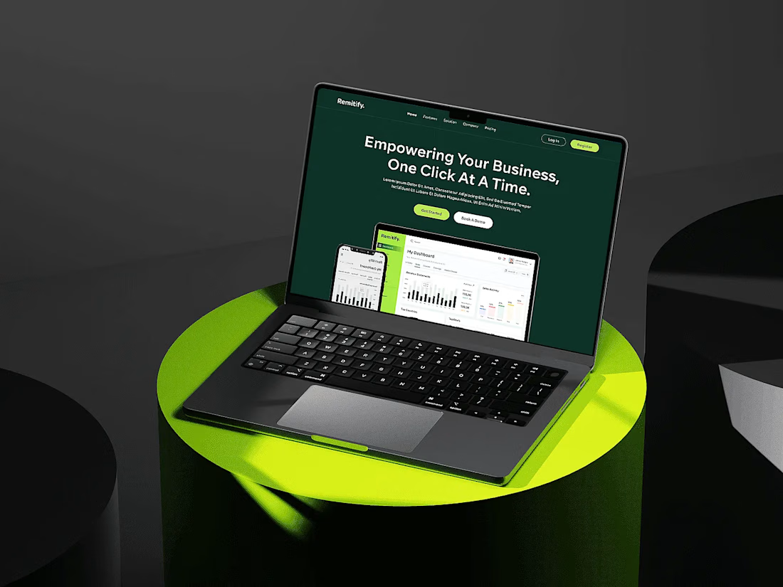

The deep green with lime accents reads "finance you can trust" without feeling like a bank, and the stats row right under the hero adds instant credibility. When pages like this get built, the dashboard in the hero is the part I'd make live: a lightweight animated version with...