The network for creativity
Join 1.25M professional creatives like you
Connect with clients, get discovered, and run your business 100% commission-free
Creatives on Contra have earned over $150M and we are just getting started
Back to feedPost
Aside from the prototype apparently making Figma start breathing hard, I think I'm pretty happy with this interaction. Basically, even though each group level shares the same properties, I thought the interface needed to help the user access and differentiate them from each other. So the District settings span the viewport width, Schools get listed into a sticky side nav, and groups within those schools can be opened in place to display the staff and students in that group without the user having to pogo-stick in and out of admin pages.
I really like this level of UI flashiness since the interaction stems directly from a need. In this case, the need to understand the hierarchy of a school district without overwhelming or slowing down the user.
Critique welcome if anyone spots something as this project is still underway and I'll never turn down good direction. :)
#
The network for creativity
Join 1.25M professional creatives like you
Connect with clients, get discovered, and run your business 100% commission-free
Creatives on Contra have earned over $150M and we are just getting started
Related posts
The status tags and filters look genuinely fast to scan, that contracts table could easily feel overwhelming but it doesn't. How much of the motion is functional feedback versus just polish for the demo reel?
Recently worked on creating a Dark Mode version for a shipment tracker UI using Figma variables.
Variables can definitely be tricky to set up at first, but I’m absolutely in love with how seamless and structured the workflow becomes once it clicks! Designing the tracking map screen was also a fun challenge that turned out a bit more complex than expected.
Check out the interactive prototype video below ⬇️
Want to try it out yourself? Feel free to play with the live prototype here:
https://www.figma.com/proto/KA2ywcwRh5LtnWN6he9mXj/tickets-screens-prototype?node-id=68-379&t=hku20yzpPVh9P2Fb-1&scaling=scale-down&content-scaling=fixed&page-id=3%3A8&starting-point-node-id=68%3A379&show-proto-sidebar=1
Variables being a pain to set up but seamless once they click sums up basically every Figma power feature honestly. Are you using variable modes to swap the whole theme, or manually mapping dark values to each color style?
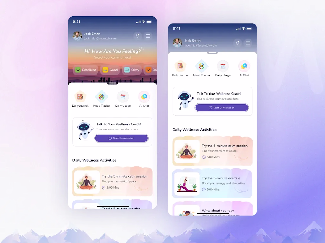
What do you think of this layout and the color palette for wellness application?
The app allows user to keep track of their mood and suggest activities based on their mood. User can talk to AI assistant coach and get help to calm themself down. I'd love to hear your feedback on the visual hierarchy, the card components, or any ideas you have to improve the overall user experience!
Trending
Claude
Claude has entered the design space. How are you using Claude Design?
Contra University
Learn from expert creatives how to earn more using next-gen AI tools.
creativeaiflow
Creative AI workflows are evolving. What tools do you use, and what are their strengths and weaknesses?
freelancerlife
Freelancer life is wins, pivots, and everything in between. What’s yours right now?