The network for creativity
Join 1.25M professional creatives like you
Connect with clients, get discovered, and run your business 100% commission-free
Creatives on Contra have earned over $150M and we are just getting started
Back to feedPost

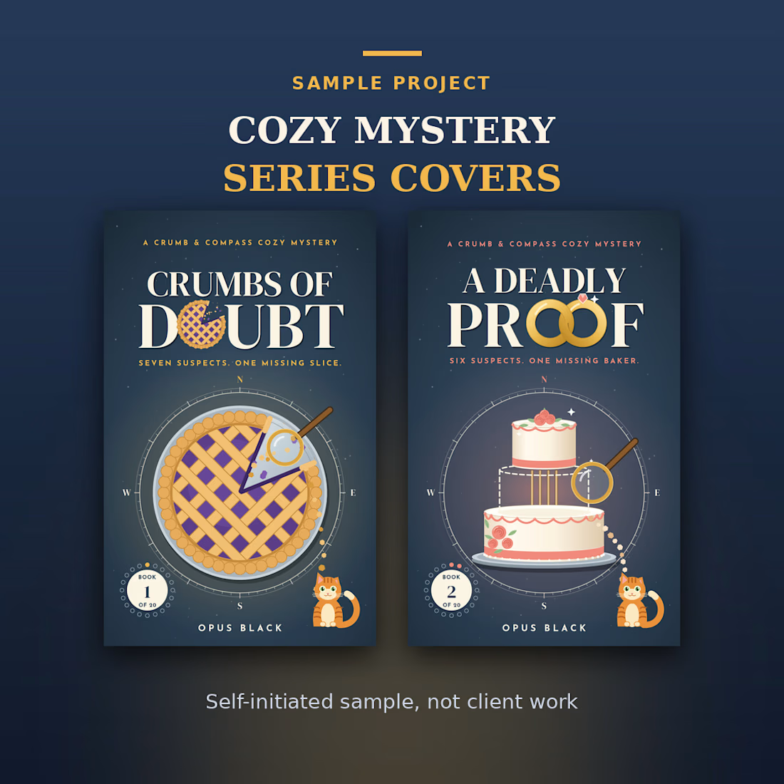
A sample project: matching covers for a cozy mystery series.
Two Kindle ebook covers, one consistent look across Book 1 and Book 2, with titles that stay readable at thumbnail size. A self-initiated sample project, not client work.
If you are planning a series, I can design all the covers to match.
bookcoverdesignebookcovercozymystery3D DesignGraphic DesignTypographyAdobe InDesignAdobe PhotoshopAdobe Premiere Pro


The network for creativity
Join 1.25M professional creatives like you
Connect with clients, get discovered, and run your business 100% commission-free
Creatives on Contra have earned over $150M and we are just getting started







Related posts

Recent work on MAE - Visual identity


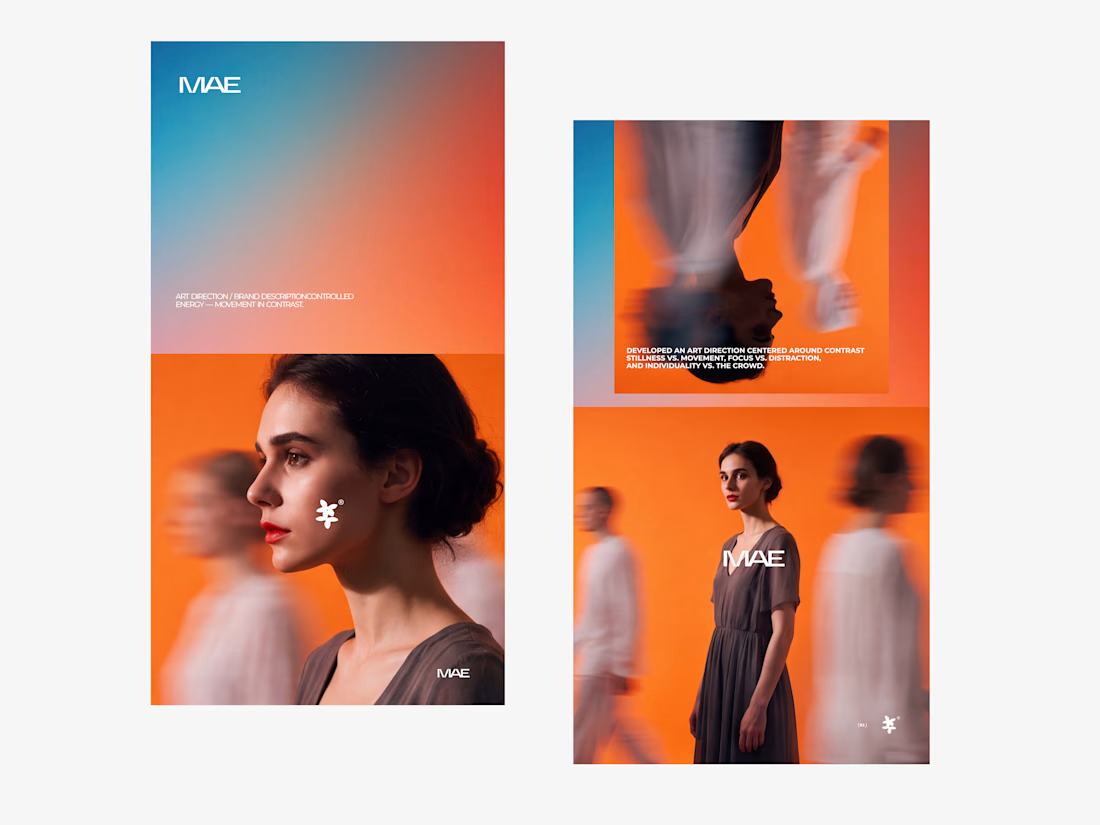

The motion blur on the figures gives the orange-to-blue gradient a reason to be there, and the small star mark stays readable on both the cheek and the shirt. Did the star come first as a standalone mark, or did it grow out of the photography direction?

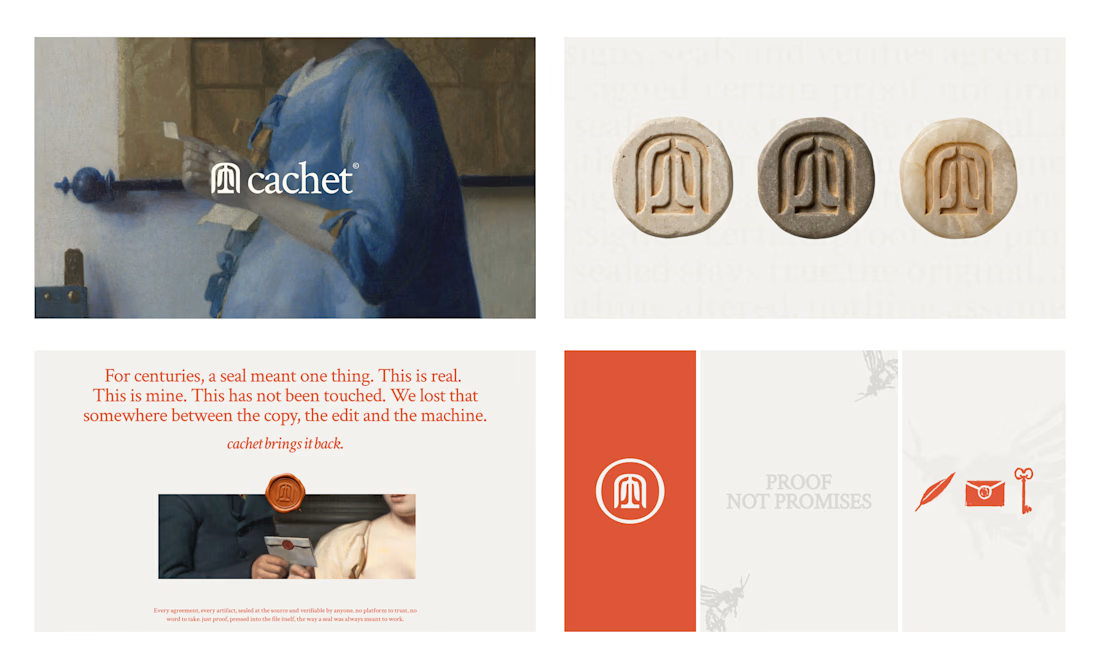
Cachet brand exploration.
Exploring patterns, textures, materials and hand-drawn illustrations

That's interesting I like it that's really unique ❤️❤️🎉🎉

Social Media Concept Design for Seed