The network for creativity
Join 1.25M professional creatives like you
Connect with clients, get discovered, and run your business 100% commission-free
Creatives on Contra have earned over $150M and we are just getting started
Back to feedPost

✨ Aftercare
The hospital discharge summary, redesigned into a calm, patient-first recovery companion.
Good healthcare information can save lives. Good information design helps people understand it.
🔗 Project Links
🎨 Wonder Design File: https://app.wonder.so/isumenuka/files/019f31a3-8c46-7707-b8d1-9bb74298da0b
💻 React Export / GitHub: https://github.com/isumenuka/Aftercare
🩺 The Challenge
Every day, millions of patients leave hospitals with discharge instructions that are difficult to read, filled with medical jargon, and presented in dense blocks of text.
Patients are often tired, anxious, in pain, or under medication when they receive this information. Unfortunately, this is exactly when understanding it matters most.
This isn't simply a healthcare problem.
It's an information design problem.
📚 Research Validation
📄 Engel et al. (2009)
Annals of Emergency Medicine
Key Finding
78% of emergency department patients demonstrated deficient comprehension in at least one aspect of their care or discharge instructions, and most believed they understood everything correctly.
This reveals a dangerous gap between what patients think they understand and what they actually understand.
Research Paper
📄 Sahhar et al. (2025)
The American Journal of Medicine
Researchers found that:
• 81% of standard English discharge instructions exceed the recommended sixth-grade reading level.
• Multilingual discharge instructions remain limited, reducing accessibility for many patients.
Together, these studies demonstrate that improving information design can directly improve patient safety.
💡 The Solution
Aftercare
A mobile experience that transforms a hospital discharge summary into a clear, personalized recovery companion.
Simply scan the discharge document and receive an interface designed around what patients actually need.
Instead of pages filled with confusing medical language, patients receive simple guidance that answers:
✅ What happened?
✅ What should I do today?
✅ Which medications should I take?
✅ What symptoms should I watch for?
✅ When should I contact my doctor?
✅ When should I visit the emergency room?
📱 Core Screens
📄 Scan Discharge Summary
Capture the printed discharge document and instantly convert it into structured, readable information.
❤️ Recovery Today
A simple daily dashboard showing recovery progress, today's tasks, hydration, activity, appointments, and care reminders.
💊 Medication Reminder
An interactive medication timeline explaining:
• What to take
• When to take it
• Why you're taking it
• Missed dose reminders
🚨 Warning Signs
Important symptoms are grouped into clear actions.
🟢 Continue recovery
🟡 Contact your healthcare provider
🔴 Visit the emergency room immediately
No medical jargon.
Just clear actions.
🎨 Design Language
The interface was designed to feel calm, reassuring, and easy to read.
• Deep near-black background
• Soft ambient magenta, pink, and blue shader lighting
• Bento-style information cards
• Large accessible typography
• Ghost-style LCD numerals
• High-contrast layout
• Warm pastel recovery cards
• Yellow highlights for urgent information
Every visual decision helps reduce stress instead of creating it.
⚙️ Built Entirely in Wonder
The entire experience was designed inside Wonder.
Workflow
✨ Wonder Chat generated the initial component system.
✨ Wonder Shader tools created the ambient backgrounds.
✨ Wonder components built the reusable interface.
✨ Wonder MCP connected Claude to structure the discharge data.
✨ The finished design was exported directly to React and Tailwind CSS.
This demonstrates a complete Design → AI → Code workflow.
🛠 Technology Stack
• Wonder
• Wonder Chat
• Wonder Shader Generation
• Wonder MCP
• Claude
• React
• Tailwind CSS
🔌 API Stack
Free APIs
• HL7 SMART on FHIR Sandbox
• NIH RxNorm / RxNav
• MedlinePlus Connect
❤️ Why It Matters
Healthcare already has the right information.
Patients simply receive it in the wrong format.
Aftercare demonstrates how thoughtful interface design, accessibility, and AI-powered workflows can make recovery instructions understandable, actionable, and reassuring.
Better information design is patient safety.
✨ Designed in Wonder.
🏥 Built for the day patients go home.


The network for creativity
Join 1.25M professional creatives like you
Connect with clients, get discovered, and run your business 100% commission-free
Creatives on Contra have earned over $150M and we are just getting started



Related posts

Crypto Portfolio Dashboard
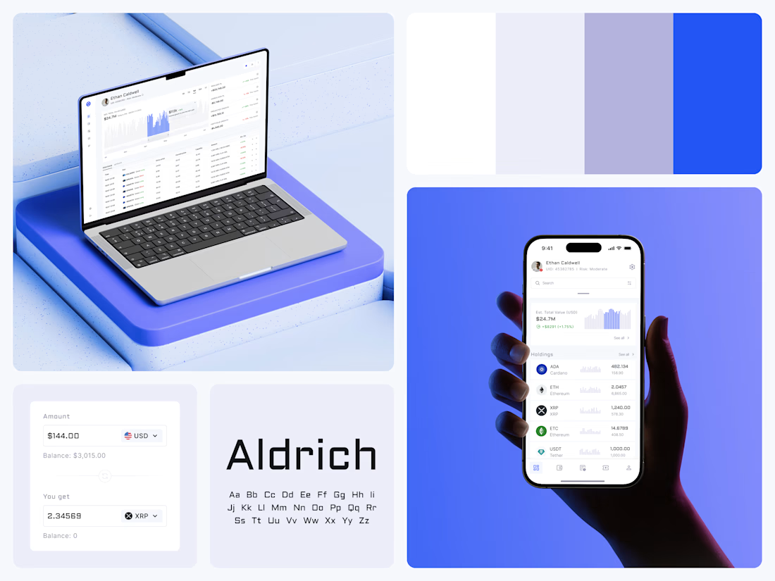
Blue means one thing here: the range you are looking at.
The value chart is a row of thin gray bars, and only the selected date range fills in blue. You read the period that matters and keep the months around it as context.
The phone carries the same chart above the holdings list. Each coin gets its own small bar chart between the name and the amount, so you can scan the whole portfolio for movement without opening a single coin.
Trading screens get busy fast. This one stays light and calm, so the numbers lead: total value, realized and unrealized P&L and open positions, all on one screen.
Designed by the Hue & Machine team.
#Crypto #Fintech #DashboardDesign #TradingPlatform #DataVisualization #UIDesign #ProductDesign #WebApp #MobileDesign #FigmaDesign



Nice Ui Dmytro


Looks great! What about readability though?
Text seems low contrast to me. Although I have a poor vision and most things seem too small and low contrast to me.

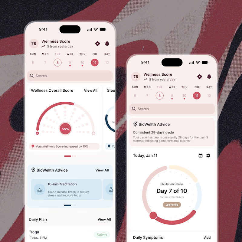
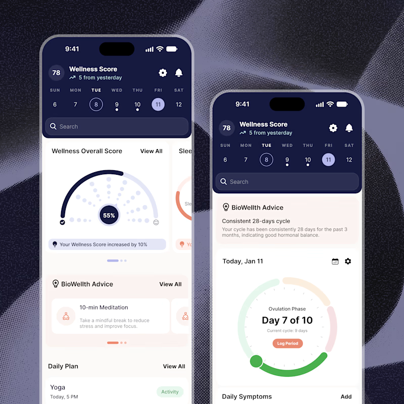
Exploring two color palette directions for a women’s health app. Which one feels right to you? 👀
32 voted
56%
25 voted
44%
57 votes
Closed

Both are amazing! The purple definitely has better contrast, but I’d still go with the berry one, purely a personal preference