The network for creativity
Join 1.25M professional creatives like you
Connect with clients, get discovered, and run your business 100% commission-free
Creatives on Contra have earned over $150M and we are just getting started
Back to feedPost

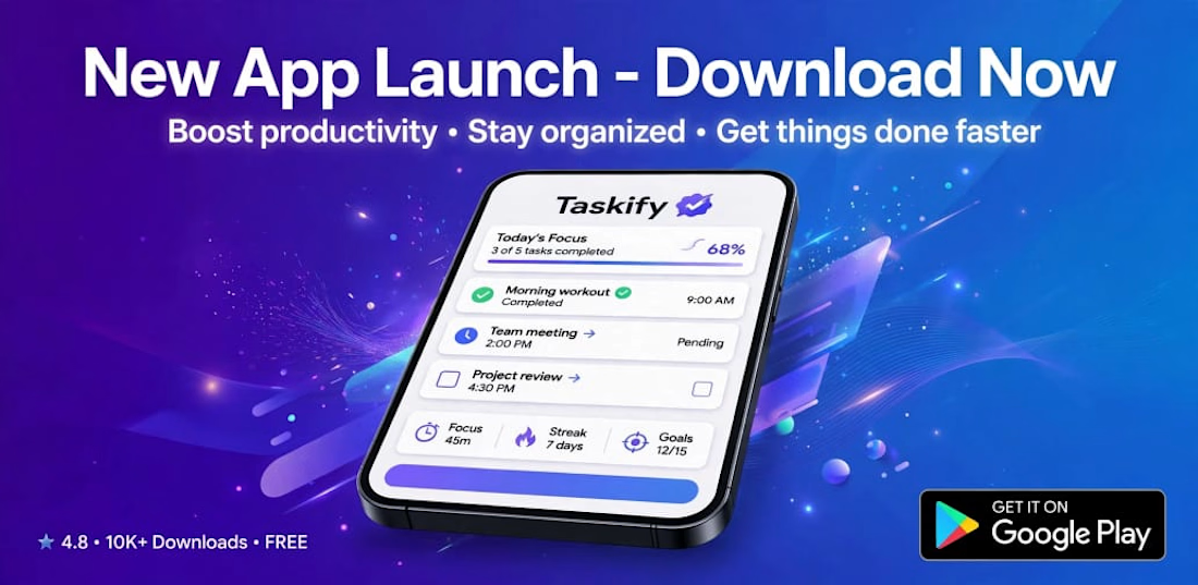
Taskify - Productivity App Launch Campaign & Play Store Banner Design
The network for creativity
Join 1.25M professional creatives like you
Connect with clients, get discovered, and run your business 100% commission-free
Creatives on Contra have earned over $150M and we are just getting started



Related posts

Volt Coaching — Fitness Coaching Website Design
Description
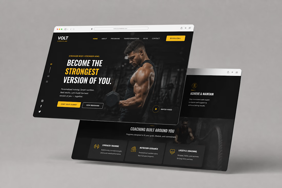
A bold website design concept for Volt Coaching, created to give the brand a strong, energetic digital presence while making its coaching programs easy to explore.
The design combines a dark visual direction with bold typography, yellow accents, strong imagery, clear navigation, and prominent calls to action to create an engaging experience for visitors looking to start their fitness journey.



I redesigned this mobile offer section of product page on @Figma to create a clearer, more persuasive buying experience.
The original page presented the essential information, but the benefits, product options and purchase controls were difficult to scan.
For the redesign, I improved:
• Product and offer hierarchy
• Benefit-focused messaging
• Product gallery and visual presentation
• Flavour and bundle selection
• Pricing and savings visibility
• Trust signals near the CTA
• Mobile usability and buying flow
The goal was to help shoppers understand the product, compare their options and move toward purchase with less friction.
This is a concept redesign created to demonstrate my approach to conversion-focused Shopify product page design.

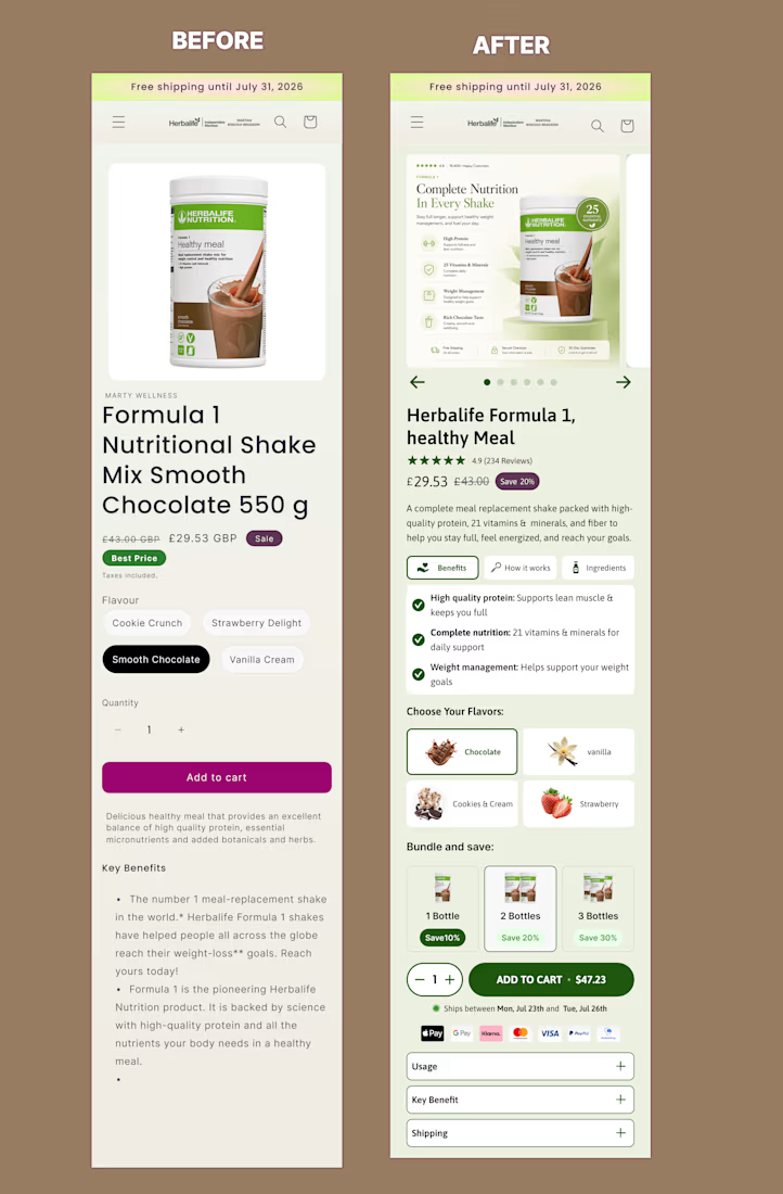

Good hierarchy fix, the before version buries the flavor picker and quantity discount below a wall of bullet points. On the bundle tiers, are the 10/20/30% discounts pulled from a real margin model for a shake product, or placeholder numbers for the concept? That third tier...

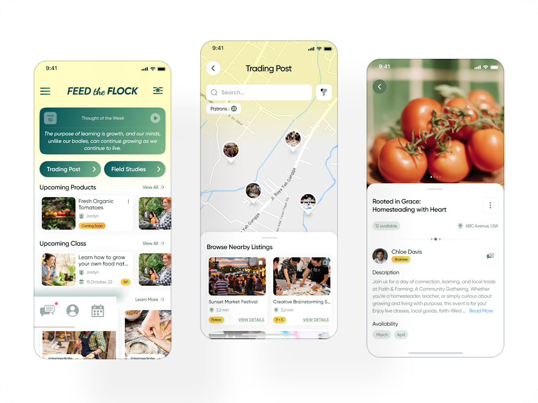
Really nice concept and clean app design. The marketplace and community-focused experience look very thoughtfully put together. Great work! 🚀


Feed The Flock — community platform for trading homegrown/homemade goods and sustainable-living education.