The network for creativity
Join 1.25M professional creatives like you
Connect with clients, get discovered, and run your business 100% commission-free
Creatives on Contra have earned over $150M and we are just getting started
Back to feedPost
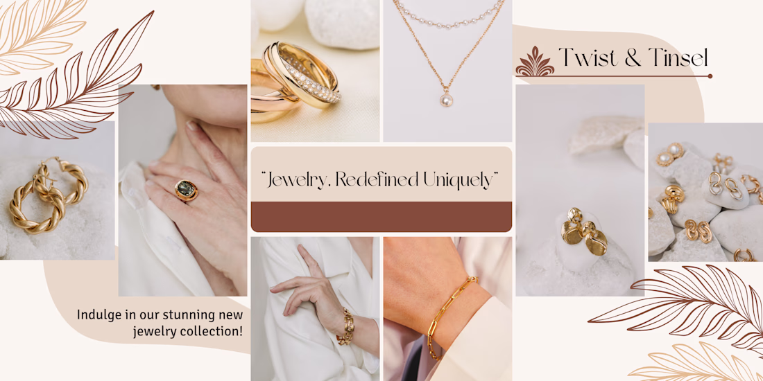
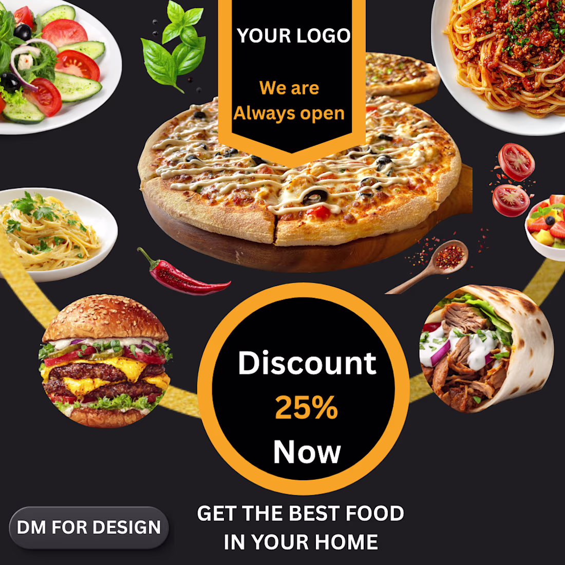
😊 The layout exhibits strong Color Curation, as the designer carefully selected stock photography that shares a unified palette of muted rose, soft terracottas, warm neutrals, and sage greens, ensuring the board feels like a singular brand universe rather than a random collection of clips. Furthermore, the central block demonstrates a keen understanding of Typographic Hierarchy, pairing an elegant, italicized serif font with varying text scales to draw the eye directly to the brand name before guiding it through the supporting product categories. Finally, the design excels in the strategic use of Negative Space and Asset Styling, using clean, rounded corner frames on every element to soften the aesthetics and leaving intentional breathing room around the central text block so the final graphic feels premium, balanced, and effortlessly sophisticated.
The network for creativity
Join 1.25M professional creatives like you
Connect with clients, get discovered, and run your business 100% commission-free
Creatives on Contra have earned over $150M and we are just getting started
Related posts
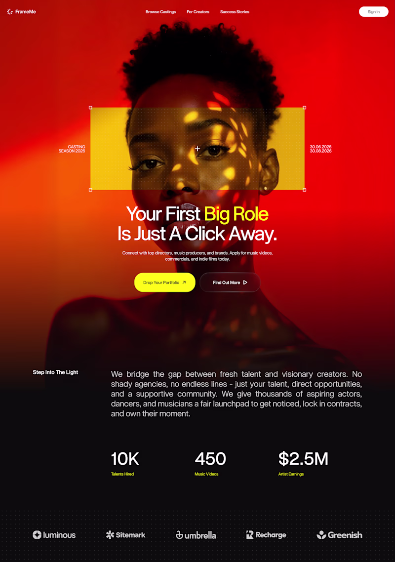
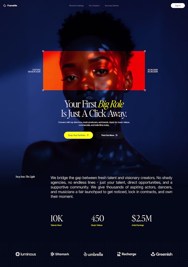
Which direction brings out the premium tech aesthetic better? 🔴🔵
Currently working on a brand new hero framework where typography meets high-contrast confidence. I’d love to hear your thoughts on which color palette feels more impactful.
79 voted
70%
34 voted
30%
113 votes
Closed
Red Version looks premium
Today's design exploration started with a Dribbble inspiration piece.
Rather than copying it directly, I challenged myself to reinterpret the concept and experiment with a completely different visual direction.
The original inspiration uses vibrant blue and orange colors to create an energetic feel, while my version leans into a darker, more premium aesthetic.
A great exercise in studying design principles and then applying them through your own lens.
Question:
Which version do you prefer?
🟠 The colorful Dribbble-inspired version
⚫ My dark interpretation
22 voted
47%
25 voted
53%
47 votes
Closed
Dark mode always
nice work!
Trending
Claude
Claude has entered the design space. How are you using Claude Design?
Contra University
Learn from expert creatives how to earn more using next-gen AI tools.
MagicPath
The canvas is infinite, and exploration is becoming the workflow. How are you using MagicPath?
creativeaiflow
Creative AI workflows are evolving. What tools do you use, and what are their strengths and weaknesses?
freelancerlife
Freelancer life is wins, pivots, and everything in between. What’s yours right now?