The network for creativity
Join 1.25M professional creatives like you
Connect with clients, get discovered, and run your business 100% commission-free
Creatives on Contra have earned over $150M and we are just getting started
Back to feedPost

Takenos . Fintech Brand Strategy & Visual Identity
Description
Takenos needed to build trust in one of technology’s most competitive categories without looking like every other fintech brand.
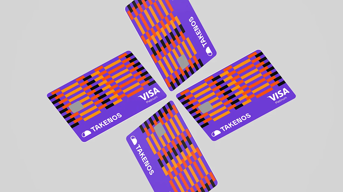
We developed a strategic identity around confidence, accessibility and commercial credibility — positioning the company as an established financial platform while retaining the energy of a modern technology business.
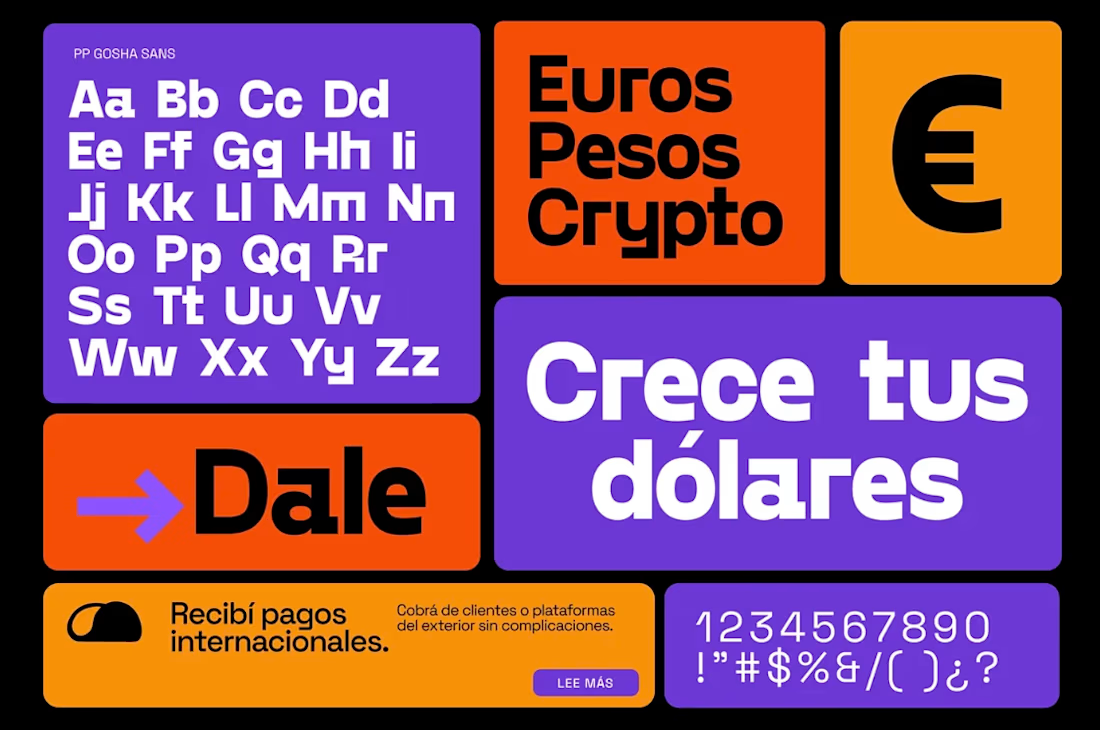
The resulting system combines confident typography, expressive graphic elements and a distinctive visual language designed to make the business easier to understand, recognise and trust.
Built to scale, the identity works across product marketing, campaigns, presentations and digital experiences as Takenos continues to grow.




The network for creativity
Join 1.25M professional creatives like you
Connect with clients, get discovered, and run your business 100% commission-free
Creatives on Contra have earned over $150M and we are just getting started





Related posts

The Rebranding Challenge - Season Investments
One of the key challenges was deciding what to change and what was worth preserving.
Rather than starting from scratch, the new identity retains a visual connection to Season Investments’ heritage, but reframes it for a more contemporary and flexible brand system.
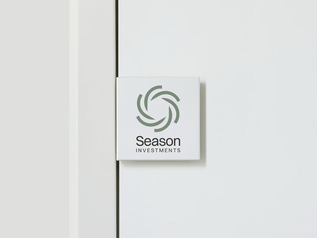
A major improvement was creating a symbol that can work independently from the wordmark. This gives the brand a stronger presence across investment platforms, digital interfaces, profile images, and other compact applications where the previous identity was difficult to use.
The result is a more adaptable system that moves the brand forward without losing its familiarity.





Love how adaptable this feels across compact digital spaces. Really well done. Any plans to post the original before version for comparison?


Beautiful work.

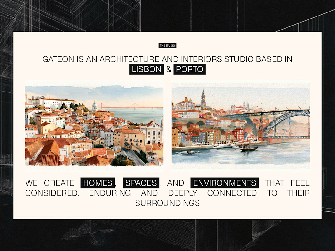
Studio section for Gateon, a interior design and architecture studio with bases in Lisbon and Porto