The network for creativity
Join 1.25M professional creatives like you
Connect with clients, get discovered, and run your business 100% commission-free
Creatives on Contra have earned over $150M and we are just getting started
Back to feedPost

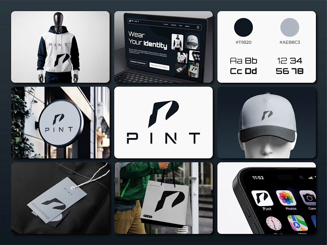
PINT® — A Mark of Modern Identity.
What if a simple letter could become the face of an entire brand?
That was the idea behind PINT.
I wanted to create more than just a fashion logo. I wanted a mark that feels bold, modern, and instantly recognizable, something that works just as naturally on a hoodie as it does on a shopping bag, a cap, or a digital screen.
✳ The idea behind the mark
The symbol is inspired by the letter “P,” shaped into a sharp, forward-moving form. Its clean geometry and distinctive silhouette give the brand a confident personality without making it feel overdesigned.
Less detail. More character.
◼ The visual direction
Deep black meets cool grey, creating a clean, understated look that lets the identity speak for itself. The typography adds a futuristic edge, while the minimal layouts keep everything balanced and timeless.
From apparel and packaging to storefronts and digital touchpoints, every element follows one consistent idea: make the brand recognizable wherever it appears.
Because a fashion brand isn't defined by what it wears alone.
It's defined by how people remember it.
✦ One symbol. One identity. One clear direction.
This is PINT — a fashion identity built around simplicity, confidence, and individuality.
What do you think of the direction? Does the mark capture the personality of a modern fashion brand?
👉 Best Design: www.fiverr.com/sellers/rifatislam149/edit
👉 Portfolio: https://dribbble.com/artoryxrifat
#PINT #PINTBrand #FashionBranding #LogoDesign #BrandIdentity #VisualIdentity #BrandGuidelines #FashionLogo #ClothingBrand #BrandDesign #MinimalistLogo #ModernLogo #CreativeLogo #LogoInspiration #GraphicDesign #BrandStrategy #BrandIdentityDesign #Typography #LogoConcept #FashionDesign #StreetwearBrand #LuxuryBranding #PackagingDesign #BrandPresentation #DesignPortfolio #AdobeIllustrator #CreativeDirection #IdentityDesign #BrandingInspiration #ArtoryxRifat
The network for creativity
Join 1.25M professional creatives like you
Connect with clients, get discovered, and run your business 100% commission-free
Creatives on Contra have earned over $150M and we are just getting started



Related posts


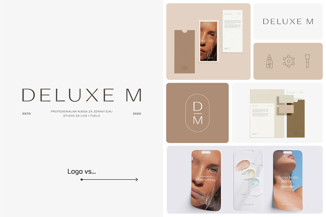
A logo is one thing. Giving it a whole personality is another. 👀
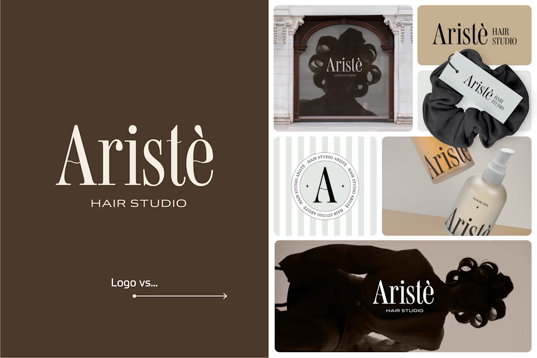
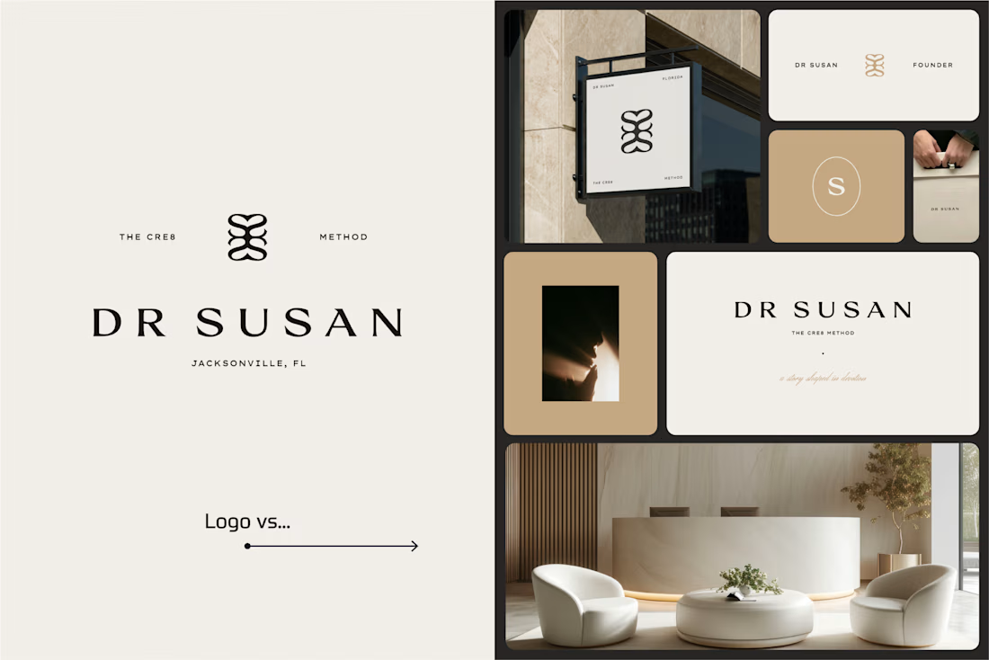
I picked a few of my branding projects to show what happens beyond the logo.
First, the logo on its own. Then, the full visual identity: colours, typography, graphic elements, patterns, packaging, and all the little details that make each brand feel like itself.
Because I don't want a logo to just look good sitting on a presentation slide. I want to see what it can become when it gets out into the real world.
Every project has a different story, personality, and visual direction. And that's probably my favourite part of brand design: figuring out how to turn one initial idea into a whole visual language.
Swipe through and meet the logos, then their bigger personalities. ;)
A logo is the starting point. The fun really begins after that.
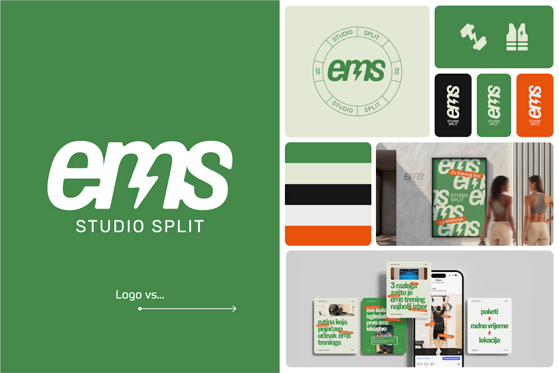

Clever use of the lightning bolt in the EMS logo!
Brand work for Boofi, DeFi platform
We are working on visual direction, motion and animations


So cute! Love it!