The network for creativity
Join 1.25M professional creatives like you
Connect with clients, get discovered, and run your business 100% commission-free
Creatives on Contra have earned over $150M and we are just getting started
Back to feedPost
IT’S WEEK TWO OF ContraQuest
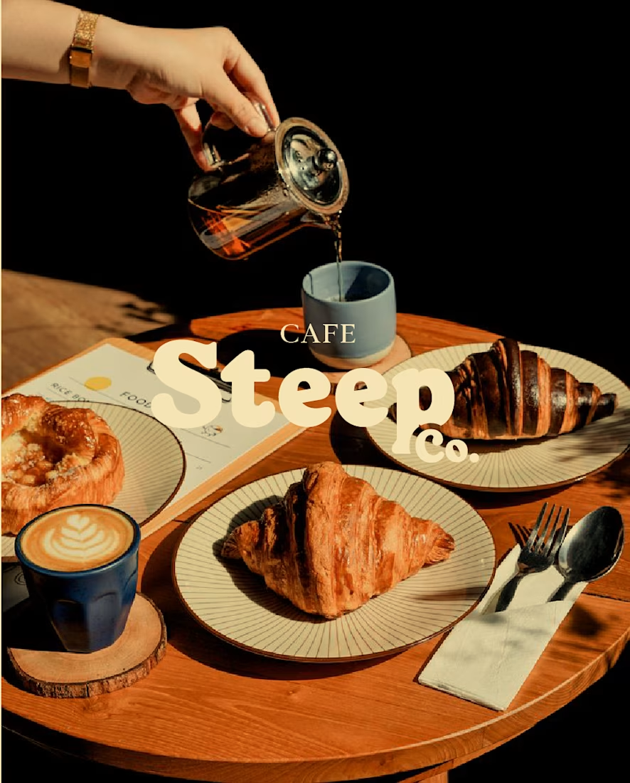
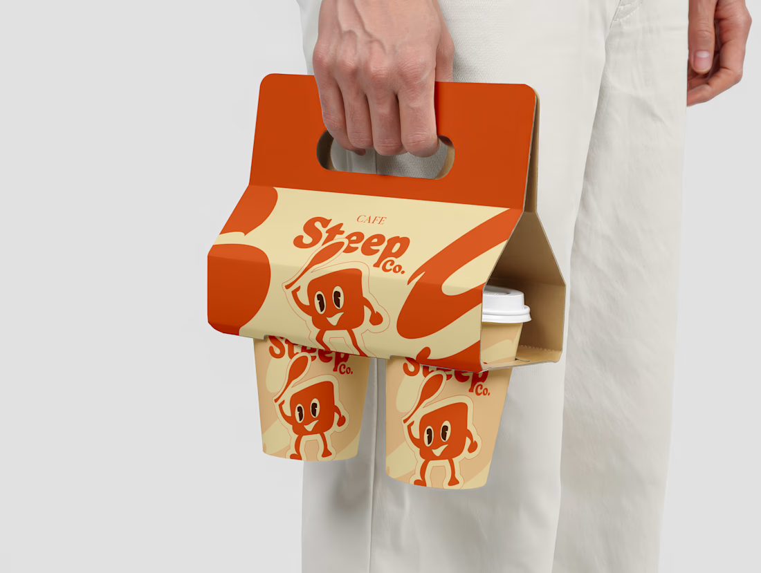
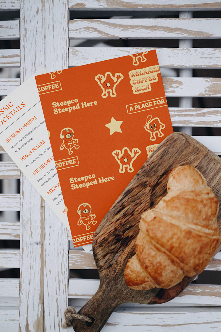
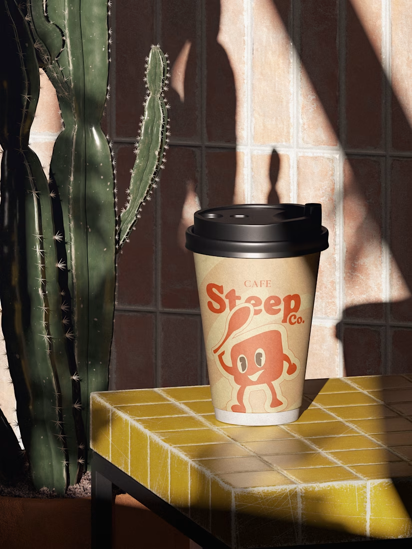
One project I’m really proud of is Cafe SteepCo ☕
I handled the brand identity from strategy to visuals, making sure everything felt warm, consistent, and intentional.
What I learned:
→ Strong brands are built on clarity, not trends
→ Consistency across touchpoints builds trust
→ Small details make a brand memorable
Tools used:
Figma · Illustrator · Photoshop
How it shaped me:
This project helped me grow as a strategic brand designer, packaging designer and reminded me why I love building brands with meaning.
What I want more of in 2026:
→ Helping brands tell clearer stories and show up with confidence.
→ Helping brands build strong identities and packaging systems designed for long-term impact.
contraquestBrand DesignbrandidentityPackaging DesignBrand StrategyFigmaAdobe IllustratorAdobe Photoshop



Really love this!🔥 💯


Thank you rufai

Nicee

This branding is so warm and inviting! The packaging especially stands out - love the playful illustrations. Your learning about clarity over trends is spot on. What was the most challenging part of the packaging system?
Thanks a lot, I really appreciate that. The main challenge was creating a cohesive system where the illustrations enhanced the brand warmth while still allowing clarity and consistency across different packaging formats.

This is amazing

Wow, I love this 🔥
Thank you

Cool, what do you use for mockups?
Adobe Photoshop and kittl

the paper cup holder is stunning 🙌

visuals are really cool

This looks so good! I love the designs. Is this an actual restaurant in Lagos? I'll really love to visit if yes.

The clarity is so glaring

Another beautiful brand design!

great work 🔥

pretty cool work!

how can i join this brand design

The branding goes well with the packaging material.

This branding is absolutely delightful! ☕️ The warm orange color palette perfectly captures that cozy cafe vibe, and the consistency across all touchpoints is spot on. Love how you've created a complete brand experience from strategy to execution. The illustrations are charming...

So clean and cool
The network for creativity
Join 1.25M professional creatives like you
Connect with clients, get discovered, and run your business 100% commission-free
Creatives on Contra have earned over $150M and we are just getting started

Challenges
View all


Related posts

For brand identity, I like to show mockups to test of the identity system: the logo, pattern, and color palette all needed to work at a much larger scale without feeling overdesigned.
That’s where a flexible brand system really starts to prove itself.
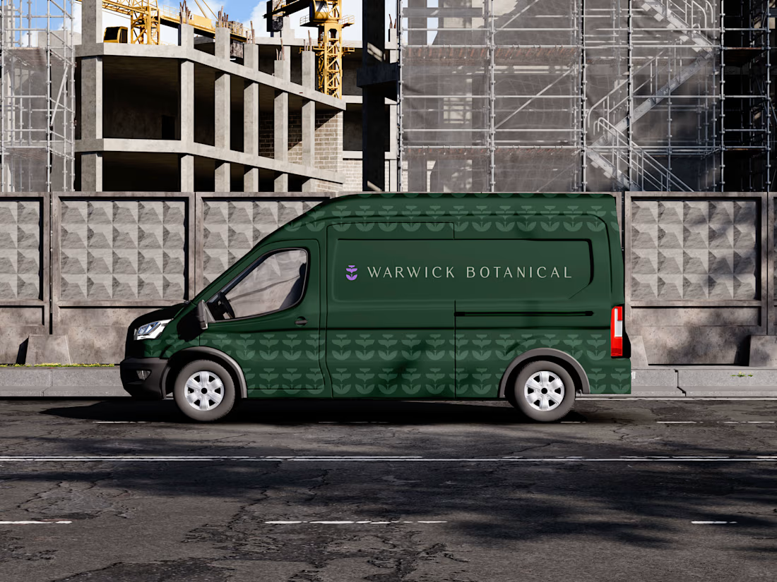
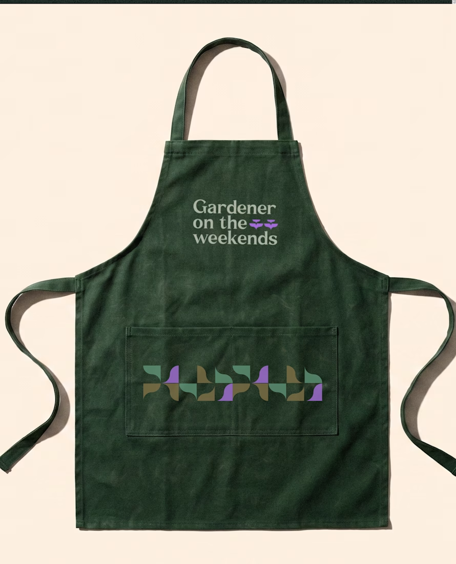
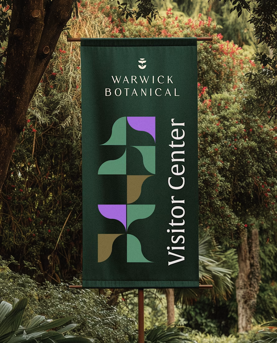

Powerful greenish look 👌

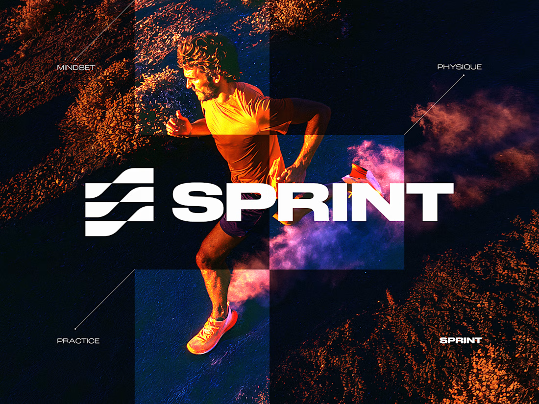
SPRINT — Experimental Brand Visual
A visual experiment built around an unused logo concept from a recent branding project.
The design was created manually, while exploring how AI-driven aesthetics are increasingly influencing contemporary visual language, even when AI itself isn’t part of the design process.
Logo design, art direction and visual exploration.

A little preview of something I’m working on.
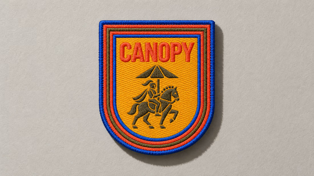
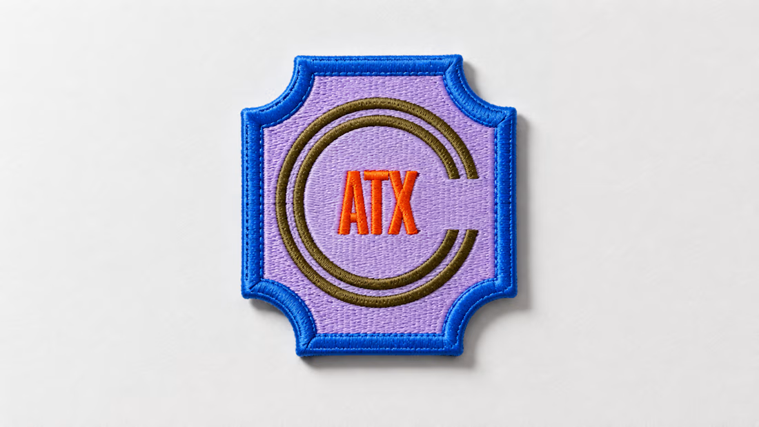
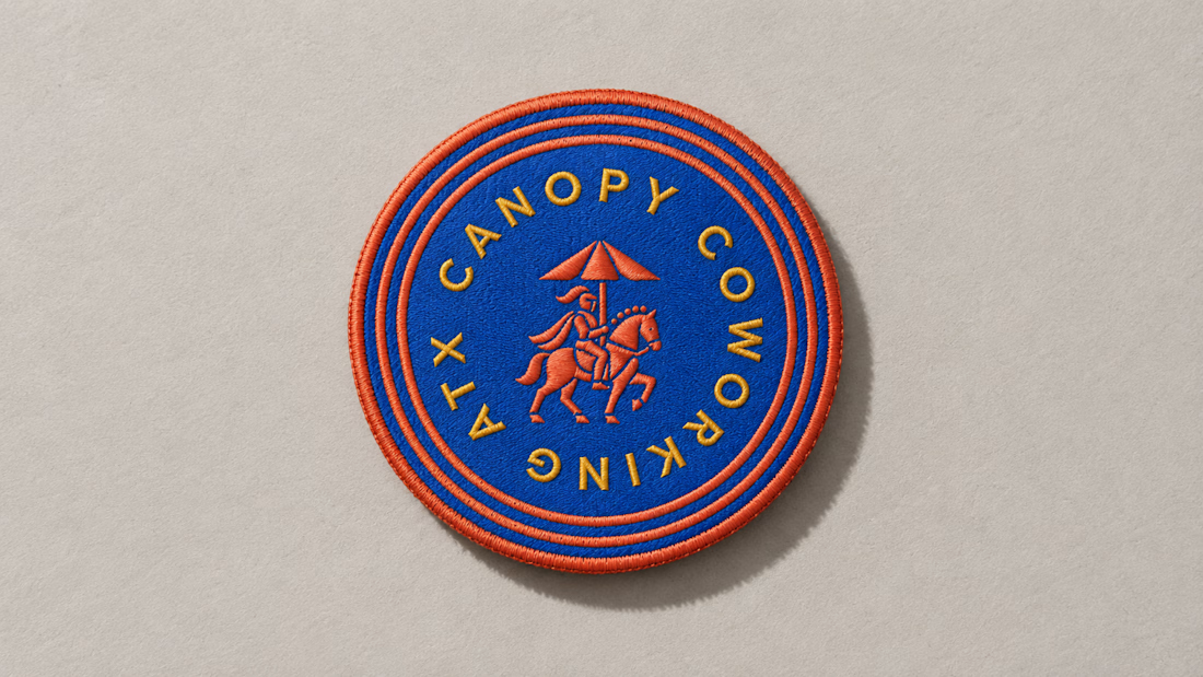
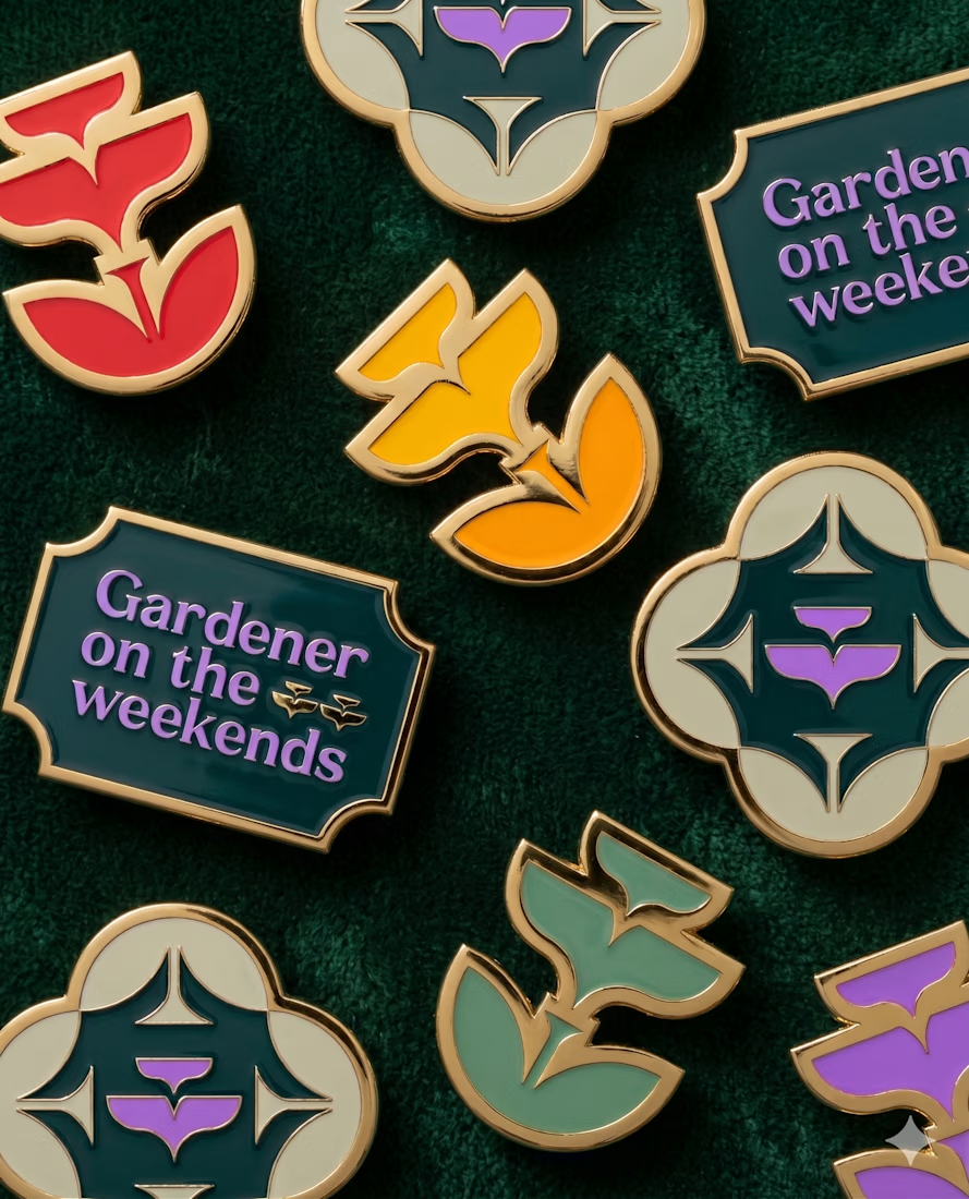
These embroidered patches are a small part of a much larger brand system, but details like this matter. The challenge is making sure the identity still feels distinct and intentional when it moves from screen to something physical you can hold in your hand.
That’s where a strong brand system starts begins to prove itself. More soon :)