The network for creativity
Join 1.25M professional creatives like you
Connect with clients, get discovered, and run your business 100% commission-free
Creatives on Contra have earned over $150M and we are just getting started
Back to feedPost

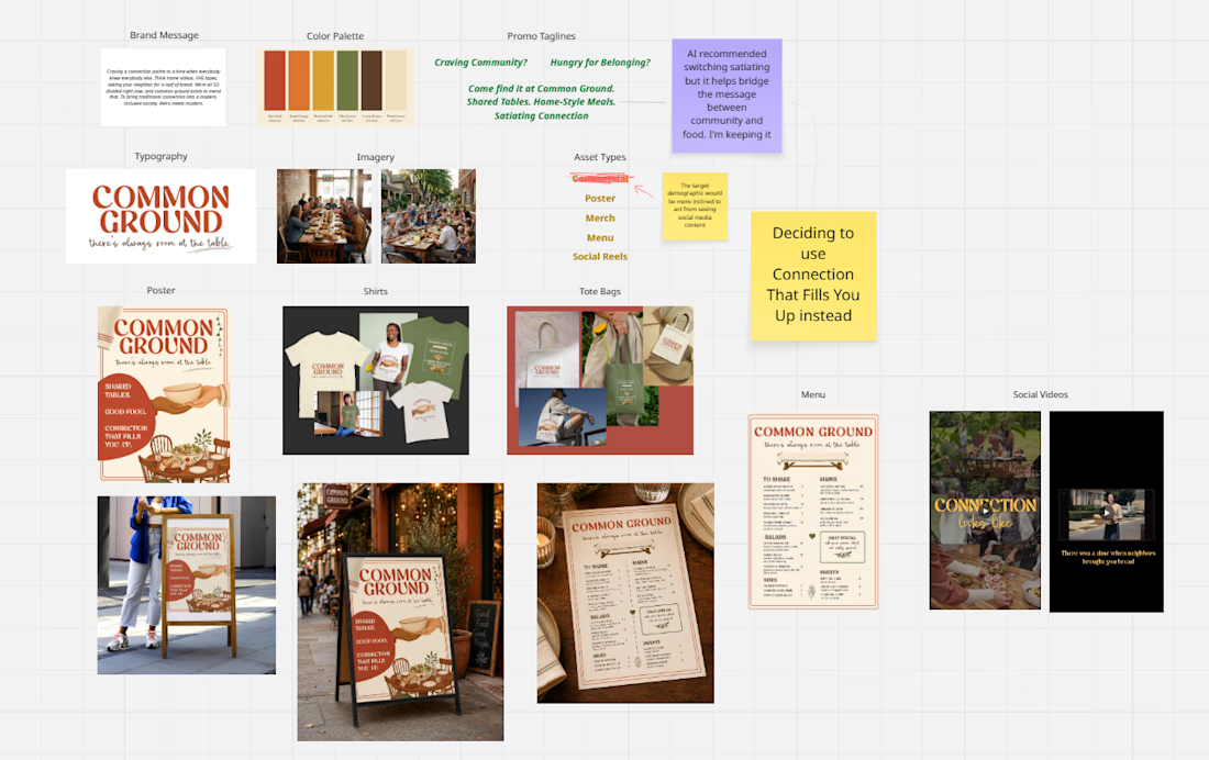
For the Envato Human by Design Challenge, I created Common Ground, a fictional neighborhood dining brand built around one idea: there’s always room at the table.
The concept reimagines the kind of connection people once found naturally in their neighborhoods - borrowing ingredients, sharing homemade food, checking in on one another, and gathering around the same table - for a modern, inclusive community space.
Envato tools used for this project:
Ai Image Gen
Ai Video Gen
Fonts
Stock Videos
Stock Images
Music Library
My Human By Design moments included:
Rejecting the first brand direction. The original olive, brown, and cream concept looked polished, but it felt too generic. I completely reimagined the identity with terracotta red, warm ivory, retro typography, handwritten details, and a stronger neighborhood-supper-club personality.
Changing the idea from “retro restaurant” to “traditional connection for today.” Nostalgia alone wasn't enough. I shifted the concept toward a modern, inclusive community space that brings back the warmth of shared meals and knowing your neighbors.
Simplifying illustrations that competed with the brand. Some icons were too thick, detailed, or decorative. I removed unnecessary elements and reduced the visuals so they supported the typography instead of overpowering it.
Choosing the empty seat and shared table as emotional symbols.
Instead of focusing only on food, I emphasized making room, pulling up a chair, and turning strangers into neighbors.
Common Ground ultimately became more than a fictional restaurant. It became a visual story about restoring the small interactions that help people feel less alone: passing a dish, pulling out another chair, meeting someone new, and staying at the table a little longer.
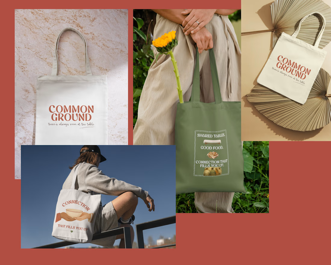
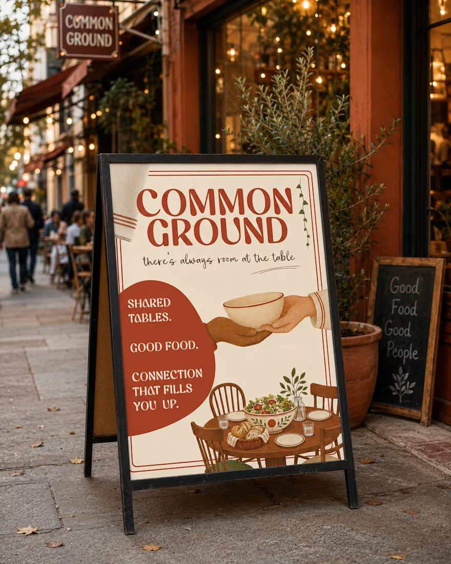
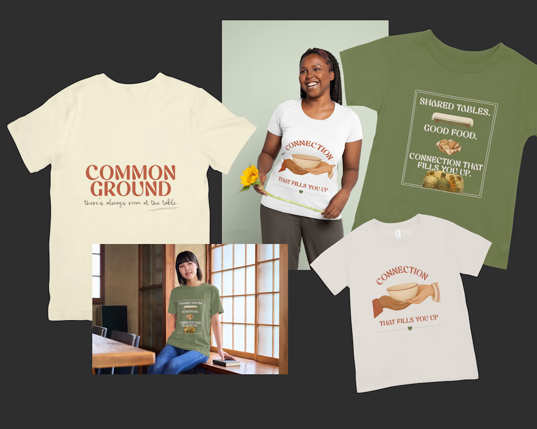
Common Ground | Shared tables. Good food. Connection that fills you up.
@envato
Here are some extras close up from the envato challeng x common ground
Thank you so much Faraz!! Appreciate you🙏🏼
The network for creativity
Join 1.25M professional creatives like you
Connect with clients, get discovered, and run your business 100% commission-free
Creatives on Contra have earned over $150M and we are just getting started





Related posts

Four restaurants, one dot, and a suspicious amount of work for a punctuation mark.
07:00 bakery. 12:30 lunch counter. 18:45 dining room. 23:10 bar.
Norr & Co. case study, coming soon

Some more experimental futuristic typography story design for Bar LOQA.


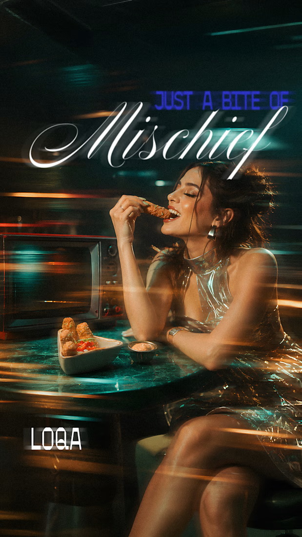
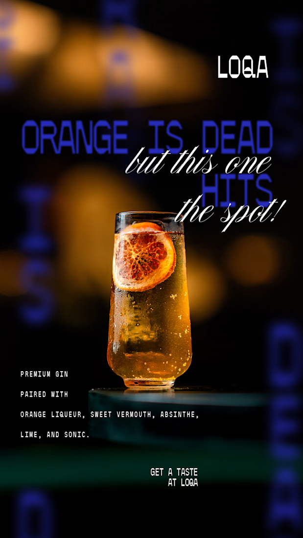
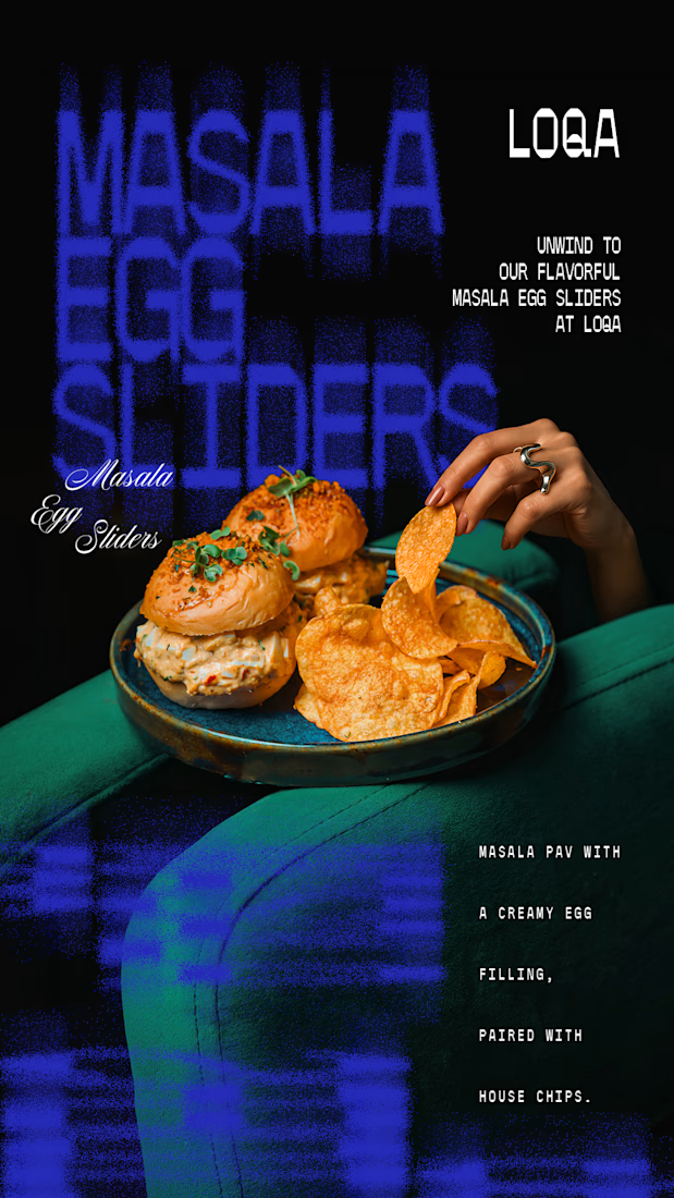
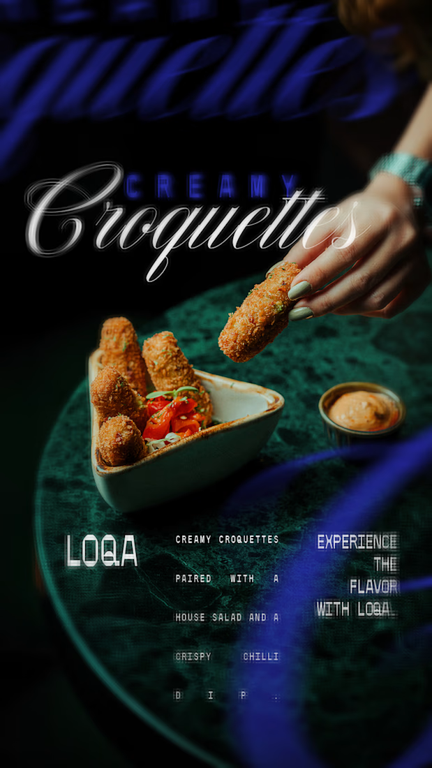

The script lettering over the cocktail sits in the glow without fighting the photo, while the sliders frame gets a much lighter touch. Do you place the type first and crop the image around it, or the other way round?

I'm working on a modern, elegant website for Mozzafiato, an Italian restaurant. The goal is to create a premium online experience with a beautiful visual design, appetizing food imagery, an elegant layout, and smooth navigation. The website is designed to showcase the restaurant's atmosphere, menu, and identity while making it easy for customers to explore the restaurant and get in touch. My focus is on clean UI/UX design, responsive layouts, and a professional look that helps the restaurant stand out online.

