The network for creativity
Join 1.25M professional creatives like you
Connect with clients, get discovered, and run your business 100% commission-free
Creatives on Contra have earned over $150M and we are just getting started
Back to feedPost

Mirage Vol. 03 — Haute Mirage: Red Reigns in the Realm of Illusion
Hi guy ! I Designed magazine cover Design
I hope you enjoy and like it.💖
Follow me and don't forget to like 💕it will encourage me to post more.
Any suggestion? comment down and help me :)
Have a good day👍

The network for creativity
Join 1.25M professional creatives like you
Connect with clients, get discovered, and run your business 100% commission-free
Creatives on Contra have earned over $150M and we are just getting started






Related posts

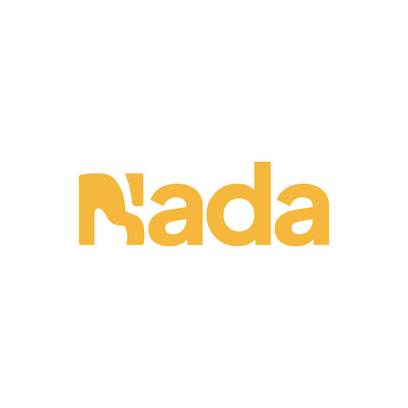
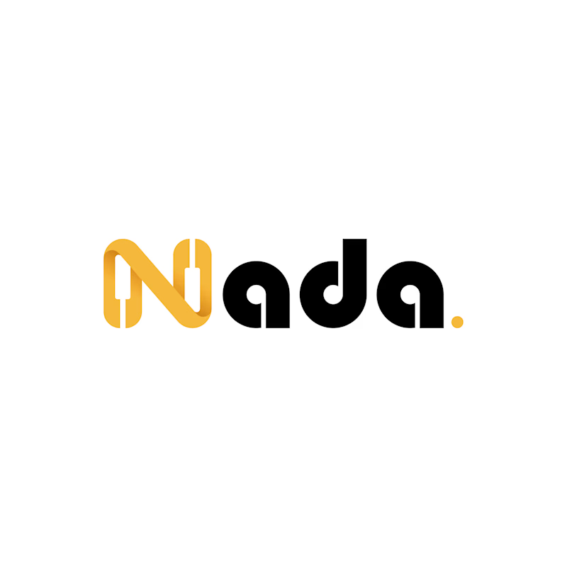
Challenge: Nada's old logo had a unique shape, but the "N" was hard to read and the design didn't connect to music.
Solution: I redesigned the logo with a piano-built "N" monogram and letterforms that carry music notes. A golden dot closes the wordmark like a final note. The warm gold stays, now paired with black for a more premium look.
Result: A clearer, more memorable logo that tells the brand story at a glance. The client loved it.
1 vote
Ends in 14h

The piano keys forming the N is a smart fix, it solves the readability problem and the music link in one move. The golden dot as a final note is a lovely detail.

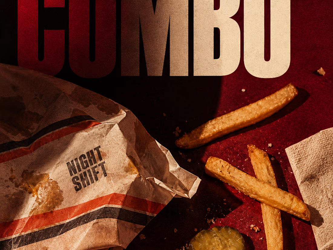
The second poster in a conceptual burger campaign using editorial still-life photography, experimental typography and a dramatic shadow system.


A vector design workspace: a tool rail, editorial poster and social artboards on the canvas, and a side panel with inspector, layers, history and an AI chat that previews colour, gradient, rotation or text changes before applying them.