The network for creativity
Join 1.25M professional creatives like you
Connect with clients, get discovered, and run your business 100% commission-free
Creatives on Contra have earned over $150M and we are just getting started
Back to feedPost

Dukkan Branding & Packaging
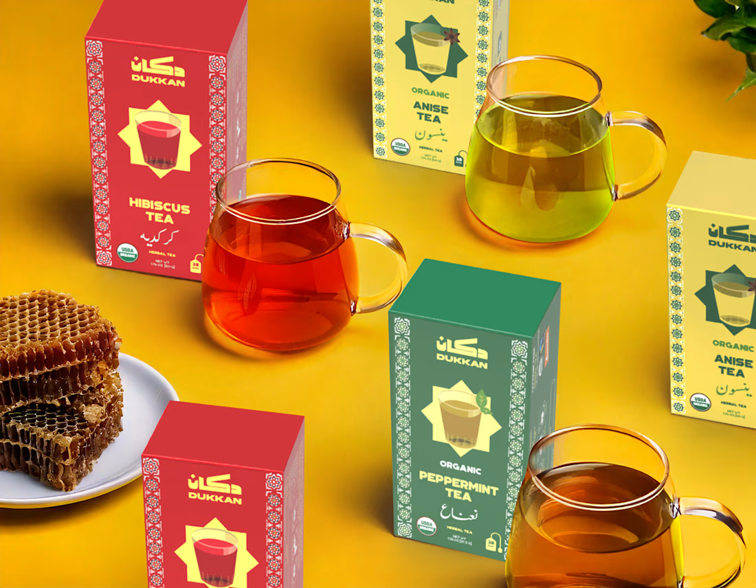
Dukkan is an online brand based in New York that aspires to be the ultimate destination for lovers of Arabic cuisine, bringing the essence of the Middle Eastern market ('Dukkan') experience to the heart of a bustling metropolis. We wanted every element of Dukkan's brand to feel like an authentic invitation to step into a place that resonates with the warmth and richness of home, reflecting our culture and culinary heritage. Dukkan is more than just a shop—it's a neighborhood institution, the cornerstone of the community. From quick stops for spices to late-night snack runs, the dukkan has always been there, bridging tradition and convenience. With this project, we aim to bring the authentic spirit of the Arab dukkan to a global audience.
Inspired by the rich patterns and ornaments found in Middle Eastern culture, the design language combines vibrant geometric shapes and intricate details to evoke a sense of warmth, history, and familiarity. These elements create a visual connection to the local culture while celebrating the essence of community, which has always been central to the dukkan.
The overall aesthetic is playful and retro, drawing inspiration from vintage decorations and signage in Egypt. This nod to the past is not just a design choice but a way of celebrating the long-standing tradition of the dukkan. By incorporating nostalgic elements, we aim to create a sense of belonging for both local customers and those experiencing the dukkan for the first time.
Through this project, we are not only introducing quality products but also continuing the legacy of community building that the dukkan represents. Whether you're looking for daily essentials or a taste of home, Dukkan is here to deliver that timeless neighborhood experience.
Challenges
With New York's crowded brand landscape, standing out required a deep cultural connection and vibrant identity to catch the eye amidst the competition. Our design solution was to blend authenticity with visual boldness, showcasing Arabic culture in a way that feels both familiar and distinctive.
Design Solution
For Dukkan's visual language, we chose Kufi script for its bold, traditional form that commands attention on supermarket shelves. The typography is balanced by vibrant colors to draw in the viewer, and complemented by patterns inspired by traditional Arabic art, adding layers of cultural depth and familiarity. Additionally, we utilized a Farsi-inspired Arabic script for a refined accent, and paired it with a clear, bold English font for easy readability.
Impact
The result is a brand that feels rooted and dynamic, where every touchpoint—from packaging to digital presence—invites audiences to experience Arabic culture firsthand, as if they're stepping into a familiar space filled with authentic flavors and stories.


The network for creativity
Join 1.25M professional creatives like you
Connect with clients, get discovered, and run your business 100% commission-free
Creatives on Contra have earned over $150M and we are just getting started

Challenges
View all


Related posts




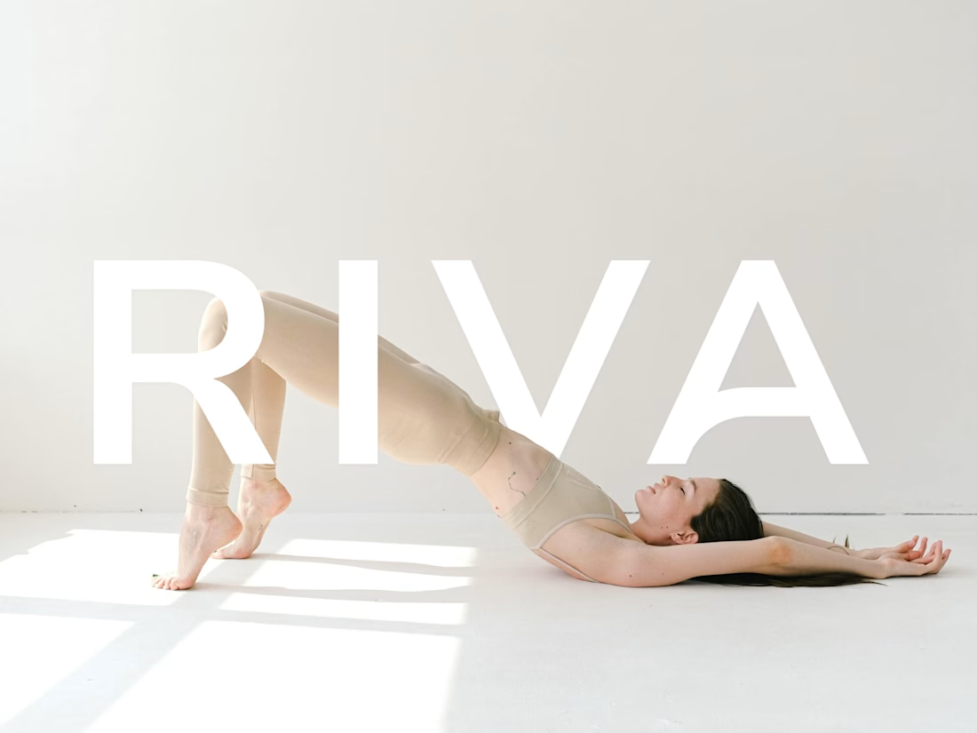
How do you turn movement into a visual identity without literally showing movement?
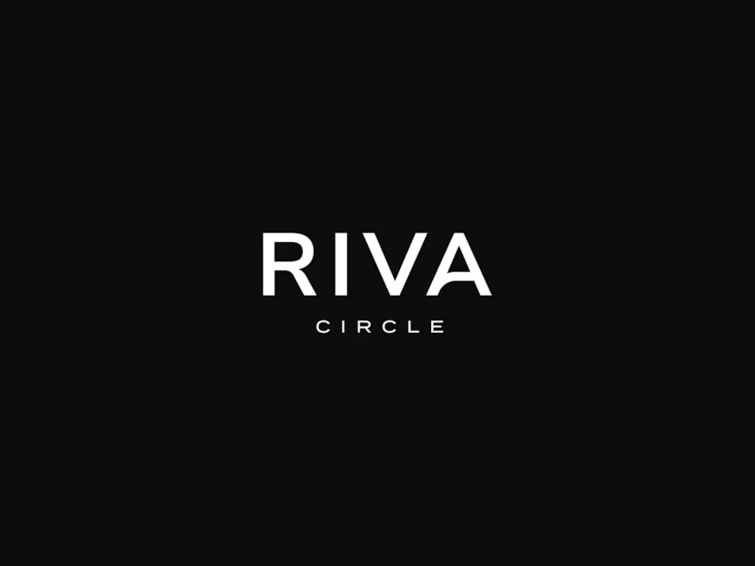
That was one of the questions behind the branding for Riva Circle, a Pilates studio based in St. Gallen, Switzerland.
Riva Circle came to us as a completely new brand. The task was to build the brand from the ground up and create a visual language that could define how Riva Circle would be perceived from the very beginning.
The goal was to create something modern and dynamic, but without being loud or overly expressive. We wanted the brand to feel refined and contemporary, while still capturing something essential to Pilates: movement, control, balance, and the connection with the body.
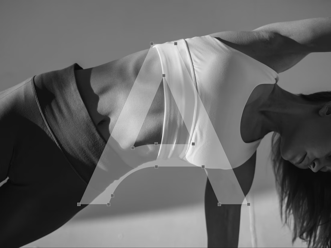
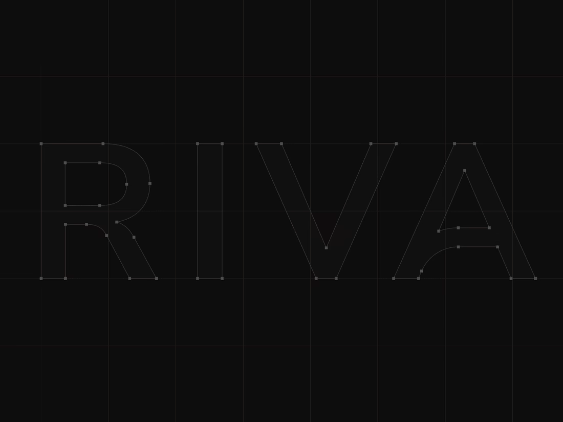
That became the starting point for the wordmark. We explored how we could translate the expression of the body and the movement of Pilates into typography. Rather than illustrating movement directly, we looked for a way to make it part of the letterforms themselves.
This led us to a custom typographic treatment where a simple continuous line becomes part of the letters. Most importantly, that line appears within the letter A, creating a subtle but distinctive gesture. From that detail, we developed the visual language of the brand. The result is intentionally simple, clean typography, a restrained visual system, and a recognizable symbol built from the same idea of movement.
For me, that balance was really important. The brand needed to have enough character to be recognizable, but not so much visual noise that it would compete with the experience Riva Circle is offering.
And I think the brand has proven that direction quite well. Just one year after launching, Riva Circle has grown, established a recognizable presence, and, most importantly, built a strong community around the studio.
So, this project was ultimately about taking something as expressive as movement and finding a very simple visual expression for it. One that can stay relevant as the brand continues to grow.


Creative work :)

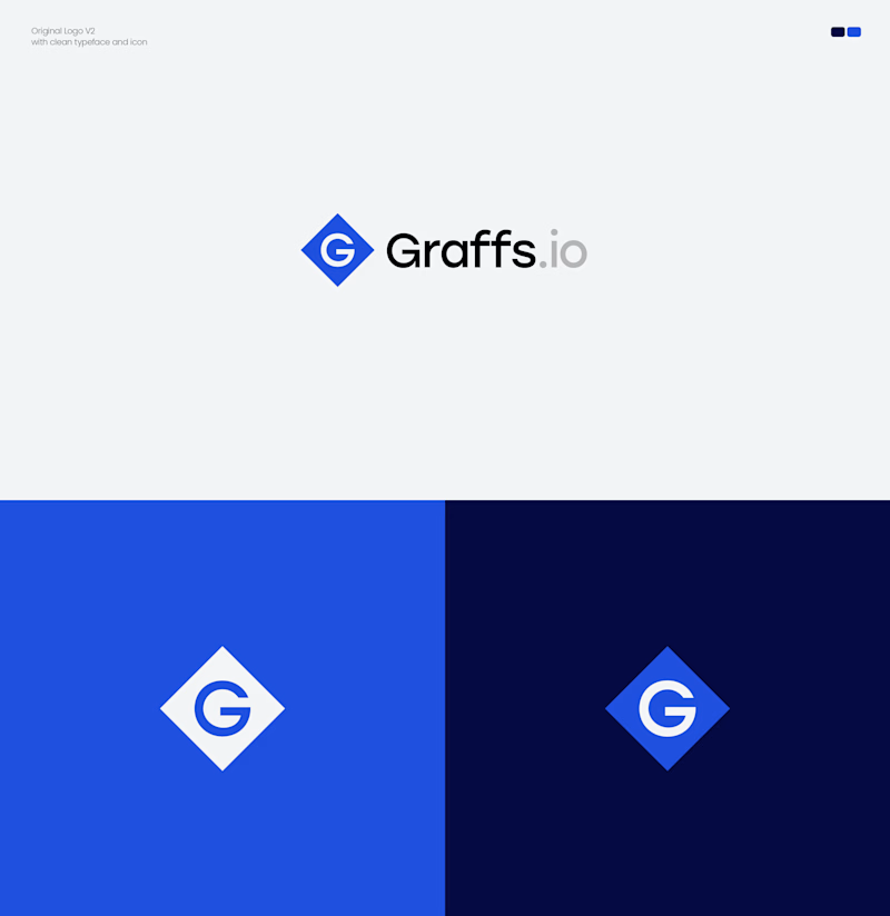
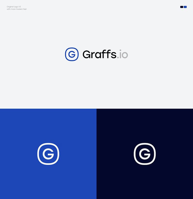
Two directions. One brand. Which Graffs logo would you choose?
I explored two approaches for Graffs, one bold and recognizable, the other clean, modern & minimal.
🔷 Option 1 — Bold & Iconic
⭕ Option 2 — Modern & Minimal
Which one feels stronger to you? 👀
Vote below! 🗳️👇
11 voted
39%
17 voted
61%
28 votes
Closed

2 is perfect match text to icon and colors also