The network for creativity
Join 1.25M professional creatives like you
Connect with clients, get discovered, and run your business 100% commission-free
Creatives on Contra have earned over $150M and we are just getting started
Back to feedPost
Taste Test

Sharing a few design options for the India Africa Summit! Each option explores a different creative direction while keeping the spirit of India and Africa at the heart of the design.
Would love to know which one you like the most. Drop your favourite in the comments and let’s see which design gets the most love!
1 voted
25%
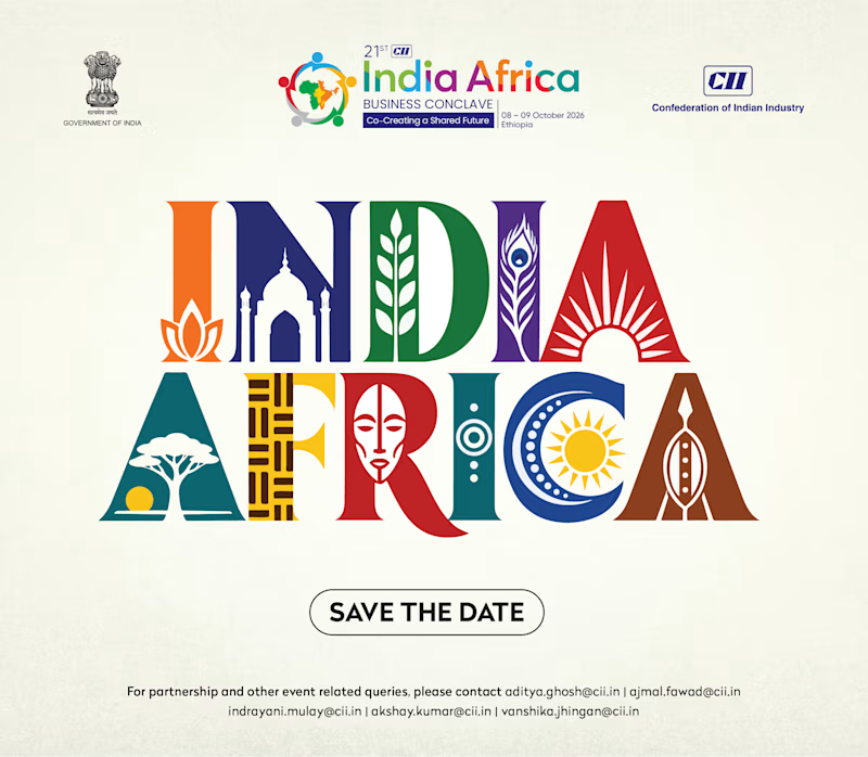
3 voted
75%
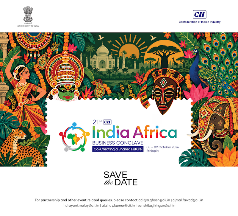
4 votes
Closed


option 2 for me the colors and layered illustration

I prefer Option 2! The vibrant colours and cultural illustrations look nice.

The network for creativity
Join 1.25M professional creatives like you
Connect with clients, get discovered, and run your business 100% commission-free
Creatives on Contra have earned over $150M and we are just getting started
Related posts

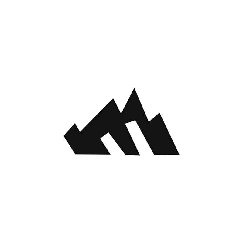
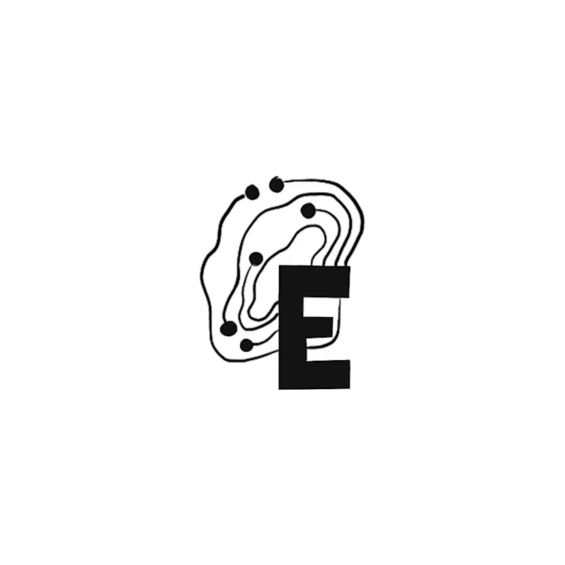
Happy Monday! Exploring early concept marks for a regional IT brand wanting to bridge modern IT services with Appalachian heritage.
Out of 10 sketches, my circle split right down the middle on these two:
A: The Ridge Monogram holds a bold silhouette where the "E" acts as the bedrock of the mountain ridge. It became a fast favorite with non-designer friends.
B: The Topo-Circuit idea plants a dynamic mark pairing circuit traces with elevation contours that can adapt to different locations as the business expands. (My personal pick!)
Which direction would you build out: A or B?
22 voted
73%
8 voted
27%
30 votes
Closed

I like the ridge monogram here!
because it is serving its purpose and it can be use in all applications.
The smallest ones as well.
Great work!🔥

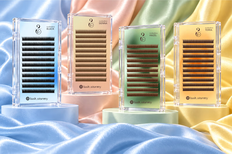
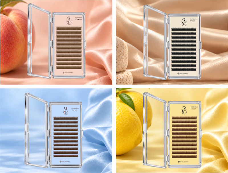
Two packaging directions for STORMY, currently in progress ✨
Exploring soft pastels and richer color finishes for the lash collection.
Which would you choose A or B?
I’d love to hear why.
3 voted
50%
3 voted
50%
6 votes
Closed

Option 1. Seeing the whole lash range together feels more like a proper collection.

I created 2 concepts for the same tagline "Shaping Skylines", for a vertical construction company. Both of these are scroll triggered, which one you prefer? I'm biased towards the skewed option.
I'm giving a free component copy for both of them:
Zoom in: https://framer.link/CQNgUkU
Skewed: https://framer.link/XTmQcBK
Check them out and if you'd like, use them in your upcoming project!
29 voted
64%
16 voted
36%
45 votes
Closed

Flawless