The network for creativity
Join 1.25M professional creatives like you
Connect with clients, get discovered, and run your business 100% commission-free
Creatives on Contra have earned over $150M and we are just getting started
Back to feedPost

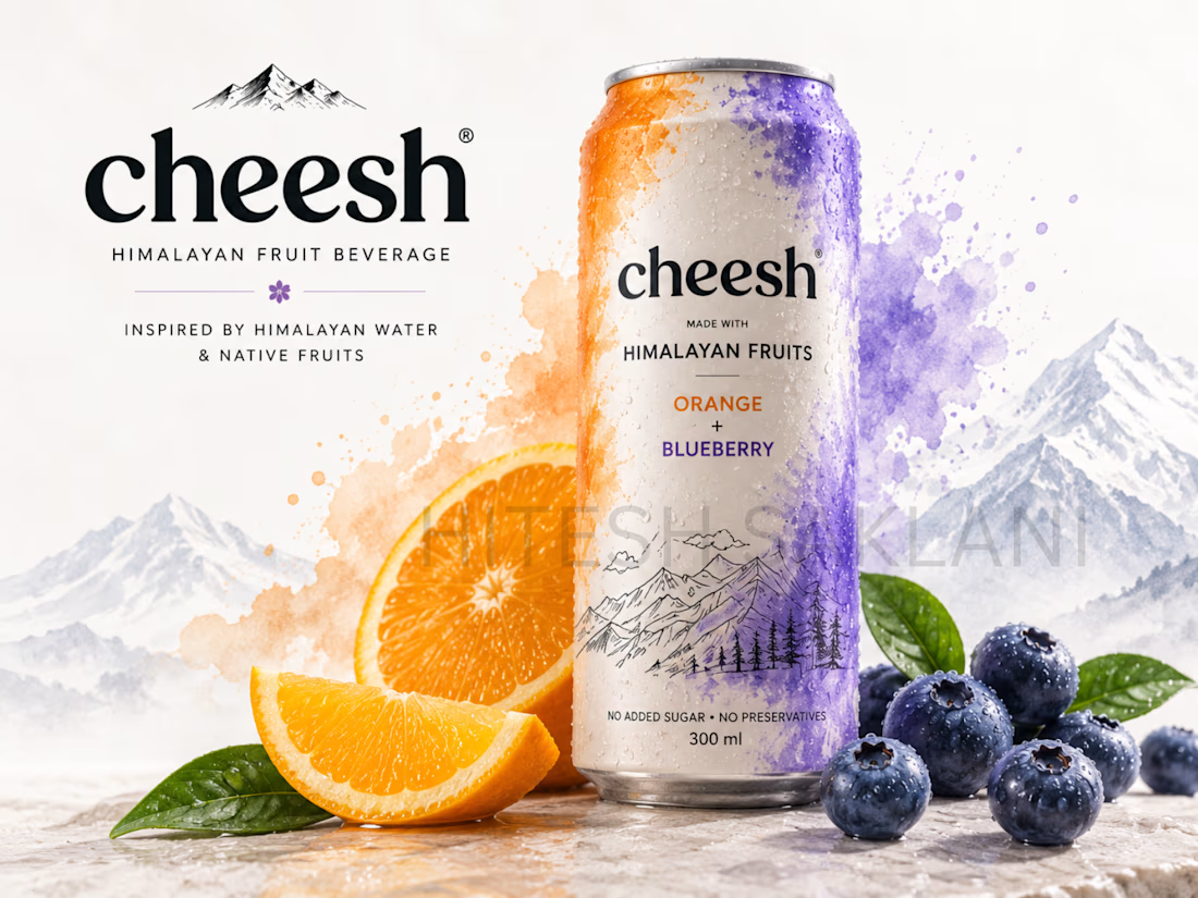
Cheesh — Himalayan Fruit Beverage Branding & Packaging.Developed a conceptual beverage brand inspired by Himalayan water and native fruits. I created the Cheesh brand identity and explored its application across beverage packaging and promotional visuals. The project combines Himalayan-inspired illustration, fruit-focused imagery, typography, and color to create a distinctive visual identity for a modern fruit beverage brand. The packaging concept was designed to connect the natural Himalayan origin with a contemporary beverage aesthetic.


The network for creativity
Join 1.25M professional creatives like you
Connect with clients, get discovered, and run your business 100% commission-free
Creatives on Contra have earned over $150M and we are just getting started




Related posts

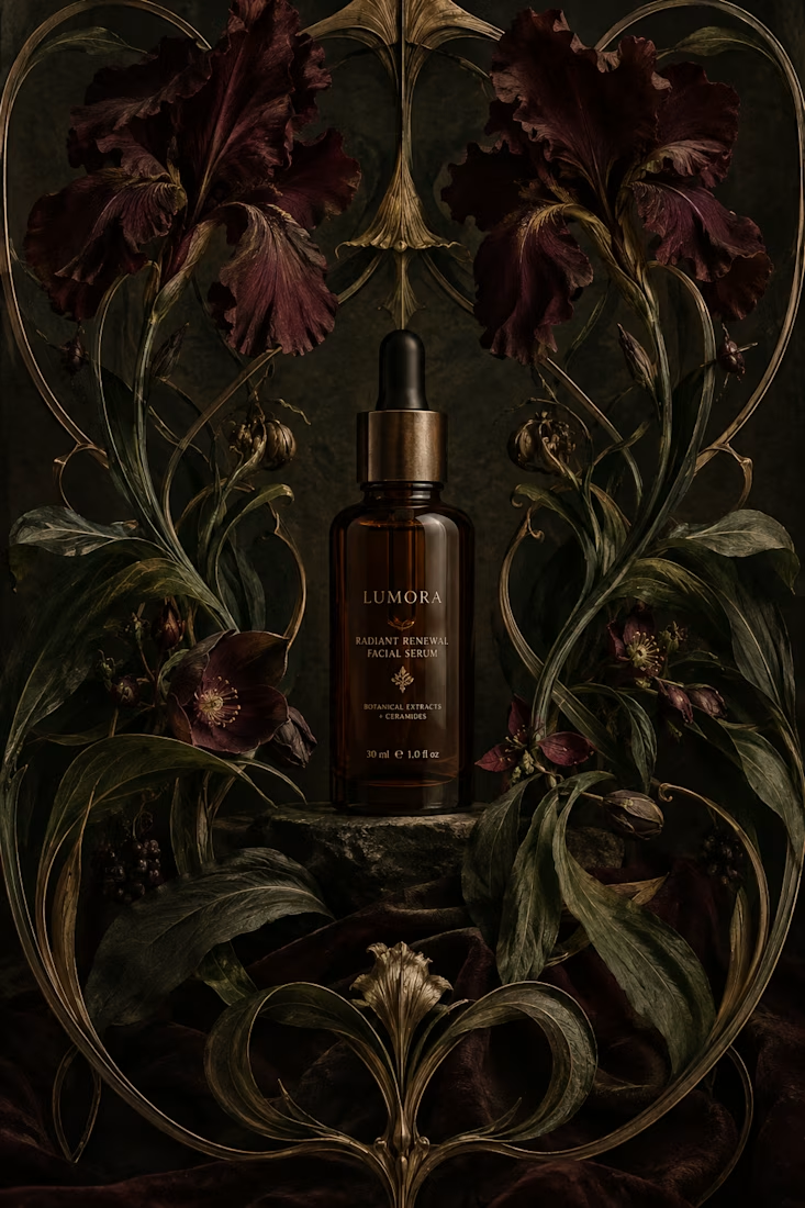
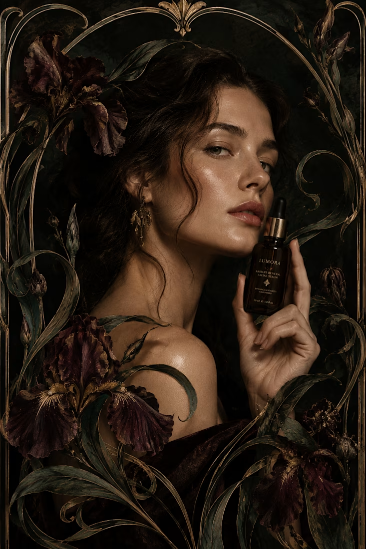
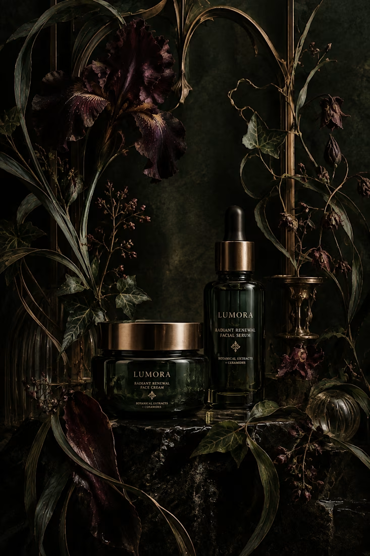
What would happen if a modern skincare product had to communicate without the visual language we associate with beauty today?
Instead, I went back to Art Nouveau, where typography, illustration, architecture, and ornament were treated as one visual system.
The subject actually felt surprisingly natural for the era. Art Nouveau was heavily inspired by nature, craftsmanship, beauty, and organic forms, all ideas that still show up constantly in skincare branding today.
One rule I refused to break: the decoration had to belong to the composition. It couldn't just be added on top to make something “look vintage.”
So... what modern product would you love to see reimagined in another design era? 👀


Reimagining modern skincare through Art Nouveau is such a refreshing take. Integrated ornamentation rather than surface-level decoration gives the packaging a deeply authentic, organic weight. Would love to see an electro functional tech brand reimagined in a Bauhaus or Brutalist framework!

Building a frozen yogurt brand from scratch and I'm obsessed with the mascot.Packaging, personality, all the tiny details still coming together.
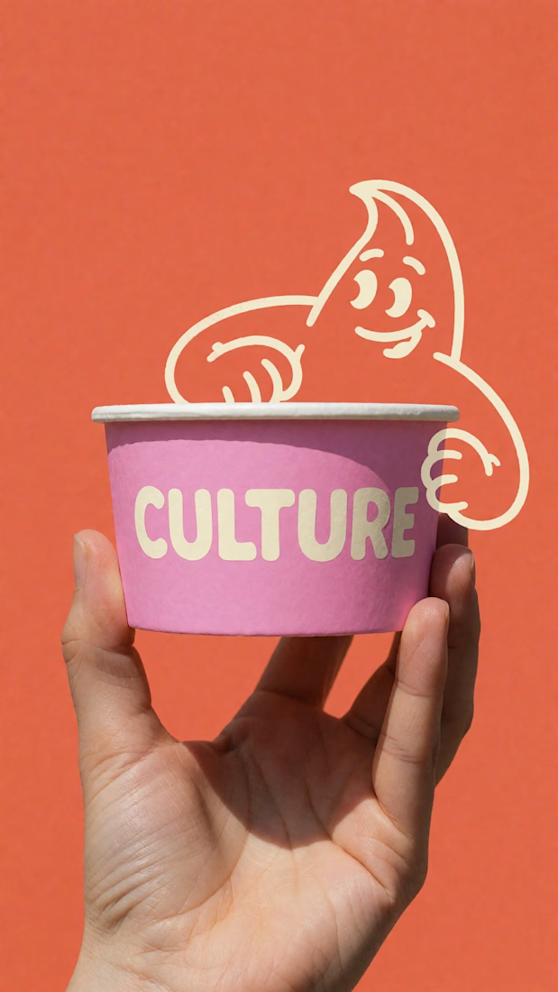
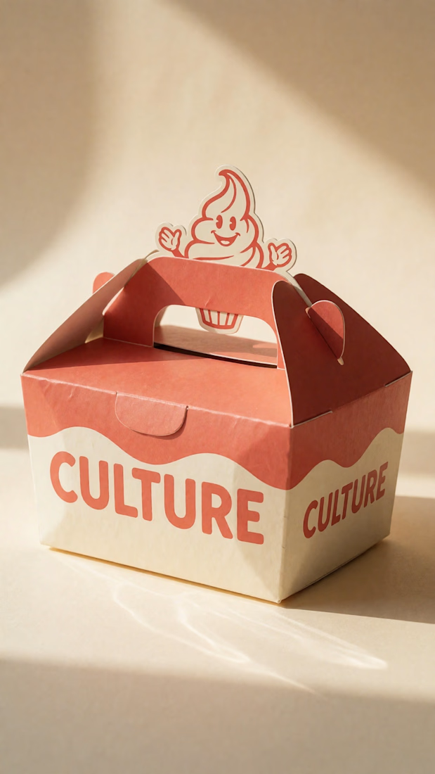
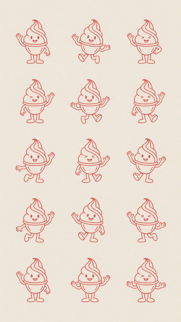
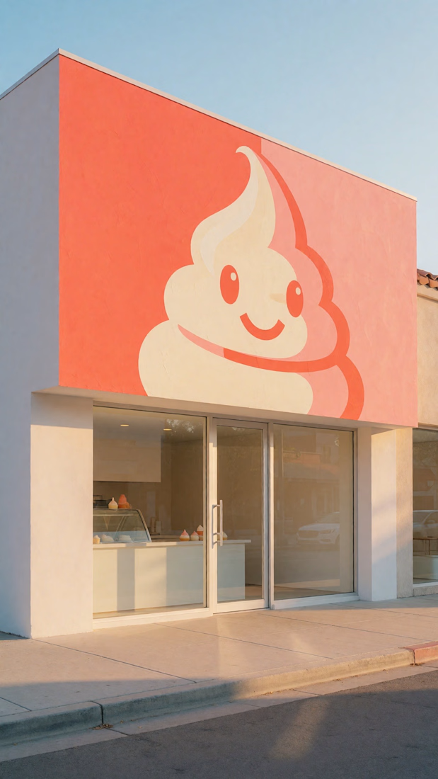

Branding 😍

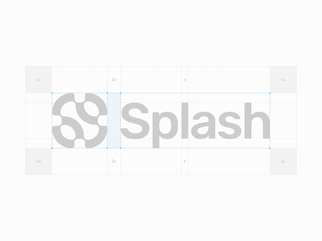

There is something so premium about seeing the construction lines of a brand identity. The mathematical precision on this layout is top-tier.