The network for creativity
Join 1.25M professional creatives like you
Connect with clients, get discovered, and run your business 100% commission-free
Creatives on Contra have earned over $150M and we are just getting started
Back to feedPost

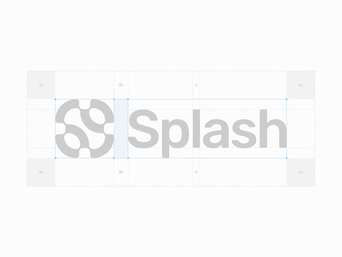

There is something so premium about seeing the construction lines of a brand identity. The mathematical precision on this layout is top-tier.

Love seeing the construction grid exposed instead of hiding the process—those spacing guides make the mark’s geometry feel intentional and give the wordmark a real sense of rhythm.

Love seeing the construction lines in the frame. The logo mark has a nice interlocking quality and the wordmark feels like it belongs together with it. That S curve in the icon is doing a lot.

this is so satisfying!


Construction shots like this always make me curious about the versions that didn't survive, the ones where the grid technically works but the letterforms stop reading as T and L. Is TL a personal mark or a client name?

The spacing system is satisfying to look at, but I especially like how the symbol carries the same soft, fluid rhythm as the wordmark. Feels precise without becoming overly rigid.


clean

Construction lines are basically showing your working out, and yours actually add up. That grid makes the Splash mark feel inevitable rather than drawn.

Splendid work, love the lockup and geometrical explantation!

I love this idea man!! 🎉

I love how you merged negative splash✨
cool
The network for creativity
Join 1.25M professional creatives like you
Connect with clients, get discovered, and run your business 100% commission-free
Creatives on Contra have earned over $150M and we are just getting started








Related posts


A little excerpt from the brand guidelines for a recent project


The APS mark built from the four small symbols reads like a map legend, which suits a psychology service. Nice that the guidelines page shows it on the dark teal, most would have played it safe on white.


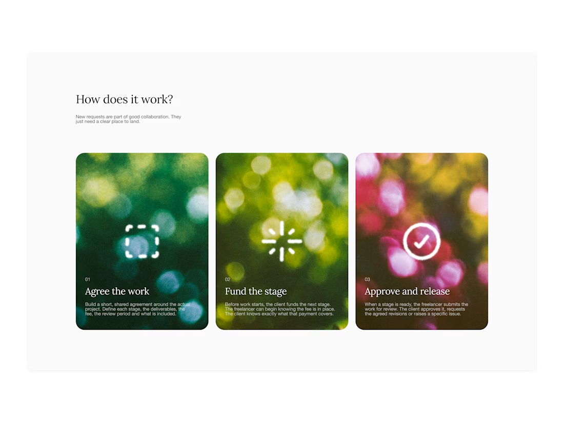
Your web sections always have such strong art direction. Great to see the brand carried right into the layout.

I’ve been working on a bold, modern-retro logotype and can’t decide between these two options.
🆘 Which one feels more aesthetically pleasing to you?
11 voted
26%
31 voted
74%
42 votes
Closed

CAPITAL is great but SMALL is unique great job Nawras 🔥🔥