The network for creativity
Join 1.25M professional creatives like you
Connect with clients, get discovered, and run your business 100% commission-free
Creatives on Contra have earned over $150M and we are just getting started
Back to feedPost
Redefining Stock Analysis: Zerodha x Tijori
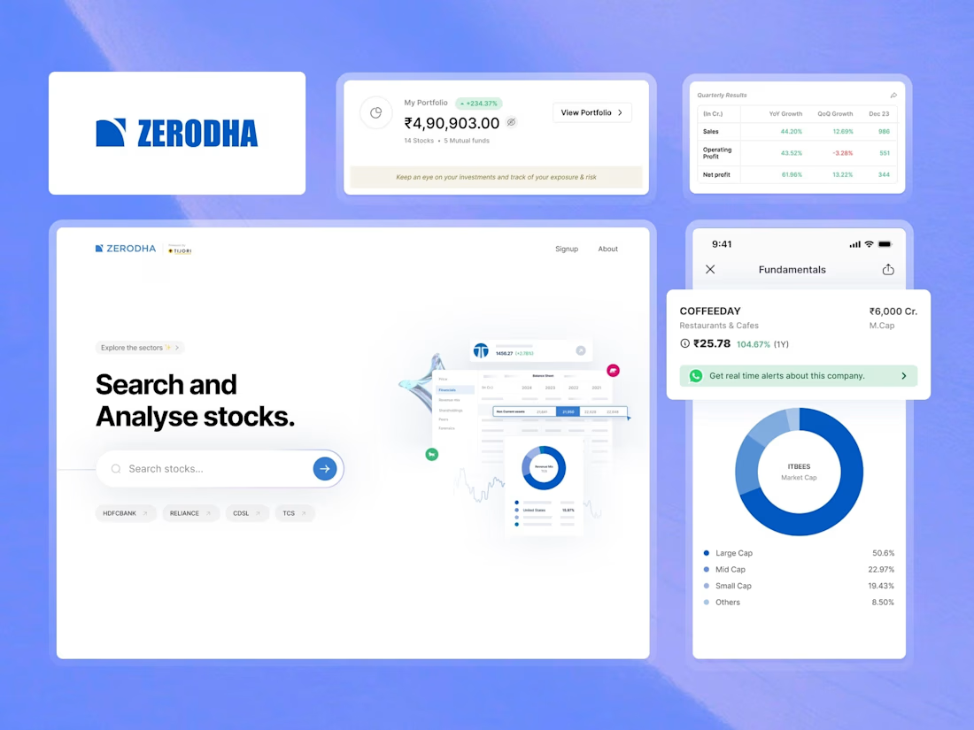
Financial data doesn't have to be overwhelming. For this project, the goal was to bridge the gap between complex fundamental data and intuitive user experience.
By focusing on clean typography and structured data visualization, we’ve created a dashboard that allows investors to "Search and Analyse" with zero friction. From quarterly growth tables to deep-dive fundamental charts, every element is designed to make the data the hero.
Key Features:
Streamlined "Fundamentals" mobile view.
Interactive Portfolio tracking with clear YoY/QoQ growth metrics.
Minimalist Search UI for faster stock discovery.eading



This is a thoughtful balance between financial depth and user experience. Making complex fundamentals searchable and intuitive—especially across mobile views and YoY/QoQ comparisons—shows strong design judgment. Letting the data remain the hero while reducing friction is exactly what investor-facing tools need.

Absolutely @Varghese C

Clean, powerful, and focused on the user. Turning complex data into clear insight is no small feat, great work on this intuitive dashboard.
The network for creativity
Join 1.25M professional creatives like you
Connect with clients, get discovered, and run your business 100% commission-free
Creatives on Contra have earned over $150M and we are just getting started

Challenges
View all


Related posts

A little interactive experiment for Verdant 🌱
Writing unique code for animations makes iterating on reactive micro-interactions so much smoother. It completely transforms how a brand narrative feels in the browser.


Great job

My previous poll showed unexpected results (I am very grateful to everyone who took the time to vote and comment 🤍).
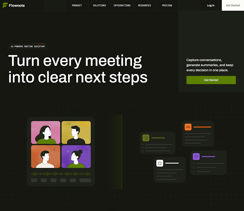
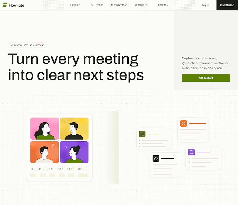
Now I am curious about your opinion on the color mode for this hero section. I definitely like a light theme. What about you?
By the way, I made a nice animation for this design. You can see it on my profile
28 voted
54%
24 voted
46%
52 votes
Closed

To be honest the dark mode looks really good

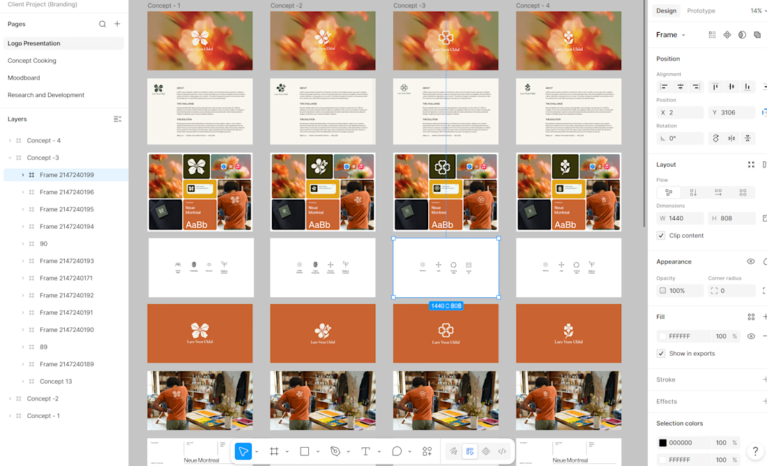
Still cooking. 🍊✨
Exploring visual directions, logo concepts, typography, color, and brand applications for a new identity in the making.
This is one of those stages where the brand starts taking shape — testing, refining, questioning, and finding the direction that feels right.
Not final. Just part of the process.
#BrandIdentity #BrandingProcess #LogoDesign #VisualIdentity #BrandDesign #CreativeProcess #DesignExploration #BehindTheScenes #GraphicDesign #IdentityDesign