The network for creativity
Join 1.25M professional creatives like you
Connect with clients, get discovered, and run your business 100% commission-free
Creatives on Contra have earned over $150M and we are just getting started
Back to feedPost

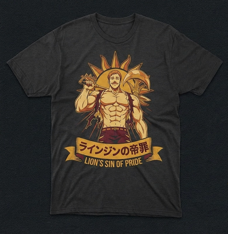
The Lion’s Sin of Pride: Exclusive Graphic Tee 🦁☀️
Fusing my expertise in Graphic Design and Visual Storytelling, I’ve created this premium tribute to Escanor.
This piece blends bold anime aesthetics with a modern streetwear edge.
Design:
Original high-detail vector art with a vintage sunburst finish.
Quality: Precision-crafted for those who value unique, artist-driven apparel.
Creative Services: Available for custom merchandise design, professional writing, and audio mixing.
📩 DM to secure your shirt or to collaborate on your next project!

The network for creativity
Join 1.25M professional creatives like you
Connect with clients, get discovered, and run your business 100% commission-free
Creatives on Contra have earned over $150M and we are just getting started





Related posts

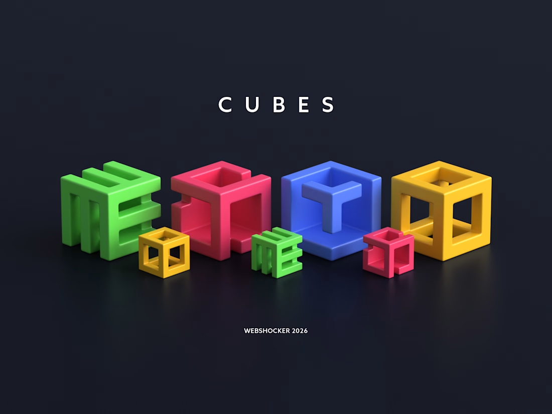
Created this custom 3D icon set for 3D Walkabout.
The icons are built around a cube-based system, with subtle variations to clearly represent different services while keeping a cohesive brand identity.



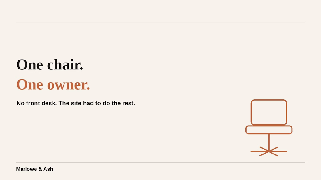
it's one chair. one owner. no front desk, no assistant, nobody picking up the phone.
that's exactly why the booking site had to do more work than most salons' ever will. built for #lovablechallenge, submitted via @contra — would appreciate a like:



Good luck Rahul 🙌

Bang & Olufsen Beoplay H95 "Enjoy The Sound with Beoplay H95'
-
We are Studio Jorza, A 3D Studio based in Prague
Want to know more about us or work together?
You can send message here or You can send the email to studiojorza@gmail.com
3D Animation3D RenderingMotion DesignAdobe After EffectsAdobe IllustratorBlender3dvisualization3dmodellingmotiondesign


So good!