The network for creativity
Join 1.25M professional creatives like you
Connect with clients, get discovered, and run your business 100% commission-free
Creatives on Contra have earned over $150M and we are just getting started
Back to feedPost

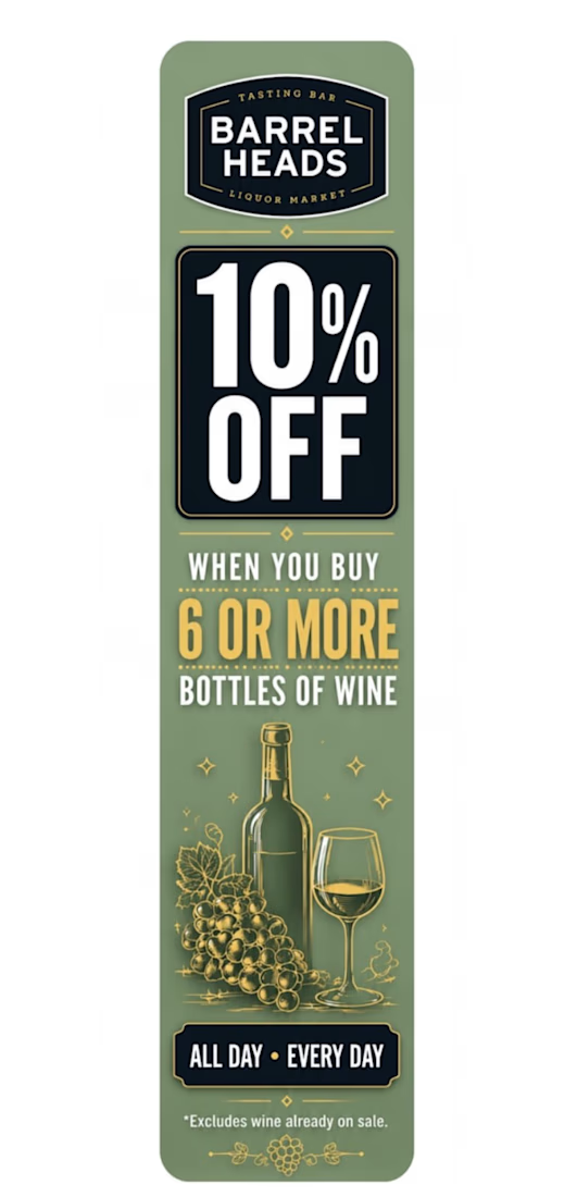
Retail Wine Promotion Aisle Blade Design
Designed a custom retail aisle blade display for a liquor market to promote a volume-discount wine offer and increase visibility within the wine department.
The objective was to create a sign that shoppers could understand in seconds while maintaining strong brand consistency. The design uses a clear visual hierarchy, high-contrast typography, and wine-themed graphics to draw attention to the promotion and encourage larger basket purchases.
Project Highlights:
• Retail promotional signage design
• Visual merchandising principles
• Brand integration and consistency
• Print-ready production file
• Customer-focused visual hierarchy
• In-store marketing optimization
Challenge: Create a professional, eye-catching display that clearly communicates the promotion while fitting the store’s branding.
Solution: Developed a vertically formatted aisle blade featuring the offer as the primary focal point, supported by strong typography and simple messaging to maximize shopper engagement.
Tools Used: Canva, PDF Export, Retail Merchandising Best Practices
Skills: Retail Merchandising • Visual Merchandising • Retail Marketing • Store Operations • Signage Design • Shopper Marketing • Retail Consulting • Promotional Displays
Outcome: Delivered a print-ready retail display designed to improve promotion visibility and support increased multi-bottle wine purchases.


The network for creativity
Join 1.25M professional creatives like you
Connect with clients, get discovered, and run your business 100% commission-free
Creatives on Contra have earned over $150M and we are just getting started





Related posts







Option B feels nothing but premium

Which hero visual feels right for this brand?
While working on the homepage for Halfspace, a website design and SEO agency, I explored two different hero visuals for the same headline and layout. Same message, same structure, just a different visual metaphor and mood.
Option 1 - Rocket Launch. Bold, literal, and energetic, visually reinforcing the "launch your business" message with motion and fire.
Option 2 - Glass Cube. Abstract, sleek, and premium, giving a more refined, tech-forward feel without relying on a literal metaphor.
Would love your honest UX/UI take, which direction feels more impactful, memorable, and aligned with a web design/SEO brand, and why?
11 voted
41%
16 voted
59%
27 votes
Closed

Both design are great; it's hard to choose one