The network for creativity
Join 1.25M professional creatives like you
Connect with clients, get discovered, and run your business 100% commission-free
Creatives on Contra have earned over $150M and we are just getting started
Back to feedPost
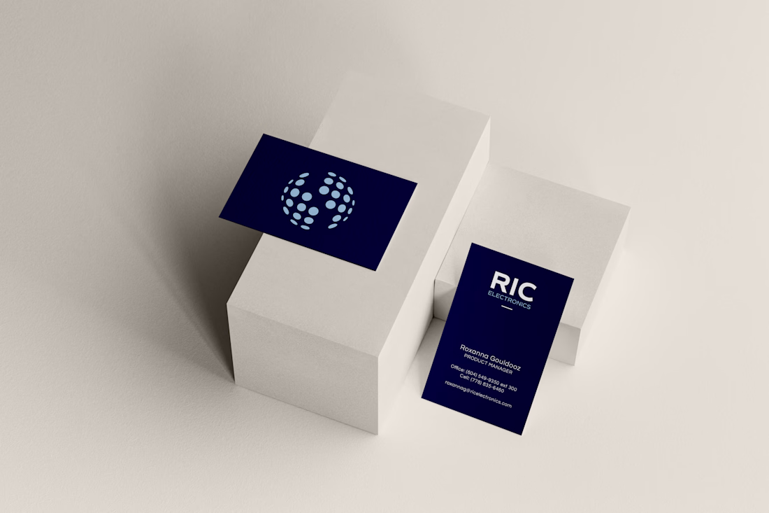
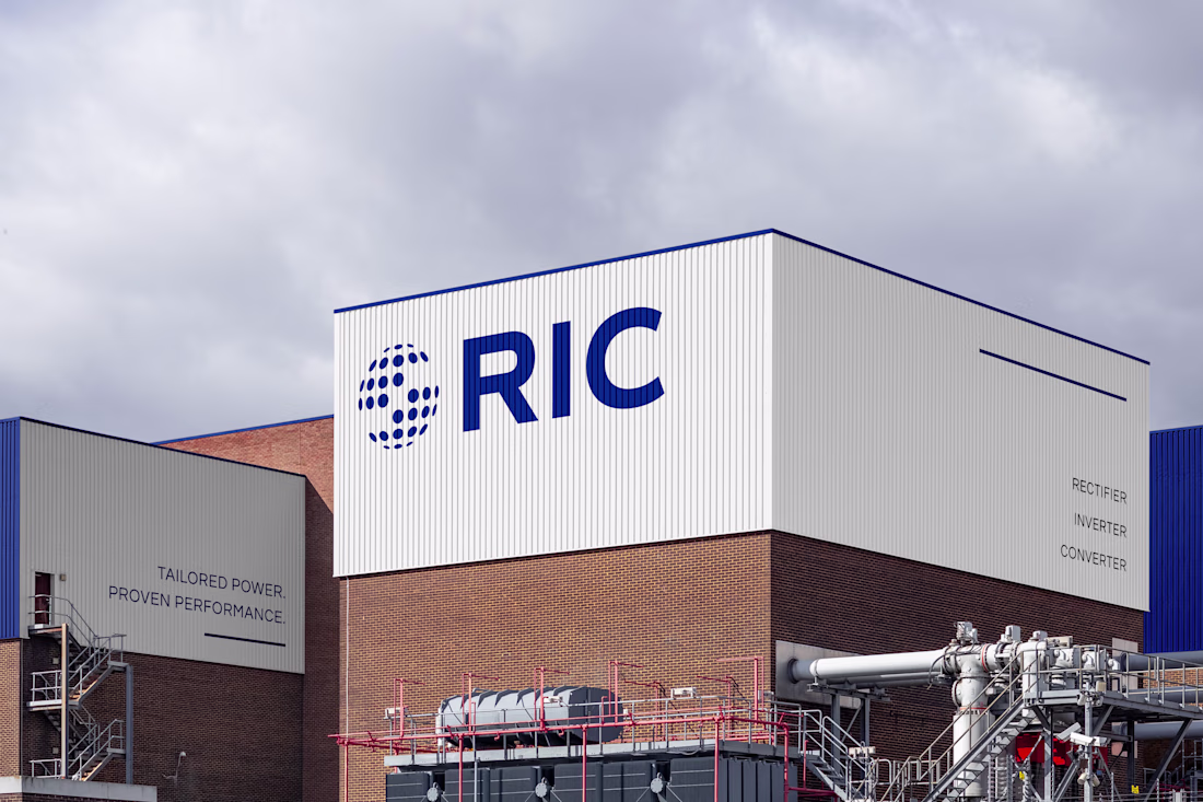
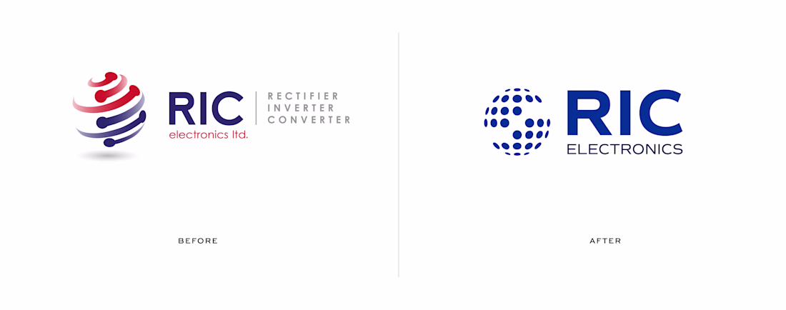
I led a brand refresh for RIC Electronics, a Canadian manufacturer specializing in power and energy solutions.
This wasn’t a total rebrand, it was a refinement. The original logo felt outdated and disconnected from the team, so the goal was to create something that still honoured their roots but reflected who they are now: sharper, stronger, and more aligned.
The result: a cleaner form, refined typography, and a mark with meaning that's built for the people who use it every day!!
Graphic DesignAdobe IllustratorAdobe PhotoshopbrandingBrand DesignshareyourworkAdobe InDesignLogo Designcasestudy

@Georgia Mashford Love how it feels evolved, not reinvented — the kind of refresh that respects legacy but sharpens perception..
@Anush | Ex-Freshworks thankyou!
@Georgia Mashford Hmm Very practical and solid but still a refreshing take, great stuff!
@Olayinka Adeyefa thanks!!
@Georgia Mashford Looks really nice 🔥
@Georgia Mashford turned out so clean
@Daniel G Bright thank youu 🙌🏼
@Georgia Mashford Nice work 🔥
@Ahmedsami thankyou!
@Georgia Mashford Clean and confident.
@Chirag Madhu thanks!
@Georgia Mashford great work bro😍
@Majid Ali thanks!
@Georgia Mashford Did you use Adobe Illustrator?
@Georgia Mashford crisp and looks great
@Sri Vatsava thanks!!
@Georgia Mashford que projeto legal
@Georgia Mashford the minimal globe looks awesome
the business card also looks good with the color
@Devanuj Nath thanks!!
@Georgia Mashford you're welcome
@Georgia Mashford Turned out so gooood 👏
@Georgia Mashford It is very clean! Great design!
@Darko Taleski Darko Taleski Thanks Darko!
The network for creativity
Join 1.25M professional creatives like you
Connect with clients, get discovered, and run your business 100% commission-free
Creatives on Contra have earned over $150M and we are just getting started
Trending
Claude
Claude has entered the design space. How are you using Claude Design?
Contra University
Learn from expert creatives how to earn more using next-gen AI tools.
MagicPath
The canvas is infinite, and exploration is becoming the workflow. How are you using MagicPath?
creativeaiflow
Creative AI workflows are evolving. What tools do you use, and what are their strengths and weaknesses?
freelancerlife
Freelancer life is wins, pivots, and everything in between. What’s yours right now?