The network for creativity
Join 1.25M professional creatives like you
Connect with clients, get discovered, and run your business 100% commission-free
Creatives on Contra have earned over $150M and we are just getting started
Back to feedPost

Christine Valmy International Academy of Beauty – Kolkata Branch
UX/UI Design Case Study | WordPress CMS
Overview
Christine Valmy Kolkata required a modern digital presence that reflected its international reputation in beauty education while improving lead generation, course discovery, and mobile usability.
Problem
The existing website faced several UX challenges:
Outdated visual design that did not reflect a premium international beauty brand.
Complex navigation made it difficult for prospective students to discover courses.
Limited mobile optimization impacted usability and inquiries.
Success stories and placement achievements lacked visibility and credibility.
Static content management created dependency on developers for updates.
Weak call-to-actions resulted in lower enquiry conversions.
Research & Findings
User interviews and heuristic evaluation identified four primary user goals:
Explore available beauty and cosmetology courses.
Verify certifications and international accreditations.
Review student success stories and career outcomes.
Contact counselors quickly for admissions guidance.
UX Strategy
The experience was redesigned around a clear student journey:
Awareness → Course Discovery → Trust Building → Enquiry → Admission
Key UX improvements included:
Simplified information architecture.
Clear course categorization.
Prominent enquiry CTAs.
Mobile-first responsive layouts.
Trust signals through certifications and accreditations.
Dedicated success stories and placement sections.
UI Design Approach
The visual language was inspired by luxury beauty and wellness brands.
Color Palette
Premium Magenta for actions and conversion elements.
Soft Green for elegance and calmness.
Neutral backgrounds for readability.
Typography
Large editorial headlines.
High readability body text.
Strong visual hierarchy for scanning.
Components
Course cards
Testimonial modules
Accreditation badges
Sticky enquiry actions
Mobile navigation patterns
Solution
Homepage Redesign
Created a visually engaging hero section highlighting global certifications and career opportunities.
Course Experience
Structured course information with duration, curriculum, certifications, and outcomes.
Success Stories
Developed dedicated alumni pages showcasing placements and entrepreneurial journeys.
Mobile Optimization
Designed responsive layouts optimized for smartphones and tablets.
CMS Implementation
Built using WordPress CMS allowing staff to independently manage:
Courses
Success stories
Blogs
Events
Placement updates
SEO content
Results
Business Outcomes
Increased enquiry visibility through stronger CTA placement.
Improved course discoverability.
Enhanced trust through accreditation presentation.
Faster content publishing workflow using WordPress CMS.
UX Outcomes
Reduced navigation friction.
Improved mobile browsing experience.
Higher engagement with success stories and placement pages.
Clearer conversion path from visitor to enquiry.
Deliverables
UX Audit
Information Architecture
Wireframes
Responsive UI Design
WordPress CMS Development
SEO Foundation Setup
Mobile Optimization
Performance Optimization
Technology Stack
Platform: WordPress CMS
Responsive Framework: Mobile First
CMS Features: Dynamic Courses, Blog, Success Stories
SEO: Search Engine Optimized Architecture
Performance: Optimized Assets and Caching
Project Impact
The redesigned Christine Valmy Kolkata website successfully transformed a traditional informational website into a modern lead-generation platform that reflects the institution's premium international positioning while providing prospective students with a seamless and intuitive digital experience.


The network for creativity
Join 1.25M professional creatives like you
Connect with clients, get discovered, and run your business 100% commission-free
Creatives on Contra have earned over $150M and we are just getting started



Related posts

Solar Energy Website
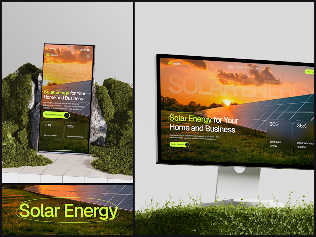
A thin lime circle tells you which two words this page is about.
The headline sits over a sunset photo of a panel field. The "Get started" and "Explore innovations" buttons share the circle's lime, so the eye moves from the circled words straight to the next step.
Large faded capitals repeat those two words across the sky, faint enough to stay inside the photo. On mobile they break onto two lines, and the headline and button stack above two frosted cards.
Only two words of "Solar Energy for Your Home and Business" are lime, and the whole page follows them.
Designed by the Hue & Machine team.
#SolarEnergy #RenewableEnergy #CleanTech #WebDesign #LandingPage #HeroSection #UIDesign #ResponsiveDesign #MobileDesign #FigmaDesign



This is really cool, Nice job Dmytro


Which brand showreel preview design would you choose - Silver & Ropes or Purple Stones? ⚡
Lynksen is cooking something fire...
and we need your expert eyes on this one 🔥😎
Vote and tell why! 👇

12 voted
24%
37 voted
76%
49 votes
Closed

Going with Purple Stones. It feels more distinctive and memorable for a showreel, Silver & Ropes is clean but a bit safer.

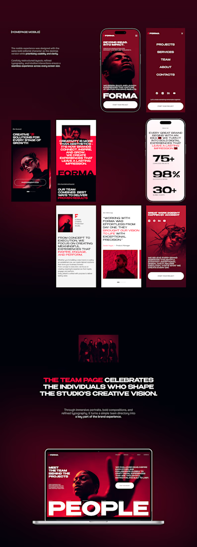
FORMA | Creative Studio Website Design
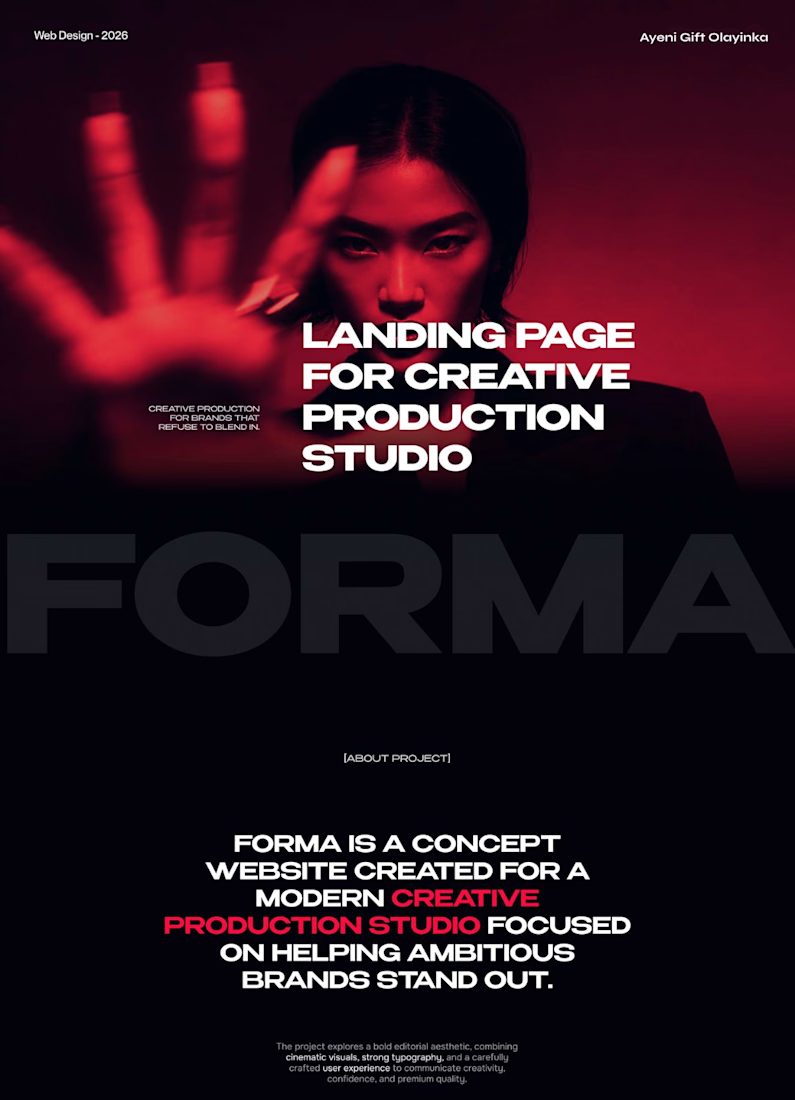
A bold, cinematic website concept for a modern creative production studio.
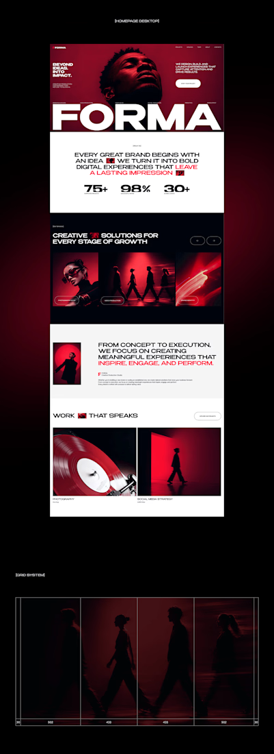
FORMA is a concept website that shows how strategy, design, and digital production come together in one immersive brand experience. The design is built on three things:
Editorial layouts that give the content room to breathe and set a confident, magazine-style rhythm
Cinematic red-lit photography that gives the brand a dramatic, memorable visual identity
Expressive typography that carries the studio’s voice and guides the eye through each section
The goal was a site that feels like the studio’s work: striking, intentional, and made to leave an impression.
My role: UI/UX Design, Visual Direction, Landing Page Design
Tools: [Figma / Photoshop / etc.]
#CreativeAgencyWebsite #CreativeStudio #LandingPage #WebDesign #WebsiteDesign #UIUX #UIDesign #EditorialDesign


Cool direction for the studio.