The network for creativity
Join 1.25M professional creatives like you
Connect with clients, get discovered, and run your business 100% commission-free
Creatives on Contra have earned over $150M and we are just getting started
Back to feedPost

BRIX - Architecture & Interior Design Studio
BRIX is a self-initiated concept project exploring the digital identity of a contemporary architecture and interior design studio.
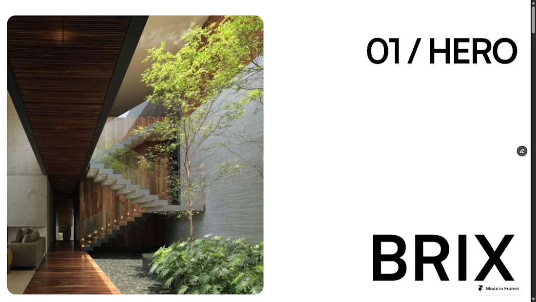
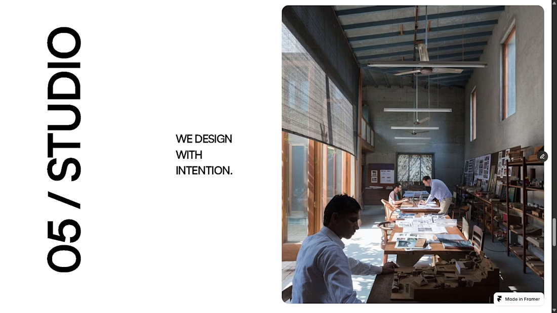
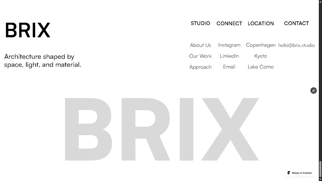
The goal was to create a minimal, editorial experience that feels as considered as the spaces the studio designs. I focused on strong typography, generous whitespace, architectural imagery, and a restrained monochromatic visual language to create a sense of clarity and sophistication.
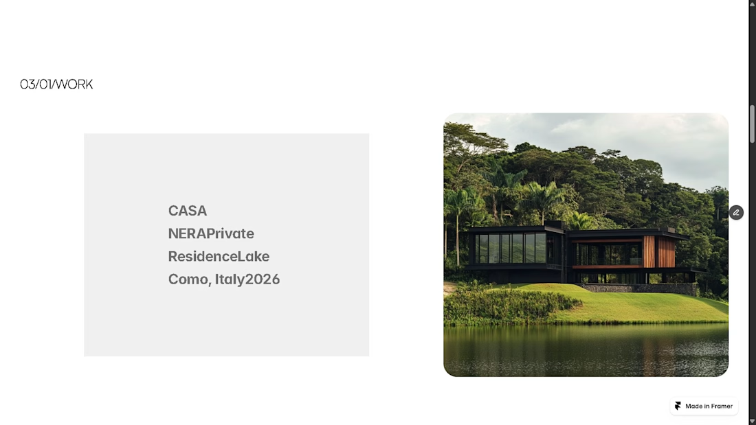
The landing page was designed and built in Framer, with subtle motion and interactive elements throughout including animated project cards and an interactive before/after experience.
Rather than filling the page with information, I wanted the design to communicate through space, rhythm, typography, and imagery, allowing the work itself to take center stage.
A self-initiated project, built from concept to final interaction.
#Framer #webdesign #uiux #WebDevlopment


The network for creativity
Join 1.25M professional creatives like you
Connect with clients, get discovered, and run your business 100% commission-free
Creatives on Contra have earned over $150M and we are just getting started

Challenges
View all


Related posts

SENE car rental Website Projects
A car rental website shouldn't make people think too much. It should help them find the right car, understand the price, trust the service, and book with confidence.
I designed SENE around exactly that principle.
Need a website that turns visitors into customers?
I help businesses create modern, conversion-focused websites that look premium and make the user journey easier.
Available for website design & redesign projects.
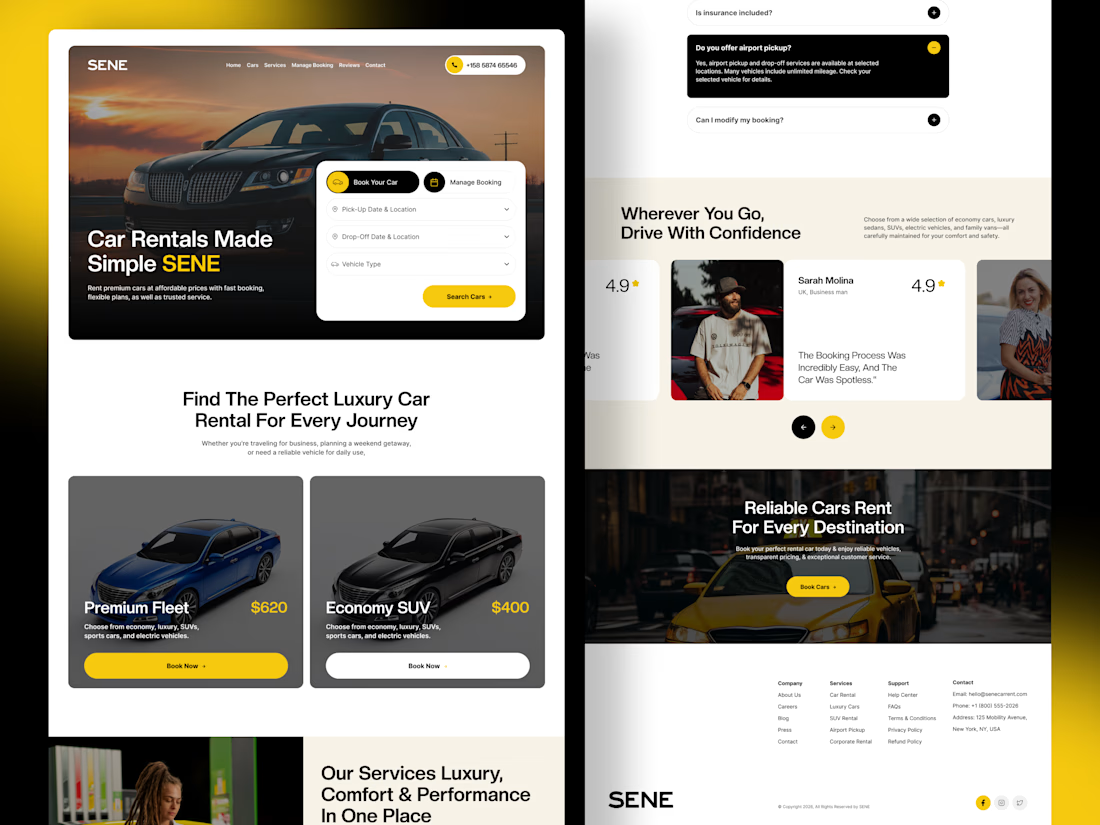

The yellow and black colour palette, strong typography, and layout create a professional automotive experience. 🔥


“Or similar” leaves a lot to the imagination.
A few billboard designs I made for Sync as part of the rebrand. The campaign centres on a simple promise: the car you see is the car you drive.
I kept that message big and direct, with the cars up close and enough pink to make you look twice.
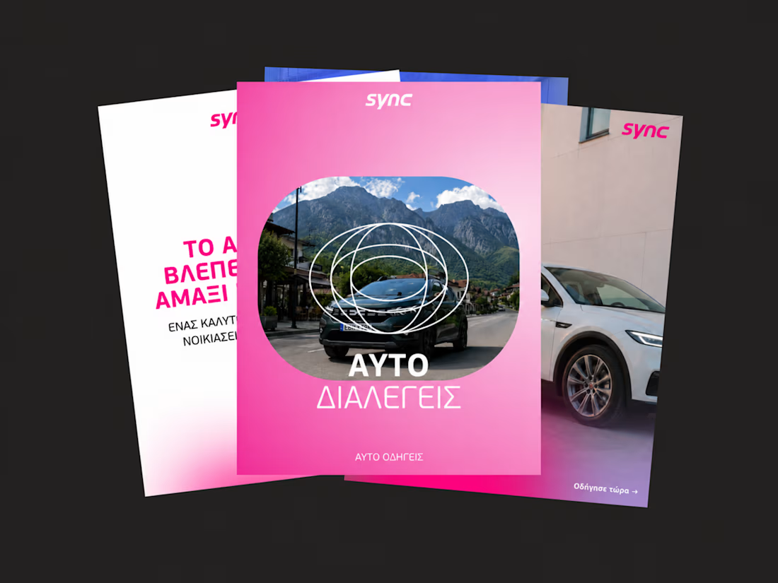
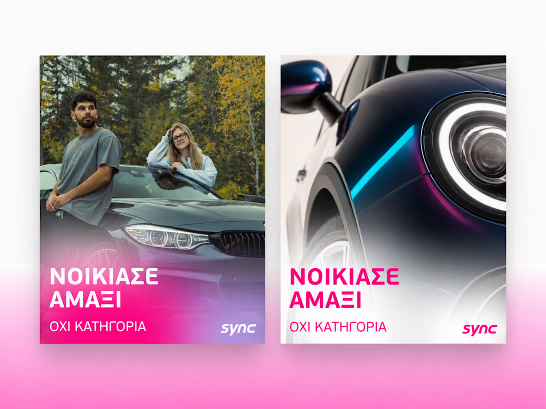
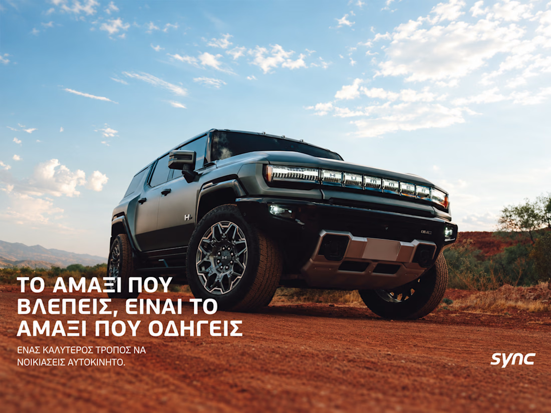
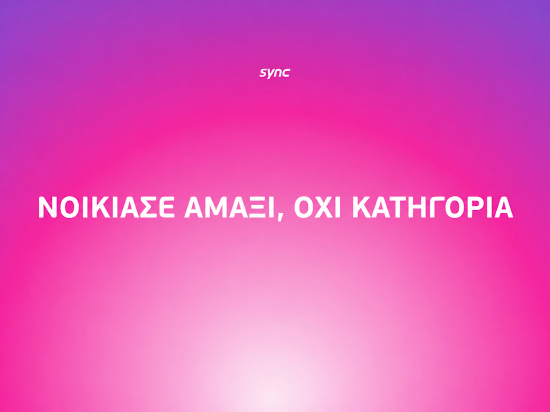

The way the oversized promise carries through the pink palette is really effective—the close-up crops make the car feel immediate without losing the campaign idea.

What if a space brand didn’t just look futuristic — but felt like it was already living in the future?
For XPACE, the goal was to build a visual identity that could turn the idea of space exploration into a complete and immersive brand experience.
The identity combines a bold typographic system, a high-contrast visual language, and electric blue accents against deep black to create a futuristic presence that feels precise, technological, and unmistakably XPACE.
But the identity didn’t stop at the logo.
The system was extended across digital interfaces, web design, favicon and UI icons, access cards, board passes, and branded applications — creating a consistent experience across every touchpoint.
Every detail was designed to make XPACE feel less like a brand inspired by the future, and more like a brand built for it.
XPACE — Visual Identity System.
Looking to build a visual identity that goes beyond a logo?
Let’s create something with a world of its own.


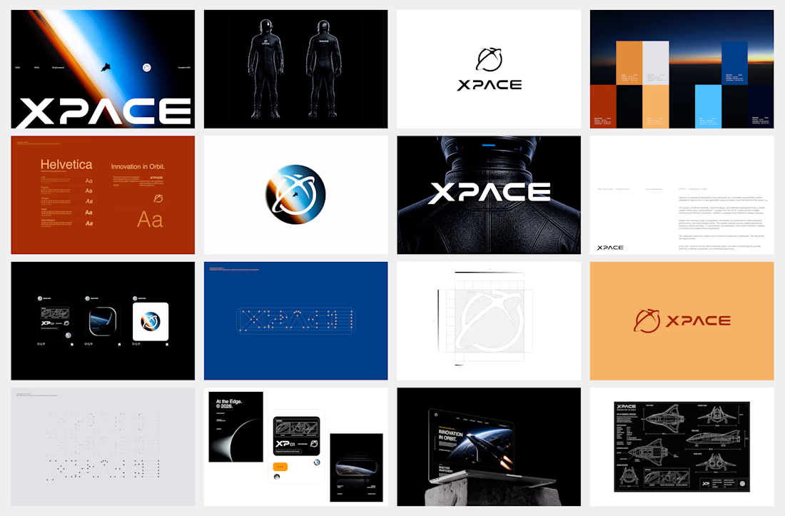
The identity system feels cohesive because the typography, electric blue accents, and image language all push in the same direction. Extending that logic into interfaces and packaging is what makes XPACE feel like a real world, not just a futuristic logo.