The network for creativity
Join 1.25M professional creatives like you
Connect with clients, get discovered, and run your business 100% commission-free
Creatives on Contra have earned over $150M and we are just getting started
Back to feedPost
Taste Test
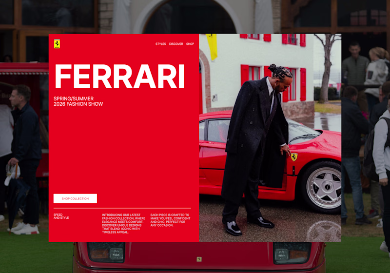
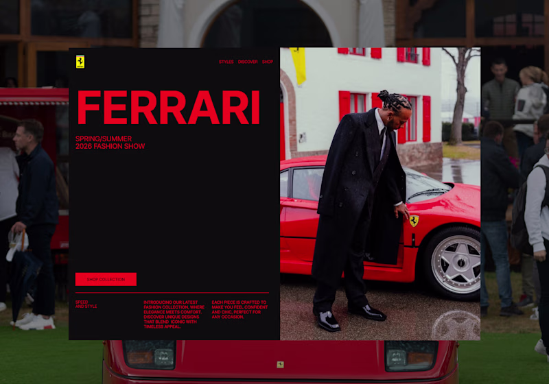
I’m exploring two hero directions for a Ferrari-inspired fashion landing page concept and testing which visual direction feels stronger.
Direction 1 uses the classic Ferrari red as the main brand moment. It feels bold, energetic, and instantly recognizable, with a cleaner fashion editorial layout.
Direction 2 shifts the experience into a darker, more luxury-driven direction. The black background makes the red feel sharper and gives the page a more premium, high-fashion feel.
Both directions have a different impact:
Direction 1: bold, iconic, energetic
Direction 2: luxury, dramatic, fashion-forward
I’m leaning toward Direction 2 because it feels more elevated and editorial, but I’d love to hear which one feels stronger at first glance.
25 votes
Ends in 18m
this is amazing
Thanks bro
Going for direction 1
I can see that. Direction 1 definitely hits faster at first glance — the red feels more iconic and instantly connected to Ferrari. That’s the main thing making me consider it.
This is really inspiring. I've been exploring emotional and atmosphere-driven digital experiences lately, so it's interesting to see a different perspective.
Thank you, I appreciate that. I’ve been thinking about that a lot too — how a landing page can create a feeling before someone even reads the details. For this one, I’m trying to balance brand recognition with a more editorial atmosphere.
its actually a tough choice to make ngl. But i have to go with direction 2 as the colors are much more influenced by the main image
it’s a tough choice because Direction 1 has that instant Ferrari impact, but Direction 2 feels more connected to the main image.
Exactly
If we're talking about fashion, then Direction 2 definitely takes the top spot
Exactly — Direction 1 feels more instantly Ferrari, but Direction 2 feels more fashion-led and editorial. For this concept, that premium fashion feel might be the stronger direction.
number one has my vote, but only by about a hair. both feel like really strong presentations!
Thank you, I appreciate that. I feel the same — both directions are close. Direction 1 has that bold Ferrari impact, while Direction 2 feels more editorial. Good to know D1 still has your vote.
Nice.....
Thanks
Ferrari
Direction2
Will go for Direction 2
The network for creativity
Join 1.25M professional creatives like you
Connect with clients, get discovered, and run your business 100% commission-free
Creatives on Contra have earned over $150M and we are just getting started
Related posts
Did you know a tornado formed the year you were born?
Not a real one. A data one.
Type your birth year. Watch the storm react - the speed, the color, the rage of it - all driven by the exact CO₂ levels recorded that year.
🌪️Live Site - https://thedatatornado.figma.site
💻GitHub Repo - https://github.com/isumenuka/Thedatatornado
🔬 The Problem
Climate change is the most documented crisis in human history. Scientists have been collecting data for over 65 years. But most people feel nothing when they see the numbers - because a wall of data doesn't make you care. That is a design problem. The Data Tornado is my answer.
⚙️ How It Was Built
I started in FigJam - mapping the full app structure, severity color system (Stable → Elevated → Critical → Extreme), and the 65-year climate timeline before touching any build tool.
In Figma Make, I loaded my complete design guidelines first - colors, fonts, spacing rules - so every generated output matched my vision from the first prompt. That one step eliminated hours of corrections.
The MCP connector was the most critical technical piece: a custom live pipeline to NOAA's servers, pulling real CO₂ and temperature readings automatically every time someone opens the app. No downloading. No pasting. Always live.
The hero background video was generated entirely in Figma Weave - I set a start frame and end frame, and Weave generated the full atmospheric storm footage between them. The Figma Agent handled precision edits throughout -clicking directly on individual elements, repositioning buttons, aligning sections, without touching anything else.
Supabase powers the share cards, news gallery, and live data caching. GitHub handles deployment.
🛠️ Tools Used
→ FigJam: full app structure, severity system & data flow diagrams
→ Figma Make: prompt-to-code app with custom NOAA MCP connector
→ Figma MCP: live pipeline direct to NOAA's climate API
→ Figma Weave: AI video generation for the hero storm background
→ Figma Agent: precision element-level UI edits throughout the build
→ Supabase: backend for share cards, news & data caching
→ GitHub: deployment and version control
✨ Key Feature - Birth Year Telemetry
Enter your birth year. The app instantly generates your personal climate log -the exact CO₂ concentration the year you arrived in the world, your temperature anomaly then vs. now, your severity level at birth vs. today. It stops being a global statistic. It becomes yours.
Most people go quiet when they see their own number.
What happened on the day you were born? Share your link in the comments!
THIS IS MINE - https://thedatatornado.figma.site/?share=d9844bb7-12d7-4c5a-94e8-ebd84ade9f8b
Claude Fable 5 just one-shotted this landing page.
check live lumio.apollostudio.design
prompts library lafys.com
yes i saw but have you read prompt? It was like full developer guidance a to z.
Love this!
Trending
Claude
Claude has entered the design space. How are you using Claude Design?
Contra University
Learn from expert creatives how to earn more using next-gen AI tools.
MagicPath
The canvas is infinite, and exploration is becoming the workflow. How are you using MagicPath?
creativeaiflow
Creative AI workflows are evolving. What tools do you use, and what are their strengths and weaknesses?
freelancerlife
Freelancer life is wins, pivots, and everything in between. What’s yours right now?