The network for creativity
Join 1.25M professional creatives like you
Connect with clients, get discovered, and run your business 100% commission-free
Creatives on Contra have earned over $150M and we are just getting started
Back to feedPost

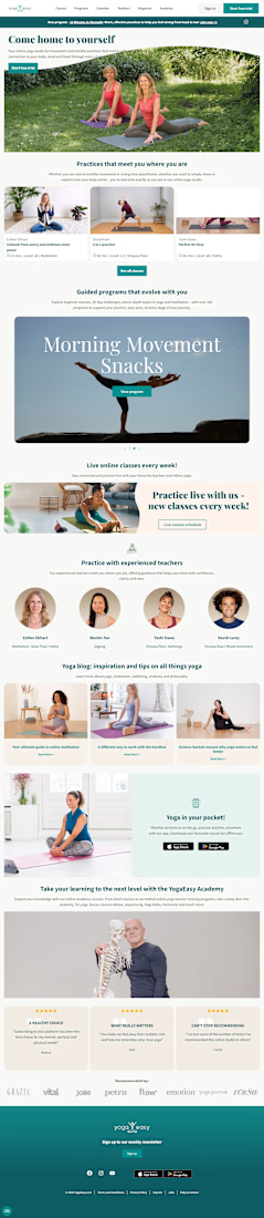
YogaEasy Inspired Landing Page Wordpress



The network for creativity
Join 1.25M professional creatives like you
Connect with clients, get discovered, and run your business 100% commission-free
Creatives on Contra have earned over $150M and we are just getting started
Related posts

Every creature in this identity is watching you.
Little Fen, a wetland club for kids. 50 creatures. 3 colors. Everyone gets eyes.
Case study drops soon.
Which creature goes first?
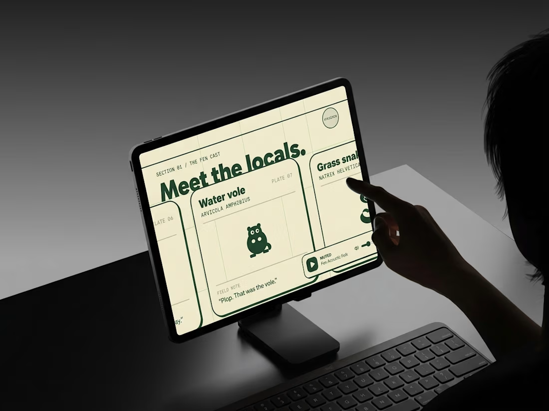
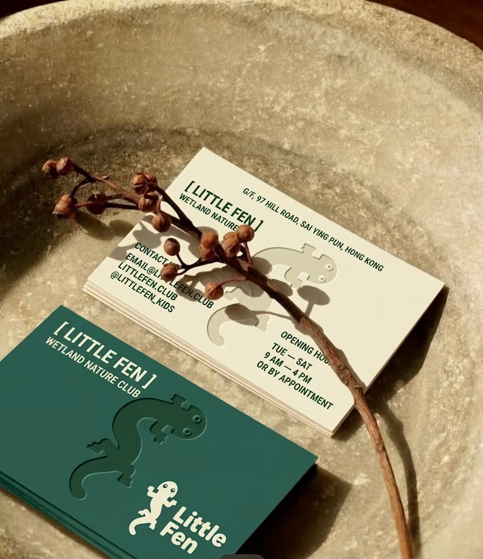
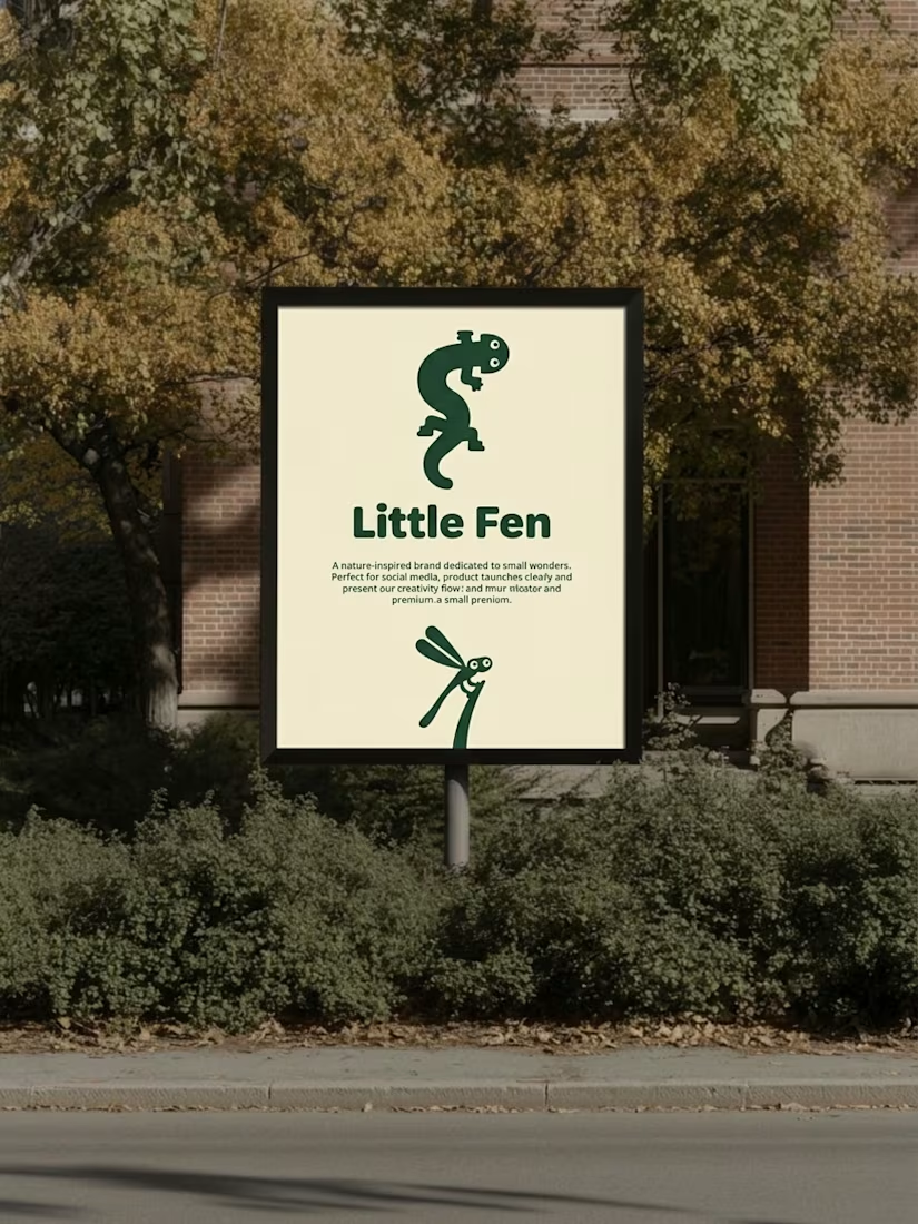

Hey Little Fen,
Can you see me?

Which hero background works better?
9 voted
75%
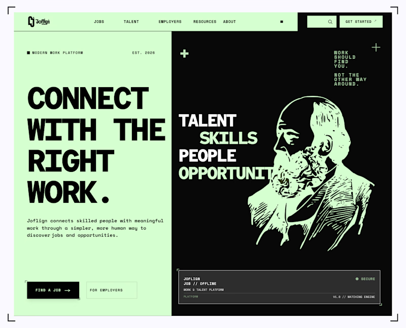
3 voted
25%
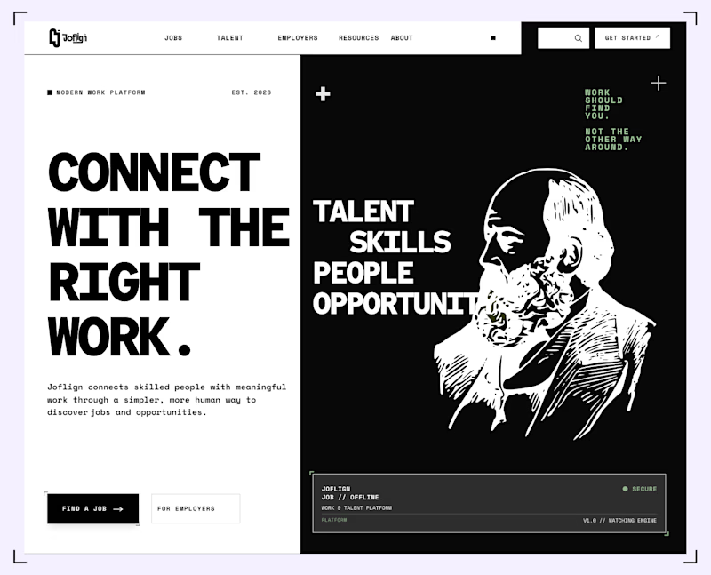
12 votes
Closed

I lean light green because it carries through both the copy panel and the illustration, making the two halves feel connected. I’d keep “Find a job” clearly stronger than “For employers” if jobseekers are the main audience. That hierarchy matters more than the background preference alone.

the reaction is why i do this.
brew & bite had great coffee, a pool table that's always busy — & no website. not even a domain.
so my brother designed it in figma, shot every photo at the café & built it with @Base44:
→ live open/closed
→ what's sold out
→ is the pool table free
the owner runs it all with one tap and in his own words " this makes it way easier to manage " this is his process video before you ask, no, i wasn't forced to post this from my account for reach

