The network for creativity
Join 1.25M professional creatives like you
Connect with clients, get discovered, and run your business 100% commission-free
Creatives on Contra have earned over $150M and we are just getting started
Back to feedPost

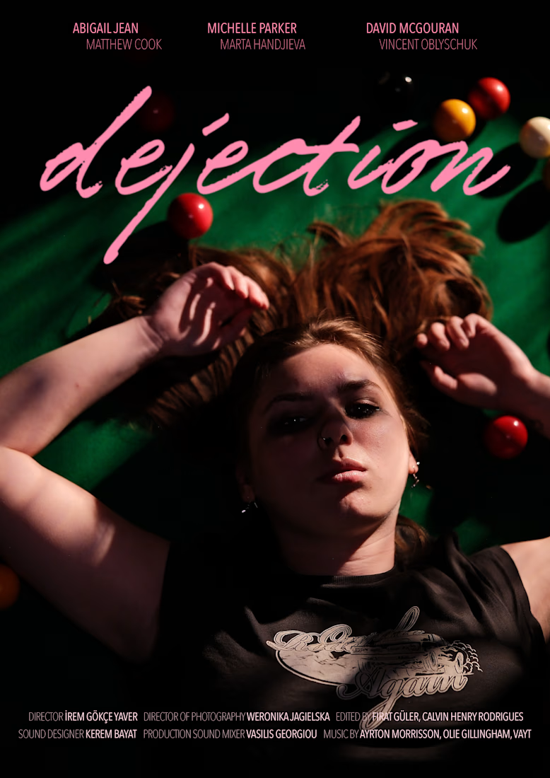
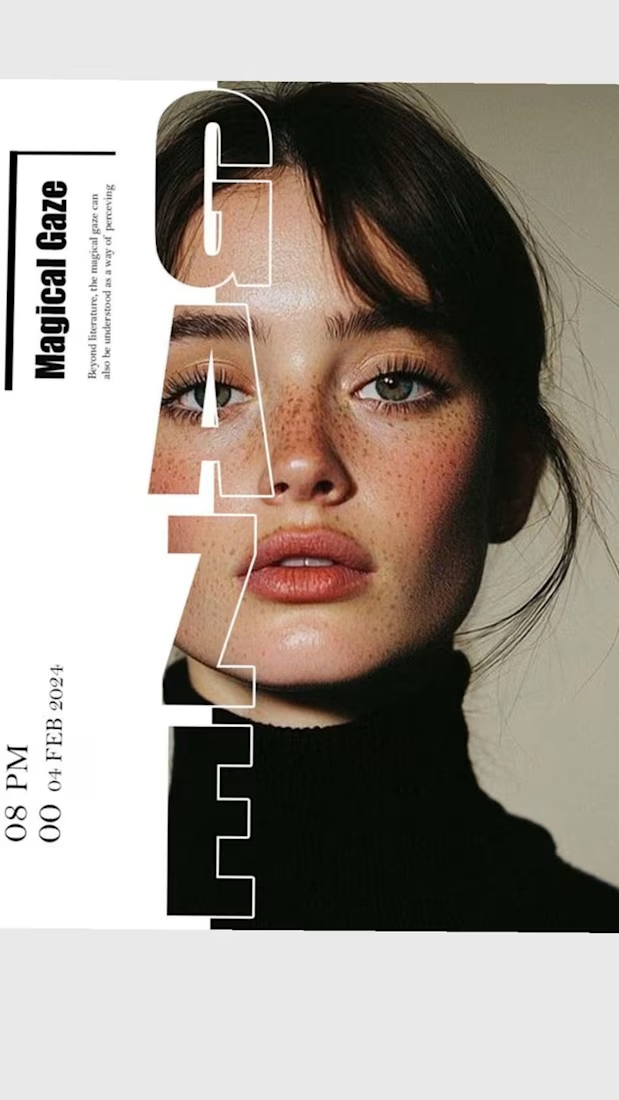
I love working on tiny artsy projects besides heavy work. The poster I designed for my friend's upcoming short film: dejection.
This is my first time designing a movie poster :) What do you think?

The network for creativity
Join 1.25M professional creatives like you
Connect with clients, get discovered, and run your business 100% commission-free
Creatives on Contra have earned over $150M and we are just getting started





Related posts

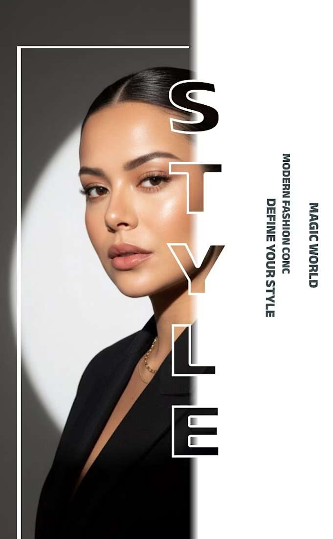
✨ Modern Fashion Poster Design - STYLE ✨
Designed a clean, high-fashion poster concept focusing on bold typography and minimalist aesthetics.
Concept: Modern Fashion | Define Your Style
Tool: Canva / Photoshop
Style: Luxury, Minimal, Editorial
Open to feedback and freelance work!
#GraphicDesign #PosterDesign #FashionDesign #Canva #ContraCommunity


The way you let the bold type dominate the empty space really drives the luxury feel.

Next intelligence. A brand you can feel.
Ice blue, deep black and refracted glass bring texture, depth and a sense of touch to an invisible technology. An identity designed to be recognised. And felt.
Brand identity and visual direction for Niwos, a platform that brings AI agents together as a digital workforce.
Five modules. One W. A simple idea at the heart of the identity: working as one.
I’ve really enjoyed working on this project with Muhammed. His trust in my design judgement and openness to new ideas gave me the creative freedom to explore fully.
Here’s hoping this is just the first chapter of an exciting journey with him and his team.


👍 nicely done

A new visual direction for Friedrich Naumann Foundation - Jordan.
I developed a visual sub-identity for the “Nau Media” project, a media training initiative focused on digital communication, human rights-sensitive media, and combating misinformation.
The goal was to build a distinct visual system that could stand on its own while remaining connected to the broader FNF Jordan identity.
This is an initial look at the project. The full visual identity and its applications will be shared soon.

Great visual identity I like the way you show the brand that's unique 🎉❤️