The network for creativity
Join 1.25M professional creatives like you
Connect with clients, get discovered, and run your business 100% commission-free
Creatives on Contra have earned over $150M and we are just getting started
Back to feedPost

How I think about future pages during the first design phase
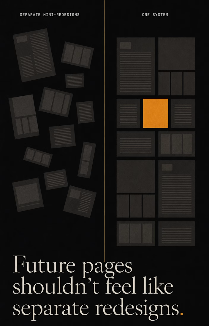
Most websites don’t break at launch. They break the first time someone adds a page nobody planned for.
A new service page. A campaign landing. The first case study. Suddenly each addition becomes its own mini-redesign — different structure, different spacing, different logic. The site slowly turns into several sites stitched together.
I design the first phase to prevent that. Not pages — the system that generates them.
Before touching home or about, I map the page types that will exist a year from now:
Service pages become one template — a repeatable hero, proof, process, and CTA blocks — so the fifth service takes an hour, not a week.
Campaign and landing pages get their own template early, so marketing can move fast without breaking the core system.
Case studies live as a CMS collection with a fixed structure, so the tenth looks as clean as the first.
CMS collections get a real content model — fields, empty states, long-list states — defined before anyone needs them.
Phase one looks like “just a website.” It’s actually the set of rules the site grows by, without falling apart.
I can help structure your website so future pages do not feel like separate mini-redesigns.

The network for creativity
Join 1.25M professional creatives like you
Connect with clients, get discovered, and run your business 100% commission-free
Creatives on Contra have earned over $150M and we are just getting started







Related posts


Marigold was a one-day concept for a design challenge. I set the direction in real photography before generating anything.
That order matters more than people think. If you generate first, you're negotiating with whatever the model offers. If you shoot or choose real references first, you've set a standard the rest of the work has to meet.
The tool didn't set the taste. It matched a bar that already existed.

Great work!, love the colors

Built the site for Linea — a boutique rail brand where the whole UI is made of the same rule as the print system.
Every route card's red line isn't decoration, it's that route's actual elevation profile. Fare tiers aren't styled, they're the same data at different density.
The logo's sparkle mark even resolves from the exact same contour-drawing logic, live on the page.
One idea, all the way down → Here

A new visual identity for Reroll.
We turned the O in the name into a die and built the wider brand language around that simple idea.
The project includes:
• Logo design
• Social media identity
• Logo animation
• Custom playing card back
• 3D visual assets
Creative direction: Dmitry Lepisov
Identity design + motion: Arthur Skripnik
Created by Lepisov Branding
Some of the 3D visuals and animation were made in Spline.


