The network for creativity
Join 1.25M professional creatives like you
Connect with clients, get discovered, and run your business 100% commission-free
Creatives on Contra have earned over $150M and we are just getting started
Back to feedPost

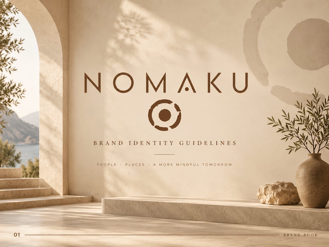
NOMAKU — Premium Brand Identity & Brand Guidelines
A refined, nature-inspired brand identity system created for NOMAKU, designed to feel warm, sophisticated, timeless, and quietly luxurious.
The goal was to transform the existing NOMAKU logo into a complete visual world—one that feels intentional across every brand touchpoint while preserving the original character of the mark. The final direction combines earthy neutrals, editorial typography, generous whitespace, natural textures, and elevated art direction to create a distinctive premium presence.
The Creative Direction
Rather than relying on overly decorative branding, I built the identity around restraint and atmosphere. Warm sand tones, rich organic browns, soft stone neutrals, natural light, and tactile materials give NOMAKU a calm yet highly considered personality.
The brand book establishes a clear system for maintaining that visual language consistently across digital and physical applications.
What I Developed
Premium brand identity direction
Brand guidelines / brand book
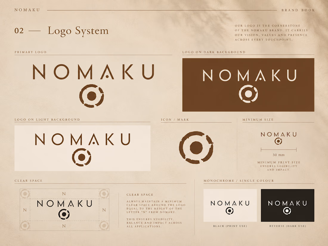
Logo usage system
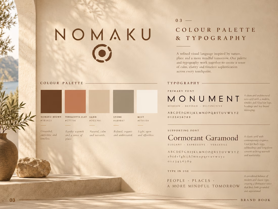
Primary and supporting color palette
Typography hierarchy
Clear-space and sizing principles
Light, dark, and monochrome logo applications
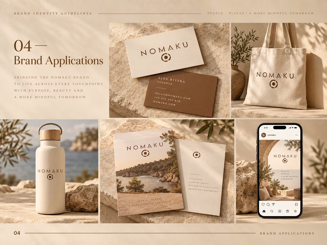
Business card and stationery direction
Branded merchandise
Packaging and lifestyle applications
Social media visual direction
Editorial-style brand mockups
Art direction and visual consistency Design Approach Every detail was designed to reinforce a feeling of simplicity, craftsmanship, warmth, and understated luxury. Instead of treating the logo as an isolated graphic, I developed a visual ecosystem around it. Typography, color, photography, materials, composition, and negative space work together to make the identity recognizable even when the logo isn't the primary focal point. The Outcome The result is a cohesive, scalable brand system that gives NOMAKU a more premium and memorable presence while remaining flexible enough for print, digital, social media, merchandise, packaging, and future brand experiences. The identity feels contemporary without depending on short-lived trends—giving the brand a visual foundation designed to remain relevant over time.


The network for creativity
Join 1.25M professional creatives like you
Connect with clients, get discovered, and run your business 100% commission-free
Creatives on Contra have earned over $150M and we are just getting started





Related posts

Jordan Reid - Sportswear Brand Identity


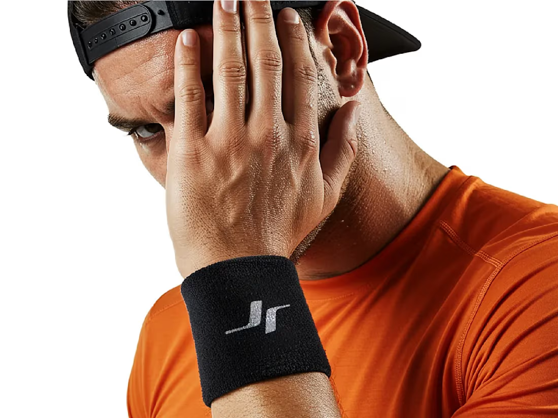




Like the logo direction

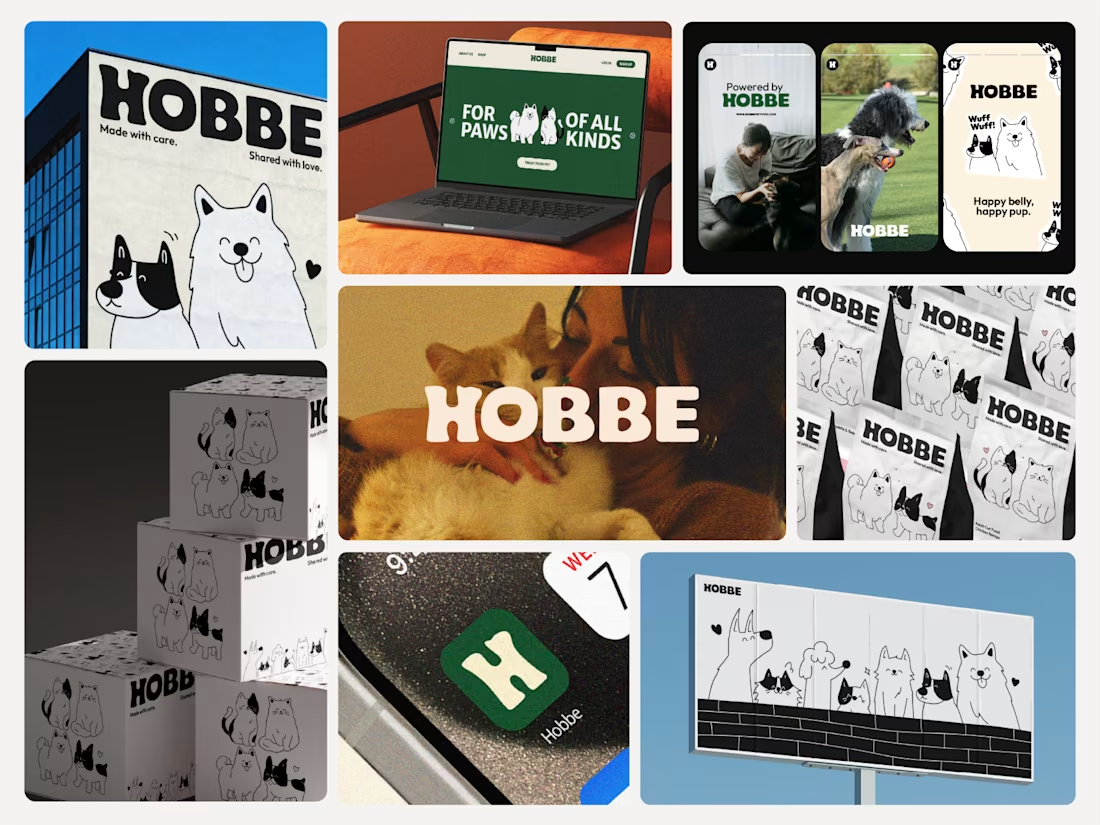
Like the branding and illustrations

Puresip — a fresh identity taking shape.
Built around one idea: make a fruit brand feel refreshing, natural and full of personality without falling into the usual “healthy juice” look.
From Spain, direct to you.
A little preview of the identity and digital direction before the full case study.
Impressive work man