The network for creativity
Join 1.25M professional creatives like you
Connect with clients, get discovered, and run your business 100% commission-free
Creatives on Contra have earned over $150M and we are just getting started
Back to feedPost

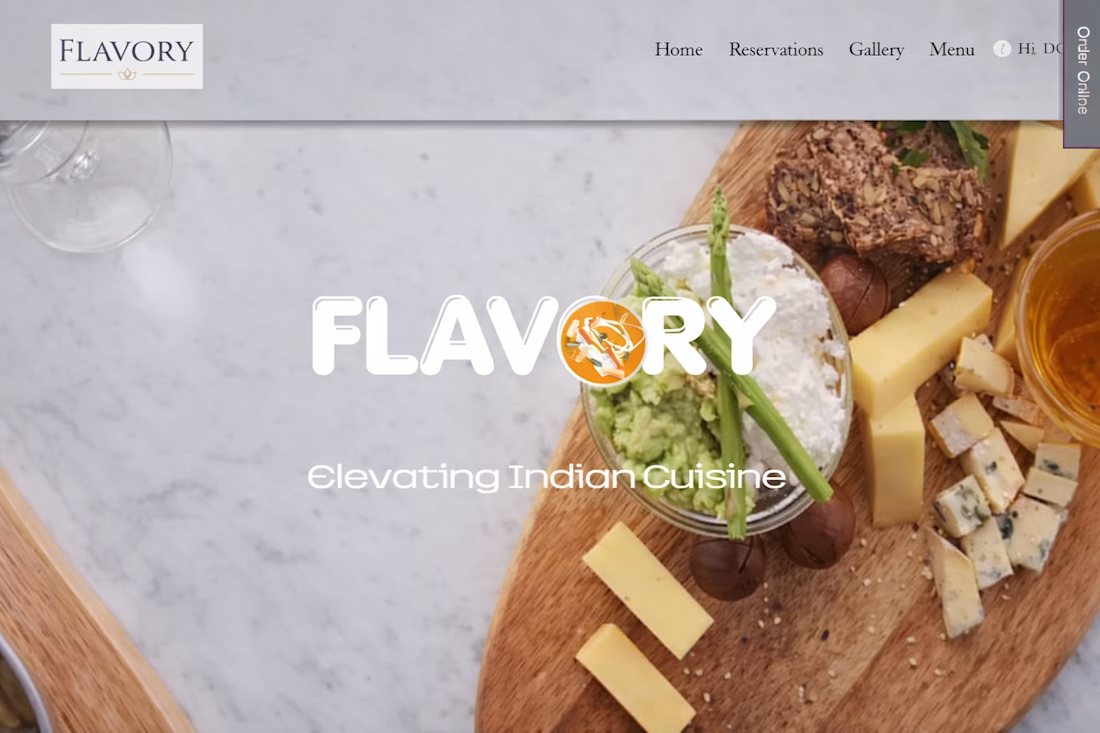
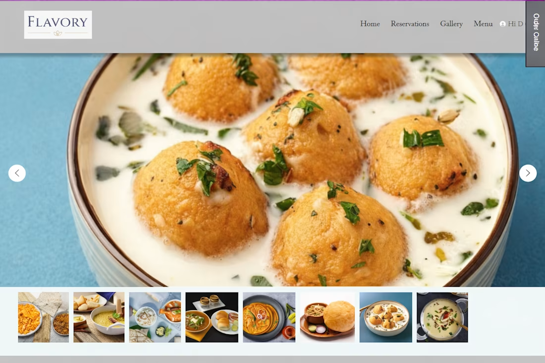
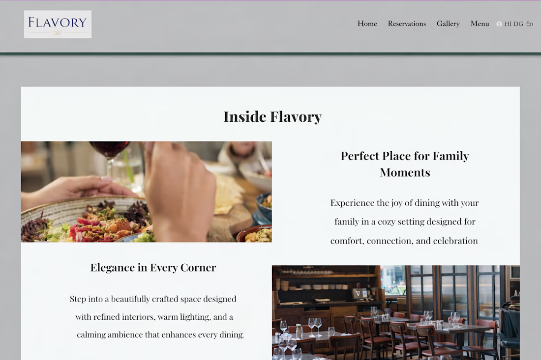
I build websites using Wix. I created this website for 'Flavory,' an Indian restaurant that showcases authentic, hygienic, and delicious Indian food, along with the glory and hospitality of Indian culture.


The network for creativity
Join 1.25M professional creatives like you
Connect with clients, get discovered, and run your business 100% commission-free
Creatives on Contra have earned over $150M and we are just getting started








Related posts


what if your portfolio page was just all of it?
we put every project from our contra profile on one wall for the new apollo studio site.


Really great to see all of your work

A premium landing page concept for a luxury sauna brand, focused on warm visuals, refined typography, and a smooth interactive experience.


Great landing page 🎉🎉🔥🔥

A few colour explorations from ARDA®.
I spent a bit of time experimenting with different colour combinations to see how they would change the overall feel of the site.
There were a few I really liked and considered taking further, but in the end I kept coming back to black and white. I felt it worked best with the imagery and typography, and ultimately suited the direction I wanted to take the project.

There is something satisfying about watching the same site change personality with each colour combination. The ARDA explorations look like a great exercise in that.