The network for creativity
Join 1.25M professional creatives like you
Connect with clients, get discovered, and run your business 100% commission-free
Creatives on Contra have earned over $150M and we are just getting started
Back to feedPost

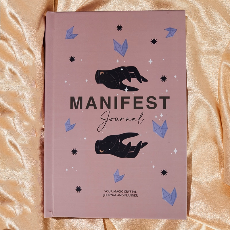
“Manifestation Journal” : A beautifully designed journal to help users clarify intentions, set goals, and attract positive energy. With guided prompts, reflections, and exercises, it encourages focus, mindfulness, and intentional living.


The network for creativity
Join 1.25M professional creatives like you
Connect with clients, get discovered, and run your business 100% commission-free
Creatives on Contra have earned over $150M and we are just getting started





Related posts

SERVE — Tennis Courtwear Landing Page 🎾
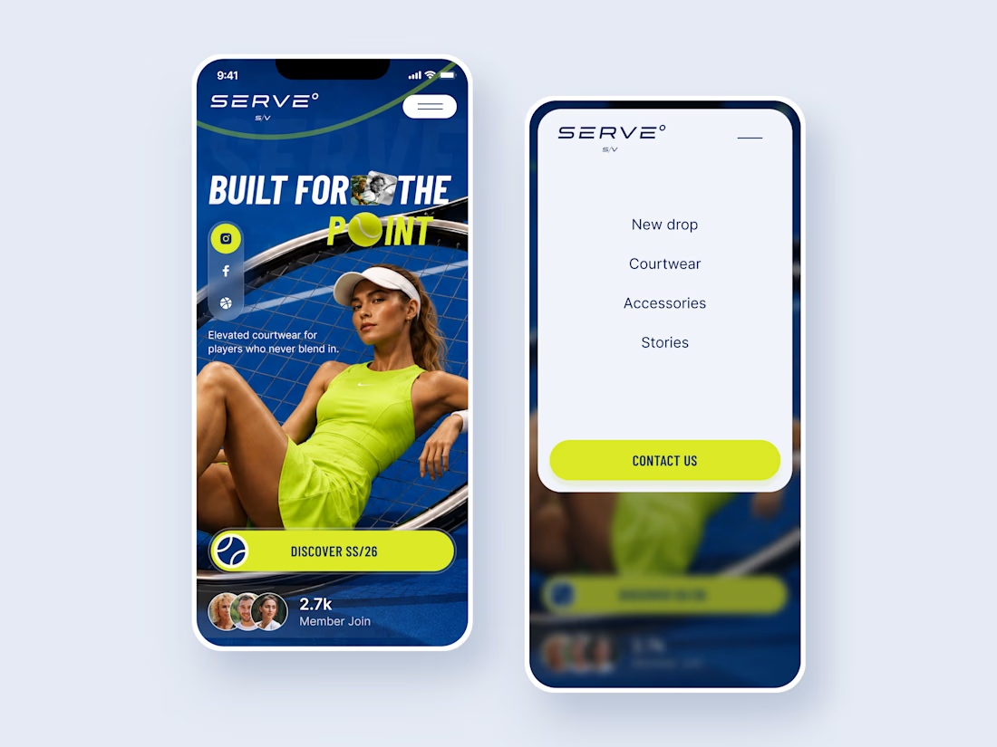
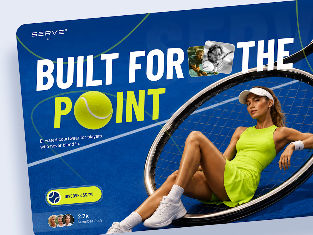
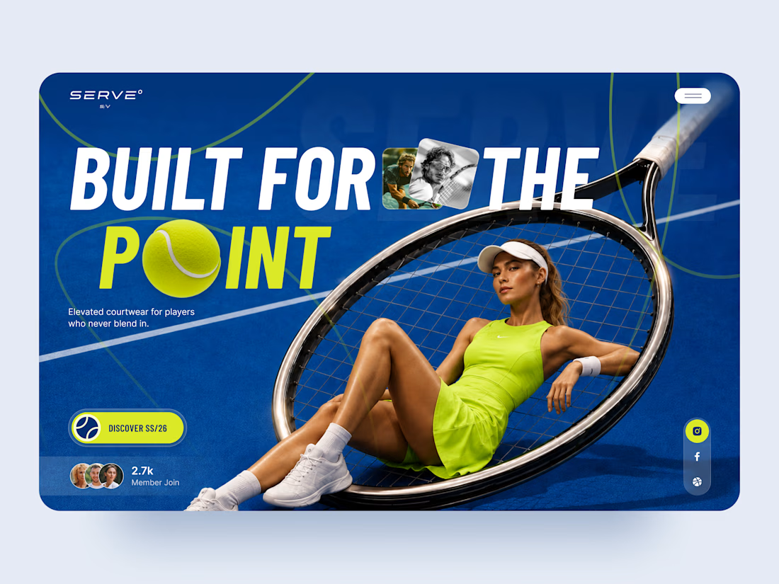
SERVE is a bold landing page concept for a contemporary tennis and courtwear brand built around performance, style, and attitude.
The goal was to move away from the traditional clean, minimal sportswear aesthetic and create something with more energy and personality. Deep court blue, electric tennis yellow, oversized typography, and layered photography give the experience a strong editorial feel.
Special attention was given to:
• a hero composition built around the tennis racket and athlete
• oversized typography that feels energetic and campaign-driven
• electric yellow accents inspired by the tennis ball 🎾
• layered photography and graphic elements that create depth
• a strong CTA for the SS/26 collection
• social and community elements that make the brand feel active
• a simplified mobile composition that keeps the same visual impact
• a clean mobile menu that contrasts with the expressive hero
The result is a high-energy digital experience that blends sports performance with fashion-forward art direction.
Looking to create a bold website for your sports, fashion, or lifestyle brand? Let’s build something people remember ⚡




Good vibes only.
What’s driving your creative energy today?
Generated with H3.


That mint-and-pink street scene is pure good vibes, love the sneaker detail catching the light. What drives my energy lately is seeing a rough idea actually ship instead of sitting in drafts. Momentum is its own fuel.

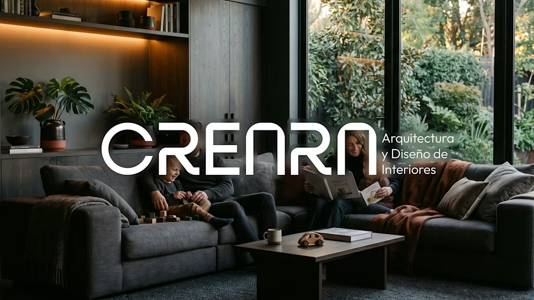
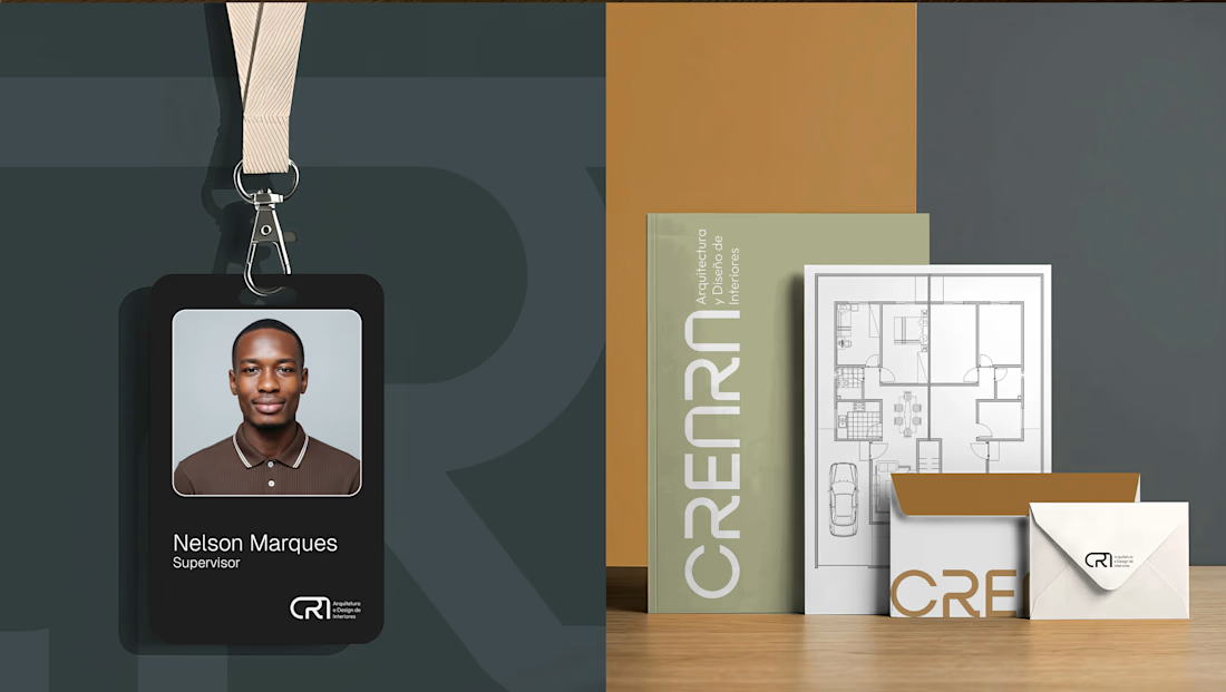
CREARA is a Spain-based architectural firm with a unique selling point: creating spaces that align with the lifestyles desired by young families.
With a premium, minimalist aesthetic, the firm stands out by avoiding cookie-cutter designs, instead creating bespoke solutions tailored to each client's specific needs.
Focusing primarily on young families, the visual identity is soft, modern, and sustainable.

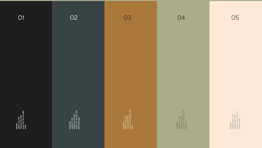

The young-families angle is the tricky constraint here, since premium minimal usually gets read as slightly untouchable and families are the audience least inclined to want that. The softened wordmark and the warmer half of the palette look like where that gets absorbed. Was the...