The network for creativity
Join 1.25M professional creatives like you
Connect with clients, get discovered, and run your business 100% commission-free
Creatives on Contra have earned over $150M and we are just getting started
Back to feedPost


Just shipped Kindred.
Every course template sells information. Kindred sells belonging.
It's a landing page template for coaches, operators, and community
builders running a paid membership on Circle, Skool, Kajabi, or
anywhere else. Founder-voice sections, real transformation proof,
and copy that actually tells you what to say.
Go from blank canvas to live in a weekend, without looking like
you bought a template.
Live now on the Framer Marketplace.


Congrats on shipping Kindred! The positioning is sharp. 'Sells belonging' is the exact thing most community builders actually need to communicate and can never figure out how to say. Curious how it performs on the Marketplace.
Yeah man, got into templates at the same time they've shipped Framer 3.0. The whole marketplace shift is great but a lot of creators aren't happy with how their template business has lost traction.
Still pretty fresh to make any conclusions but we'll find out haha

Amazing work

Love it

nice!

Beautiful design system and consistent UI throughout.

What a color combination! your design hits my dopamine button; I've been staring it at least 30 minutes. 😍
Haha thanks so much

Great job!
Thanks Man

good bro
Thanks bro
The network for creativity
Join 1.25M professional creatives like you
Connect with clients, get discovered, and run your business 100% commission-free
Creatives on Contra have earned over $150M and we are just getting started



Related posts

Exploring two different hero directions for a new project.
Same message, two completely different visual approaches.
Which one makes a stronger first impression?
A or B? Curious to hear your thoughts!
36 voted
90%
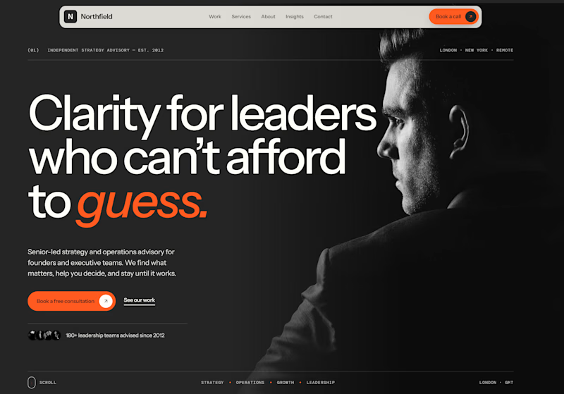
4 voted
10%
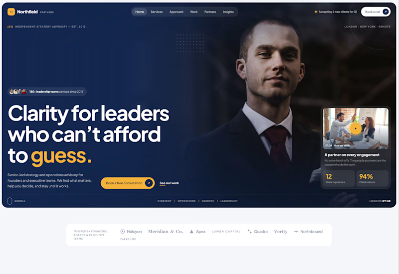
40 votes
Closed

Both are strong. I lean towards the dark version, because the orange accent on the italic "guess." pops and the profile portrait gives it a more editorial, confident feel. The navy one reads a bit more corporate, which could suit a more conservative audience. Nice exploration!

𝗗𝗮𝘆 𝟮𝟲𝘁𝗵 𝗼𝗳 𝟯𝟬𝗱𝗮𝘆𝘀, 𝟰 𝗗𝗮𝘆𝘀 𝘁𝗼 𝗴𝗼
𝗙𝗿𝗮𝗺𝗲𝗿 𝘃𝘀 𝗪𝗲𝗯𝗳𝗹𝗼𝘄 𝗶𝗻 𝟮𝟬𝟮𝟲: 𝗦𝗽𝗲𝗲𝗱 𝘃𝘀 𝗖𝗼𝗺𝗽𝗹𝗲𝘅 𝗖𝗠𝗦 𝗔𝗿𝗰𝗵𝗶𝘁𝗲𝗰𝘁𝘂𝗿𝗲
Both platforms excel at visual development, but their modern use cases are distinct:
• 𝗙𝗿𝗮𝗺𝗲𝗿: Best for rapid AI layout iteration, SaaS conversion pages, and Figma-native auto-layout fidelity.
• 𝗪𝗲𝗯𝗳𝗹𝗼𝘄: Unmatched for complex relational database logic, multi-locale localization, and enterprise governance. Here is how to choose between them in 2026.
𝗪𝗵𝗶𝗰𝗵 𝗽𝗹𝗮𝘁𝗳𝗼𝗿𝗺 𝗶𝘀 𝗰𝘂𝗿𝗿𝗲𝗻𝘁𝗹𝘆 𝗶𝗻 𝘆𝗼𝘂𝗿 𝗺𝗮𝗶𝗻 𝗰𝗹𝗶𝗲𝗻𝘁 𝗽𝗿𝗼𝗱𝘂𝗰𝘁𝗶𝗼𝗻 𝘀𝘁𝗮𝗰𝗸❓❓❓
𝗟𝗲𝘁 𝘂𝘀 𝗸𝗻𝗼𝘄 𝗯𝗲𝗹𝗼𝘄!


Amazing