The network for creativity
Join 1.25M professional creatives like you
Connect with clients, get discovered, and run your business 100% commission-free
Creatives on Contra have earned over $150M and we are just getting started
Back to feedPost

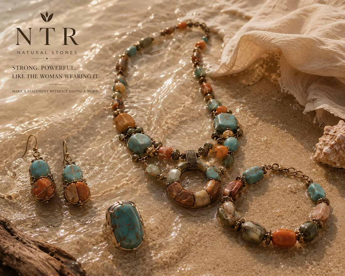
NTR Natural Stones — jewelry range. AI-assisted concept work.
A concept jewelry brand built around natural stones. We created the name, tagline, and product range, plus the launch visuals: a hero campaign image, a full range sheet across five stones, and a lifestyle story.
Self-initiated concept, not a client project. We created the images with AI tools, then art-directed and finished them in Canva.


The network for creativity
Join 1.25M professional creatives like you
Connect with clients, get discovered, and run your business 100% commission-free
Creatives on Contra have earned over $150M and we are just getting started
Related posts


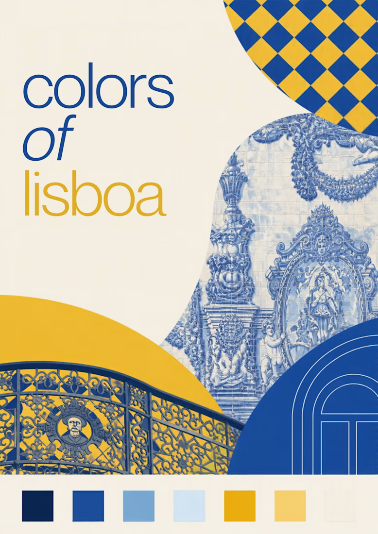
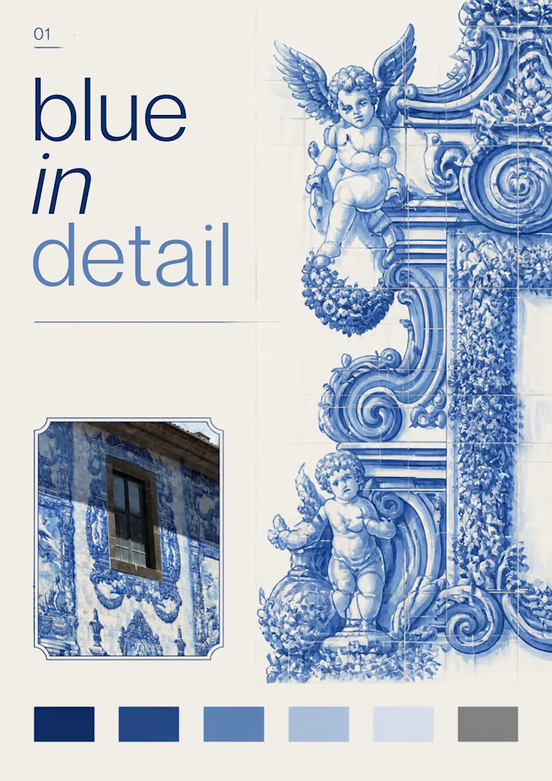
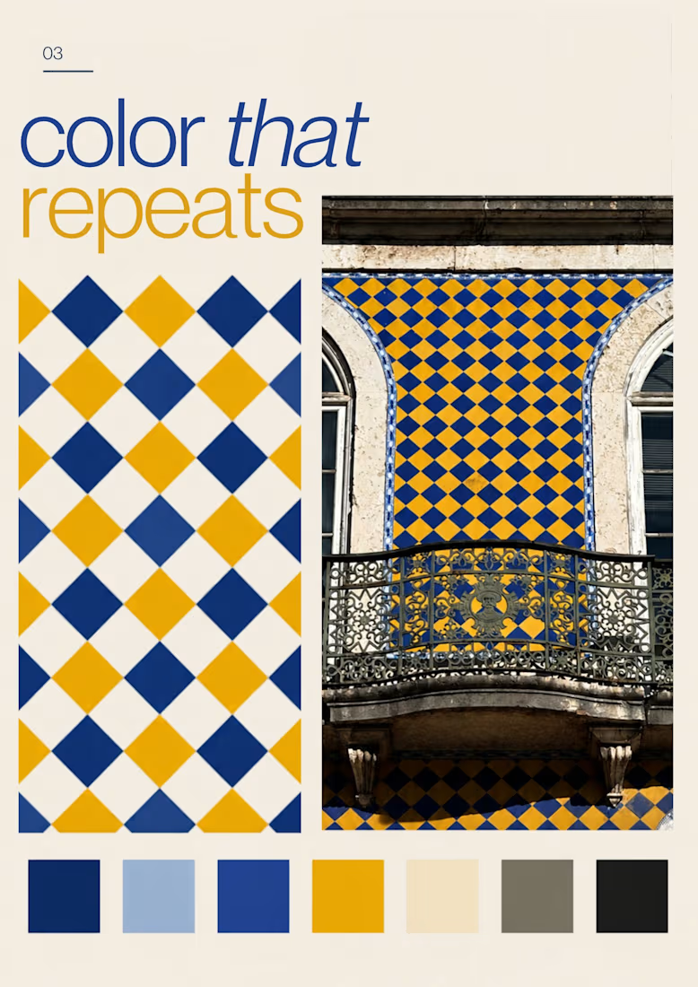
Turning the colors I notice around Lisbon into a series of posters, each inspired by a different photograph.
01 [Blue in Detail] started with the blue Portuguese tiles, exploring their intricate patterns, ceramic tones, and small details.
02 [Color on Repeat] explored the rhythm of blue and yellow tiles, using repetition as the starting point for the design.
I sampled colors from my photographs and used Canva Craft to explore layouts, typography, and graphic elements. Then I refined the designs by hand, adjusting the colors, spacing, and text.

In response to the aesthetic homogenization brought about by AI, brands like Prada remind us that the human touch is the ultimate luxury.


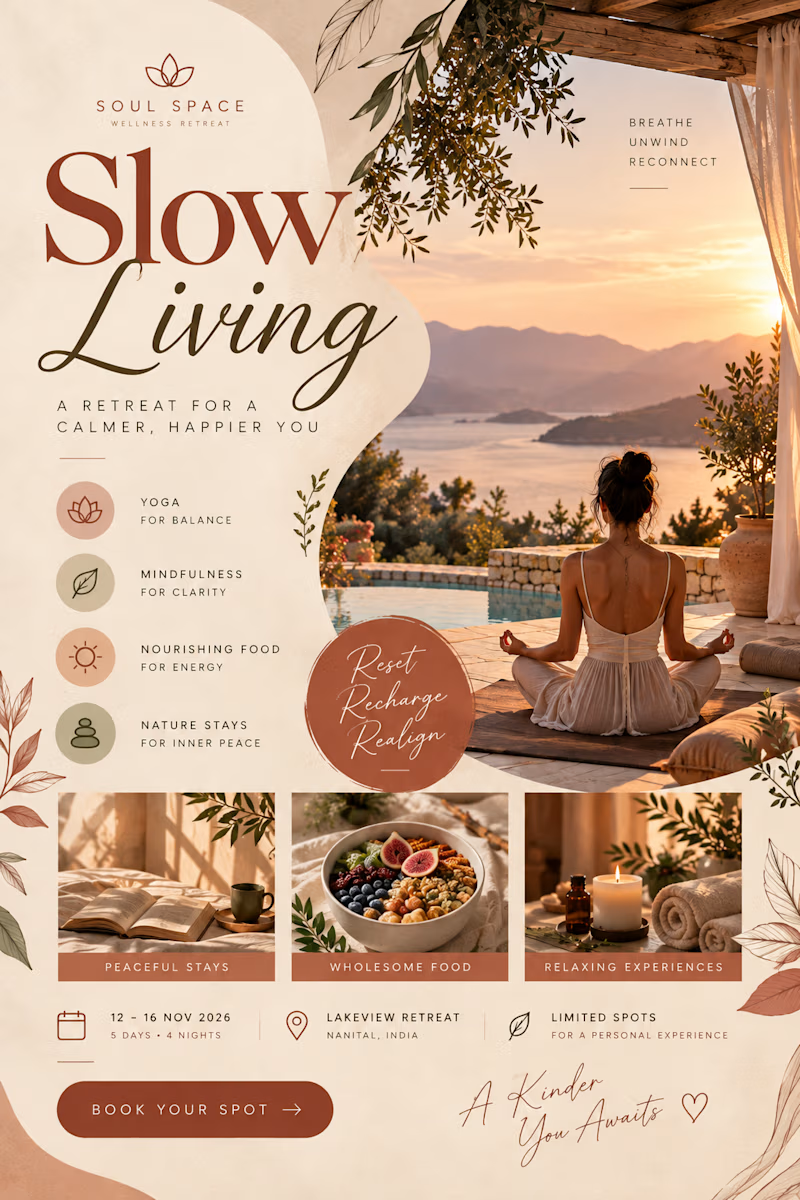
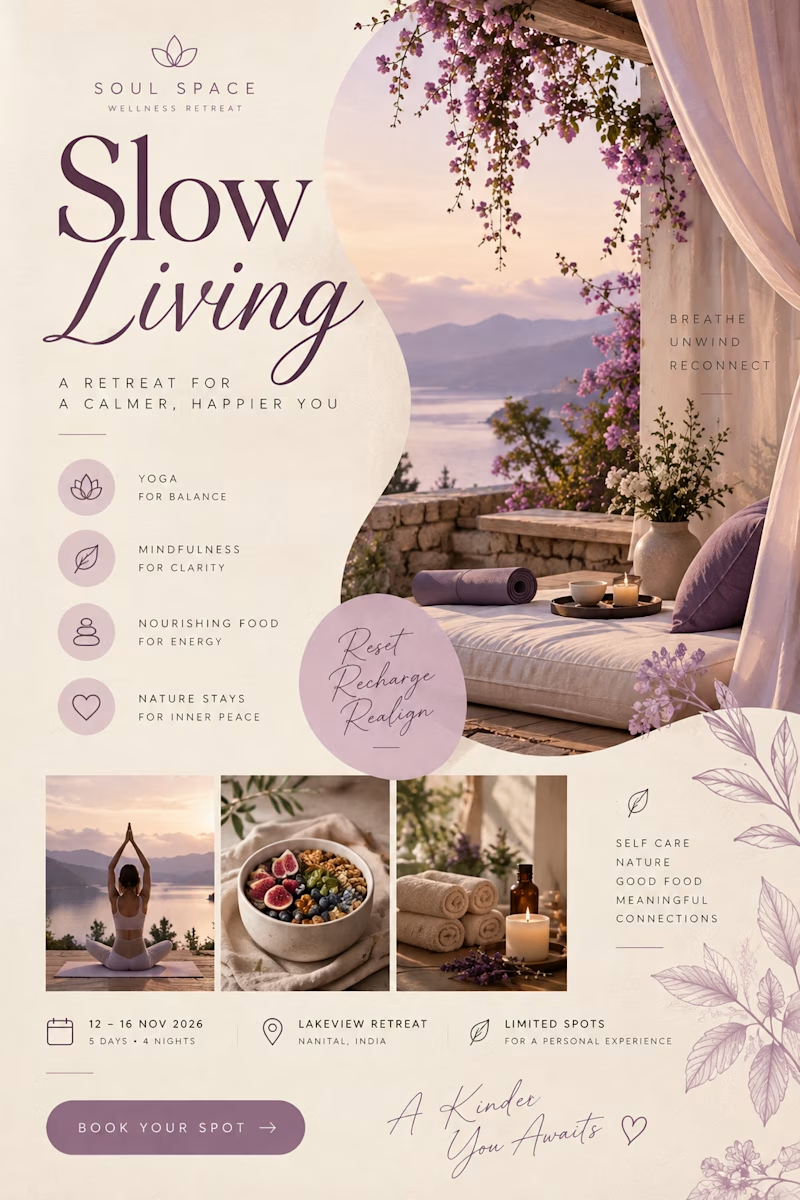
Created a collection of aesthetic promotional flyers for a wellness retreat brand, inspired by mindful living, relaxation, and nature.

2 voted
67%
1 voted
33%
3 votes
Closed