The network for creativity
Join 1.25M professional creatives like you
Connect with clients, get discovered, and run your business 100% commission-free
Creatives on Contra have earned over $150M and we are just getting started
The network for creativity
Join 1.25M professional creatives like you
Connect with clients, get discovered, and run your business 100% commission-free
Creatives on Contra have earned over $150M and we are just getting started
Challenges
View all


Related posts

I tried experimenting a little with my previous design. I changed the fonts and background a bit. Which version do you like better?

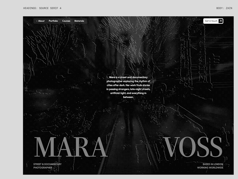
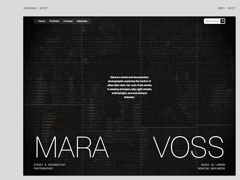
22 votes
Ends in 19h

New design for sure. The distressed texture in the type makes it feel like actual street photography lives inside the letters. The previous version is clean but this one has grit.


The purple glow gives this mascot a distinct personality against the dark background. Did you design the character with its motion in mind from the start?

Finished this crazy 142hour edit. let me know guys how it looks


142 hours is a serious investment in an edit. Which part took the most iteration: pacing, compositing, or the transitions?