The network for creativity
Join 1.25M professional creatives like you
Connect with clients, get discovered, and run your business 100% commission-free
Creatives on Contra have earned over $150M and we are just getting started
Back to feedPost

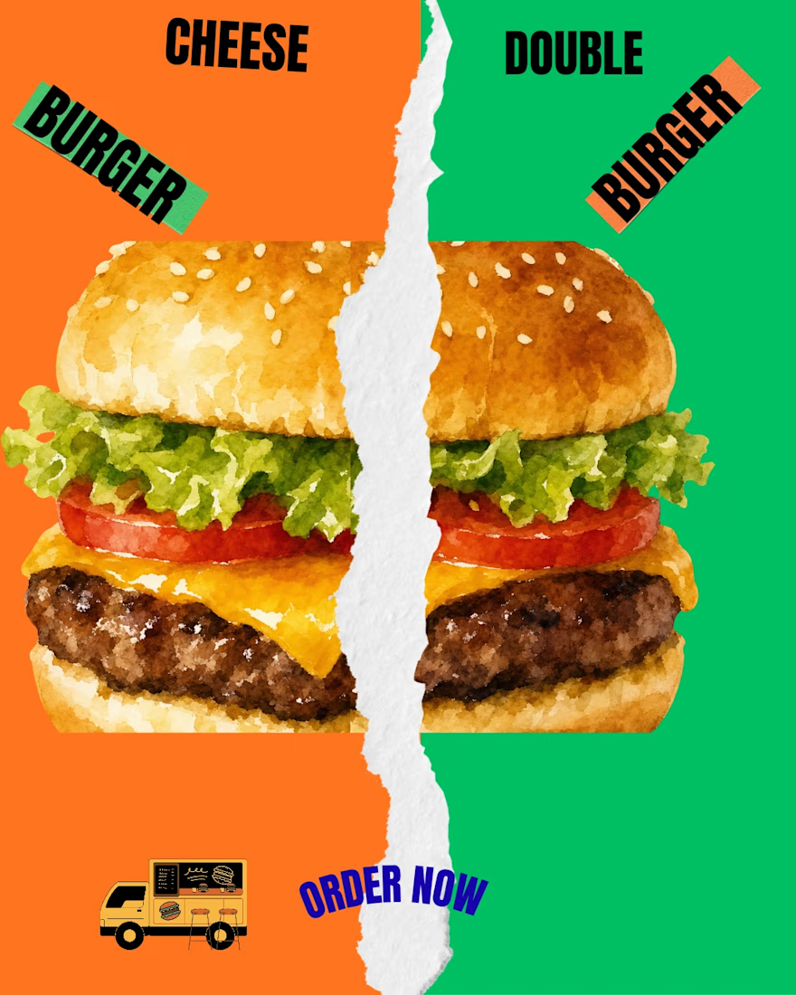
Team CHEESE BURGER 🧀 or Team DOUBLE BURGER 🍔? Comment below!
The network for creativity
Join 1.25M professional creatives like you
Connect with clients, get discovered, and run your business 100% commission-free
Creatives on Contra have earned over $150M and we are just getting started


Related posts

Los 3 Salchis: a mascot logo for a neighborhood pizzeria 🍕
This is one of the projects I enjoyed working on the most.
Los 3 Salchis is a family-run neighborhood pizzeria, and the goal was to create a mascot logo that captures what happens around their tables: warmth, closeness, love, celebrations, and those long nights with friends and family.
What I worked on:
Mascot logo design: a friendly little sausage dog who’s always ready for a slice
Warm brand palette inspired by the feeling of an American pizzeria
Visual direction and imagery with a nostalgic, film-like look
I hope you enjoy it as much as I enjoyed making it!!! ❤️ :)
Los 3 Salchis: mascot logo para una pizzería de barrio 🍕
Este es uno de los proyectos que más disfruté trabajar.
Los 3 Salchis es una pizzería familiar y de barrio. El objetivo era crear un mascot logo que reflejara lo que pasa alrededor de sus mesas: la calidez, la cercanía, el amor, los festejos y esas juntadas largas con amigos y familia.
Qué hice:
Diseño del mascot logo: un salchicha simpático, siempre listo para una porción
Paleta de marca cálida, inspirada en el feeling de una pizzería americana
Dirección visual e imágenes con un look nostálgico, estilo film
Espero que les guste tanto como a mí hacerlo!!!! ❤️ :)


Same four pasta dishes, two ways to meet them.
Would you rather watch the chef finish your plate or find it waiting at a sunlit table?
Vote A or B.
14 votes
Ends in 1d

Nice work!

I’ve been playing around with a few logo animation ideas for CHOOPZ using Claude AI, and I have two directions so far.
The first one is what I call The Drop. The letters drop into place, squash a little and bounce back. I like how it plays into the chunky, playful feel of the wordmark.
The second is The Bite. A bite takes a piece out of the logo, then it snaps back into place. I thought it would be a fun way to connect the logo to the actual product without adding anything extra.
Both use the same logo and the three flavor colors, red, yellow and green, but the feel is quite different.
I'm still deciding which direction to go with.
Which one do you think works better for CHOOPZ? 👇