The network for creativity
Join 1.25M professional creatives like you
Connect with clients, get discovered, and run your business 100% commission-free
Creatives on Contra have earned over $150M and we are just getting started
Back to feedPost
MERIDIAN — Ultra-Luxury Real Estate Typography Direction
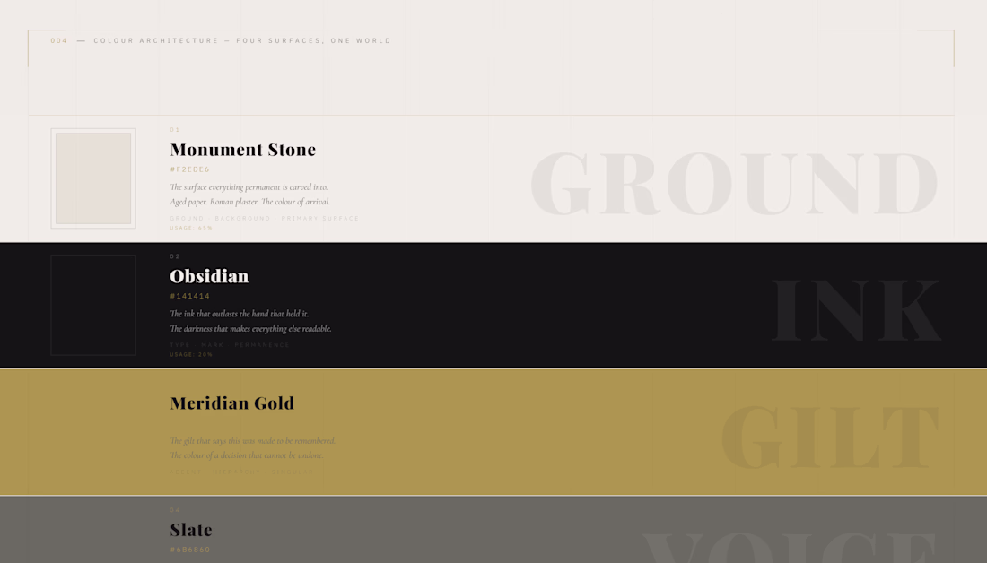
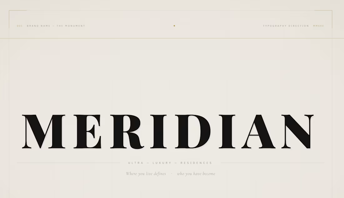
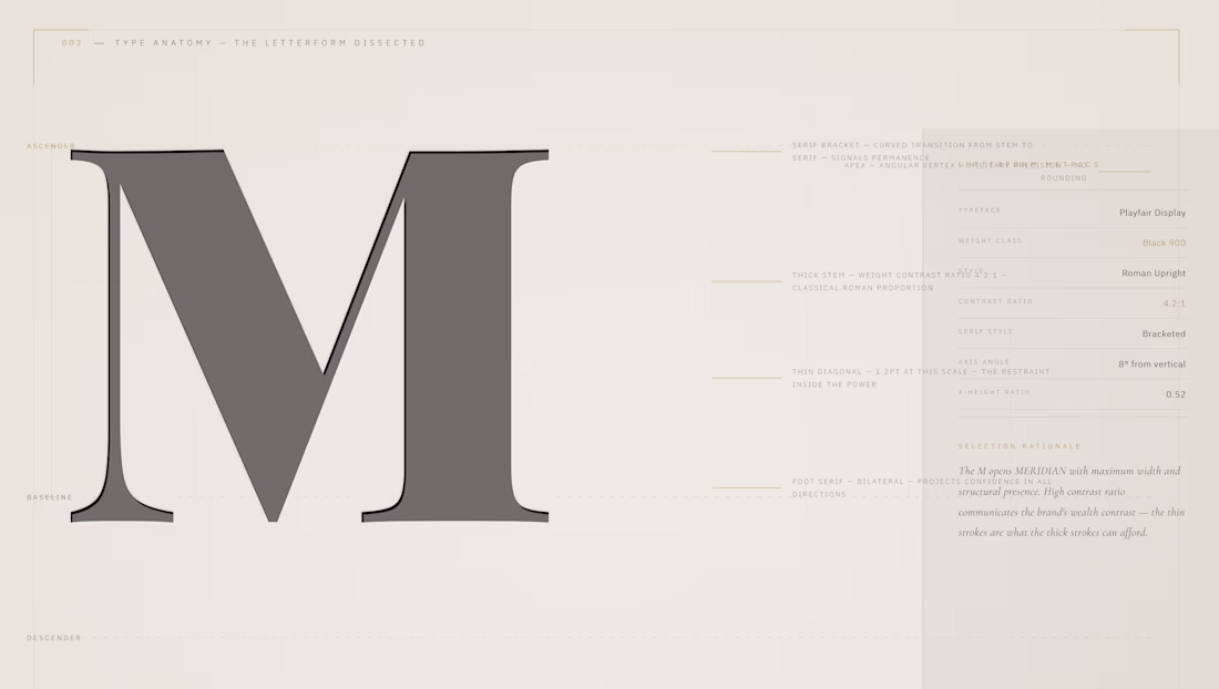
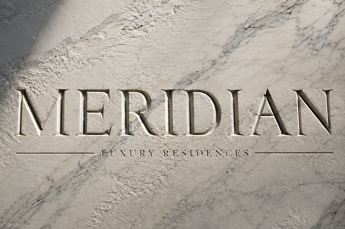
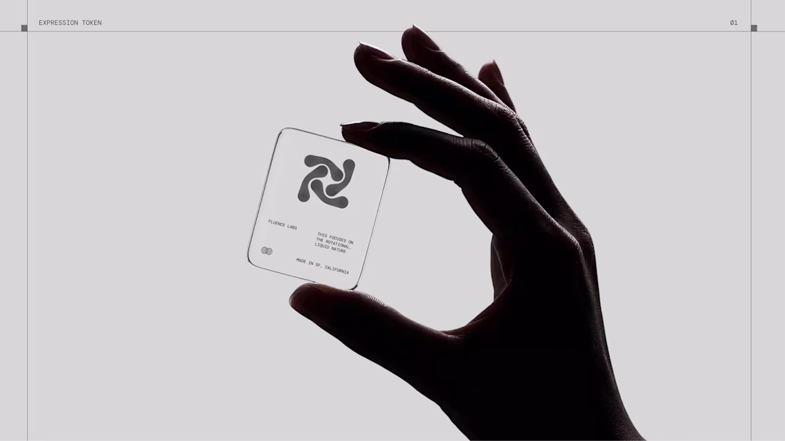
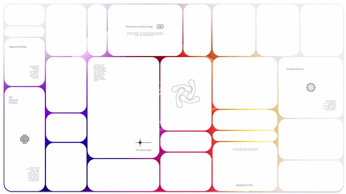
Typography Direction is the most demanding form of brand direction. No photography. No atmospheric images to carry the weight. Only letterforms, space, hierarchy, tension, and the conviction that the right typeface in the right position says more than any photograph of marble or skyline. MERIDIAN is an ultra-luxury residential real estate developer that does not sell apartments. It sells the permanent fact of arrival. This project delivers complete typography direction — letterform anatomy dissected, scale hierarchy from monument to whisper, the Swiss 12-column grid system made visible, three typeface voices documented and demonstrated, and the brand applied across letterhead, lobby plaque, and business card. Playfair Display. Cormorant Garamond. IBM Plex Sans. Three voices. One position. The type is the building.
M N LOKESHWAR REDDY, Creative Director.
Link to the full project:
https://www.behance.net/gallery/249708105/MERIDIAN-Luxury-Real-Estate-Typography-Direction
The network for creativity
Join 1.25M professional creatives like you
Connect with clients, get discovered, and run your business 100% commission-free
Creatives on Contra have earned over $150M and we are just getting started
Related posts
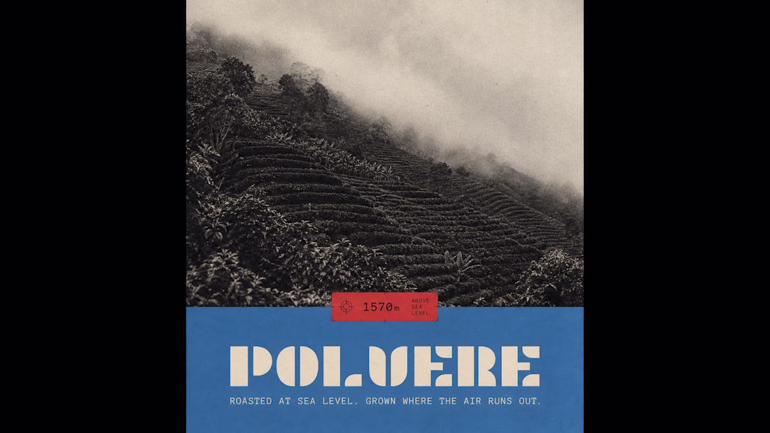
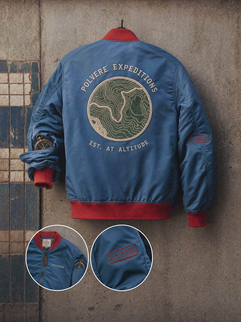
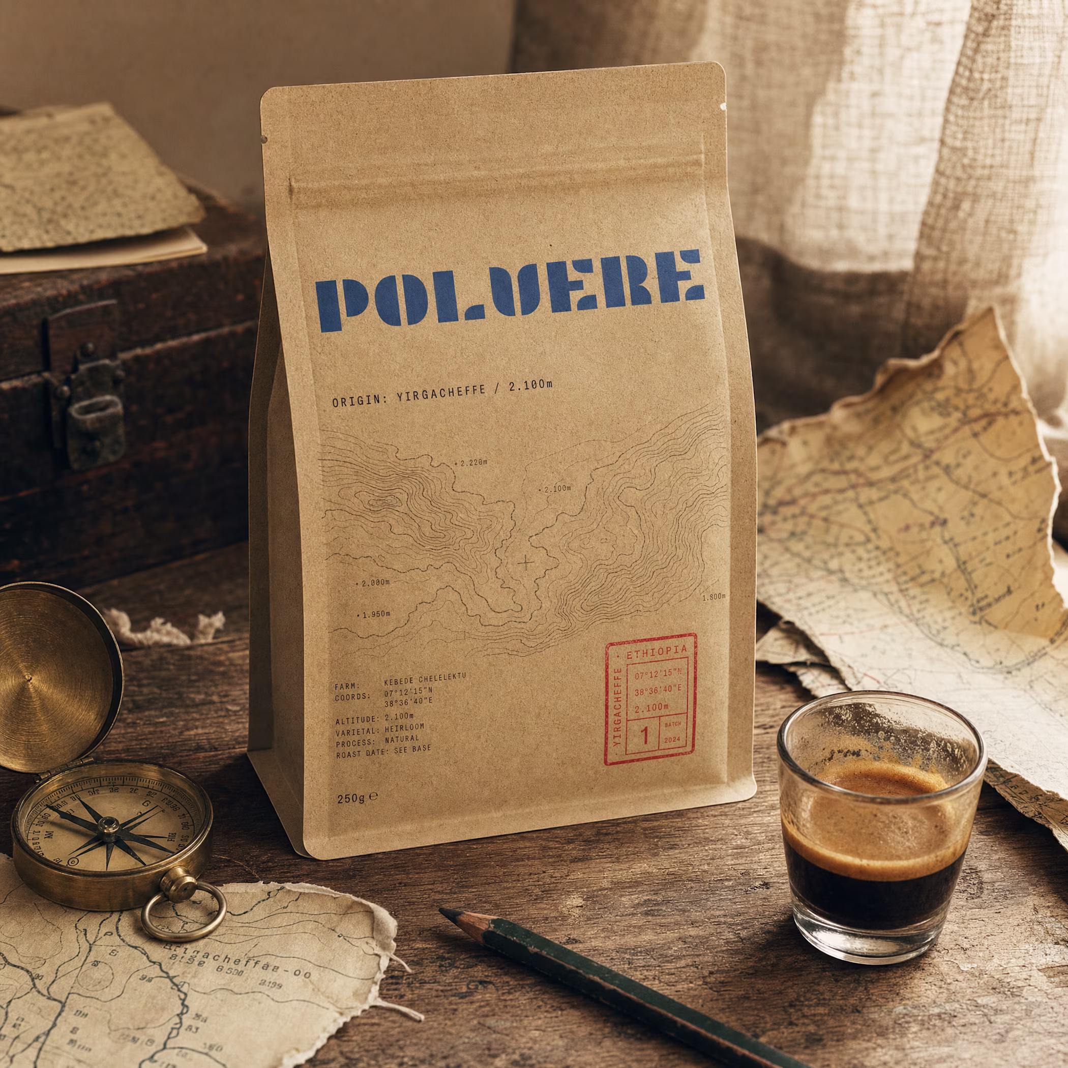
built a coffee brand where the bag is a postcard from 2,100m above sea level.
topographic maps. airmail borders. stamps that track altitude, not price.
full case study
Nice design
Love this!
Trending
Claude
Claude has entered the design space. How are you using Claude Design?
Contra University
Learn from expert creatives how to earn more using next-gen AI tools.
creativeaiflow
Creative AI workflows are evolving. What tools do you use, and what are their strengths and weaknesses?
portfolioreview
The best portfolios tell a story, not just show a grid. Share yours for feedback.
freelancerlife
Freelancer life is wins, pivots, and everything in between. What’s yours right now?